Peter Dornauf – 8 June, 2012
All the posters in this exhibition reveal that fertile interplay and blurring of boundaries between graphic art and fine art. Border crossings have always been made in both directions and here in Marker, that historic phenomena is demonstrably evident.
Hamilton
Matthew Galloway, Jack Gatasa, Mark Curtis, Tana Mitchell, Alan Deare, Mark Liu, Matt Scheurich, Kirsty Lillico, Lesley Kaiser, Spencer Levine, Benjamin Thomson, Kelvin Soh, Aaron Beehre and Simon Nicholls
Marker
Curator: Kim Paton
May 29 - June 15
The current poster exhibition at Ramp Gallery, Wintec, got me thinking about the difference between art and design and if there is one in this age of all things equal and plural.
The answer many might give is: not a lot - since both engage the same craft and box of technical tricks. Indeed the evolution of the modern poster, beginning in the second half of the nineteenth century, mirrored the same stylistic progression as seen in the fine arts themselves - De Stijl, Cubism, Futurism et al.
And yet there’s something that does indubitably separate them. Function. The poster, of necessity, has a more utilitarian task, its job more wedded to the world of commerce, announcing, selling or illustrating something, needing therefore to be more direct even while playing with visual subtleties.
Edward Hopper had a foot in both camps, but one would never mistake his commercial poster work, pre 1925, for the later tense existential noir paintings after that period. But then it could be equally said that the gap between the two modes was made almost negligible in the screen-printing works of Andy Warhol and our own Billy Apple.
Nor, when it comes to a question of monetary value, is there a great divide. In 2005, well in advance of half a million dollars was paid for a poster of Fritz Lang’s 1927 film, Metropolis.
It could also be safely argued that the poster, appearing as it does on public bollards, the poor man’s gallery, the exhibition space for the common person, can exert a stronger influence on the mind for social and political ends.
From politics to pin-ups, the placard has cast a wide net. Lissitsky’s famous Soviet propaganda poster Beat the Whites with the Red Wedge, using constructivist design, and more recently the Obama Hope poster by Shepard Fairey, have stamped their mark on visual consciousness.
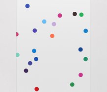
Kim Paton’s curated exhibition at Ramp puts together an energetic and assorted show of poster art, called Marker, involving fourteen New Zealand designers who exemplify the cross-fertilization between the world of design and that of the fine arts.
The best illustration of this is evident in the work of Alan Deare (winner of numerous Publishers Association of New Zealand Awards) whose piece borrows and parodies Roy Lichtenstein’s signature style using heavy outlines, cartoon simplicity and Benday dots. Lichtenstein himself fed off graphic design which then fed back into the commercial world. His Girl with Ball, 1962, originally came from a newspaper ad and much later his reconfiguration of it turned up in a TV commercial for Pineapple Lumps. The trademark look has become ubiquitous and Deare pokes gentle fun at it all, complete with cheesy tear drop. Mark Curtis also plays with the same trope as does Kelvin Soh in a sort of way.
Certain minimalist restrictions were placed on the designers in this show, going the Low-fi, A1, B&W printing way, narrowing the focus to plan printing as a drawing tool. This pared back method has put the designers on their metal.
Tana Mitchell (award winning independent designer) works a way around this by playing the mixed style method in Richard Killeen manner, using a variety of visual formats and fonts together with an eclectic array of subjects whose relationship which each other is somewhat ambiguous.
Matt Scheurich plays off geometric form against more cursive bulbous outlines configured in the shape of speech bubbles (think early Seraphine Pick) which camouflages randomly placed letters that might together spell out the name of the show and even the gallery. The merest hint of an art nouveau line is figured in the work of Mark Liu (senior Lecturer at Wintec School of Media Arts). Edvard Munch borrowed the style from graphic design for his famous Scream, 1893, and design artist Jan Lenica borrowed the creation back again with the celebrated poster for the opera Wozzeck, in 1964. Liu is more geometric but a similar forbidding feel is created.
Jack Gatasa (Melbourne based designer) and his plan model for a ‘house’ reminds one of Terrence Handscomb’s Model for World Decline, 1989. Similar format, different subject.
Ben Thomson (freelance designer in Melbourne) goes surreal. Think Magritte meets Claes Oldenburg. Spencer Levine (Wellington based designer in book publishing) constructs a theme, based on the history of medicine, while Sawtooth City, by Aaron Beehre (lecturer at University of Canterbury School of Fine Arts) recalls any number of Colin McCahon images, but specifically Imprisonment and Reprieve, 1978-9, without the spiritual overload.
All the posters in this exhibition reveal that fertile interplay and blurring of boundaries between graphic art and fine art. Border crossings have always been made in both directions and here in Marker, that historic phenomena is demonstrably evident as well as displaying the range and inventiveness of contemporary design itself, following in this case the dictum of Abram Games, official war poster designer for Britain; “maximum meaning, minimum means”.
Peter Dornauf


 Two Rooms presents a program of residencies and projects
 Advertising in this column


This Discussion has 0 comments.
Comment
Participate
Register to Participate.
Sign in
Sign in to an existing account.