Kelly Carmichael – 27 December, 2012
I think what I'm trying to get at here is the tension that exists between a type-design as a manufactured thing and an artistic work, something that is creative and is aesthetic, that is made and has the potential to be applied as communication - adding numerous complexities….an idea that is related to the ‘technologicalisation' of the alphabetic system, which has played a large role in its applied proliferation in organisational and storage media, like books, signage, product and digital systems.
David Bennewith
PART TWO:
KC - Lets talk about *Latent Stare*, your current project in Maatstricht and its exhibition … I’m intrigued that the press material around the project talks of it exploring the idea that “Tacit historicism, security and familiarity; the suggestion of dependability; reliability and ‘truthfulness’ are deep-rooted concepts and tensions within the discipline of type-design”. It also suggests that these ideas “may simultaneously mould & reflect the values and rules of the public a typeface is intended for.” Can you expand on this a little?
DB - I think what I’m trying to get at here (which is still a forming idea in regards to the *Latent Stare* project) is the tension that exists between a type-design as a manufactured thing [a product] and an artistic work, something that is creative and is aesthetic, that is made and has the potential [and desire] to be applied as communication - adding numerous complexities. [I also wonder where this communication might even begin?] I guess this is an idea that is related to the ‘technologicalisation’ of the alphabetic system, which has played a large role in its applied proliferation in organisational and storage media, like books, signage, product and digital systems, etc. Not to forget its myriad roles and uses even within these systems. Generally speaking, type-design asserts itself to be in service to the aforementioned ideas (dependability, etc.) because it is foremost a product - the destiny of most technical inventions - and wants to be sold or traded, it posits objectivity and neutrality. But on the other hand, that typefaces are material to transport texts, which have the potential to be indefinitely multiplied [and are always ambitious in this sense] - would conceivably lend them a potential agency, sent and received. There is a duality in this condition that fascinates me about a type-design, I guess this is where the name, or idea, *Latent Stare* comes from - the asterisks here remain a linguistic device denoting ambiguity.
I have started thinking like this because I’m interested in a typeface as not simply a tool (which perhaps avoids/refuses responsibility) but as a kind of device - a thing made or adapted for a particular purpose. Even though a tool and a device share many qualities, a device can - more specifically - refer to a desire or an intention in a design. Something that is more purposeful and telling than functional and passive. That a letter is an abstract sign, I would say, already makes it less ‘tool-like’. For a graphic designer typefaces are mostly used like ‘tools’ in their work, but perhaps this is not the case when the general public uses them, especially in present-day society. In this way, in application, in ubiquity, a typeface could be considered a material that reflects the circular relationship that we have with it (in a cultural sense) through language production. This idea is very much influenced by the writings of the cultural theorist Paul Virilio and historian and philosopher Walter J. Ong.
If type-design is in fact a ‘design’, then what and where is this ‘design’? And what relation does it have to current ideas in the discipline of graphic design? (the larger discipline it is included in) Because I feel it is discipline that has a tendency towards hermeticism, sometimes I wonder if type-design is simply the endless plotting of Bézier curves. Tracing, making an aesthetic outline, metadata … this for me would make it less a design but more a continuous exercise in self-reference as applied to formatting - also quite an intriguing subject in itself. [This idea is interestingly addressed in Jonathan Sterne’s recent book MP3: The Meaning of a Format.] These previously mentioned things I think maintain type-design as a craft, which is a totally noble and fine undertaking in itself. Also these things work perfectly for it in terms of it being a (desirable) product. In my own, quite limited, experience of making typefaces I have noticed it is very easy to get completely lost in the system of the typeface itself when making it. It’s easy to slip into a kind of ‘unconscious’ state of formalisation, which is what happens in any repetitious activity, and perhaps motivates a loss, or slipping, of meaning. I sometimes wonder how this moment can be captured, directed and revealed.
As in response to these ideas, the works in the *Latent Stare* exhibition each demonstrate or capture a moment when the agency, potential or the genus of a type-design might come to the forefront, through its construction, distribution or use. Each contribution to the exhibition looks slightly deeper into what a type-design might be - further than its appearance, that on which it is usually judged. For example, in the exhibition, the contribution of Hinrich Sachs’ Document from the archive of the International Auction of Basque Typefaces, 2001 is a slide-show format presentation contextualising the story of computer programmer Thierry Arsaut’s systematic collection and digitization of traditional Basque letter-designs that are made for sale by public auction. The Basque letters are inevitably connected to and often utilised by a nationalist movement that, to this day, strives for Basque independence from Spain. Controversially, Arsaut ultimately claims copyright for the Basque typefaces, which motivates universal questions concerning cultural property law, the appropriation of historical and national property as well as issues of ethnographical preservation. Sachs’ presentation is set against the background of the development of a new metro system and a Guggenheim art museum in the city of Bilbao - a city in transformation from an industrial city into a post-industrial one - a tourist destination, whose tourist industry also mobilises these Basque letters. By doing this, making this larger context more-clear, also calls into question the activity and role of digitisation in relation to both economic and social shifts in the 1990s-2000s ‘new economies’.
Another example might be Peter Verheul‘s Rijksoverheid [State government] typeface from 2008. Commissioned by an especially set up department within the Dutch government, whose aim was to resolve all of the various departments’ communication [which had evolved into dozens of different and expensive to maintain identities] by their amalgamation into one identity: ‘Project 1Logo’. A prominent element of the new identity was the realisation of a new set of typefaces for the exclusive use of the government. These typefaces were designed by Dutch type-designer Peter Verheul for the Dutch design agency Studio Dumbar - who had won the contract for the ‘1Logo’ project. Beyond the pragmatism of such an exercise some interesting questions are raised: How to visually represent a national government? What forms and cultural attributes are called on to mobilise the communication of such official narratives? Can these cultural values and forms find a place in a project that is aimed at [democratic] normalisation?
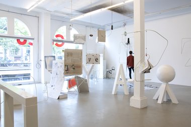
There are a myriad and diverse approaches to a conception of type-design in the exhibition and many happened to be in opposition with each other. These oppositions were intended to reveal themselves in the exhibition with the idea that the exhibition should operate like an ‘essay in space’. After all the idea of the *Latent Stare* exhibition was the testing of a particular thesis directed at type-design. In this regard the structures made for the exhibition design, by Olga Balema, were really important. We wanted to achieve something through the structures that simultaneously contained, supported but also interfered with the works, somehow both joining and complicating them.
KC - Lets talk more about the ‘meaning’ that typography can suggest… It seems to me that typography does something almost metaphysical by creating an emotion or sensation that an audience identifies with. As viewers, or especially as readers, we are willing victims, enjoying being lured into the atmosphere created. You might say we confide in the type, and by doing so identify ourselves with the imagery that the typeface suggests. How do you understand this?
DB - This is an interesting and complex observation. I think typographic meaning can stem from different places. In a way, to suggest that typography has ‘metaphysical’ qualities in application does come close to how it is supposed to function. After all, generally speaking, a letter is an abstract sign and one that is implicated in the organisation of a text, a world that somehow understands and exploits it. I would say it is mostly given meaning through the repetitive channels of production and distribution, the channels and formats that allow it to be used; this is usually not any one meaning and maybe a more superficial way of approaching it. Every so often a designer, writer, inventor, person, gives a typography or a type-design more pre-emptive meaning, through ideas or theories developed in their practice that are almost simultaneously put into play through their works. Usually these productions, or intentions, are significantly limited in use because they can appear too specific, dogmatic, experimental or just confrontational. This is what makes them meaningful maybe… Often these productions fall (relatively) quickly out of favour and are replaced by something else. When a way of doing something becomes revered and consequently imitated (where only its image is captured) to a certain extent it becomes sucked of any life it once had. Although, here, the extreme opposite is also feasible - something can become really interesting again if it is ruthlessly and rigorously copied.
There are many interesting scientific and linguistic studies of the semantic and morphological qualities of typefaces on the reader. Usually these studies are aimed at congeniality and quite often reveal what we already suspect. But nevertheless these studies do say something about how typefaces are received and these revelations can be quite culturally specific. For example something that is visibly ‘heavy’ (bold) to one group of people might offer different connotations to another group of people. The results of these kinds of studies can lead type-designers to formal solutions that will have desired or conscious affect on the user and receiver.
I’m generally attracted to type-designs that reveal something about themselves. When their design somehow suggests something greater than its suggestion or value as a product. This ‘revealing’ is sometimes clear, for example in Swiss design studio NORM’s typeface Replica. Replica is the outcome of a thesis by its designers directed towards a computer software used to produce a digital typeface. The result is a conceptual and formal outcome which comments on, and makes visible, the foremost way typefaces are currently produced.
But sometimes, mostly, these particular qualities are more convoluted, or hidden. I like introverted and esoteric things. I also like things that question Designs desire for teleological clarity. Looking for these kinds of messages in a type-design might open them up wider: to speculation and further to potential. From this I have the hope that a kind of criticality might emerge - a criticality that I feel is generally lacking in the practice and subject. A criticality not made entirely of taste but also of awareness.
One typeface I really appreciate for these kinds of reasons is Joseph Churchward’s type-family named ‘Design’ [1970-75] - which is type-family of (around) 76+ variations of a basic skeleton. The roots of Design’s skeleton can be basically traced back to forms appearing in Herbert Bayer’s ‘Universal’ alphabet [1925] - an alphabet about the mechanical, industrial alphabet. Bayer’s Universal would be an indirect influence on Churchward’s Design, via a series (a proliferation) of antecedent and subsequent versions from other designers. It illustrates what happens when an experimental and epochal idea is slowly captured and proliferated through a co-opting market, its related technologies and someone’s enthusiasm. Churchward’s Design was a me-too version of a particular category (that is, related to Universal and the Bauhaus School of Design) of typefaces made possible by - a digital/photographic hybrid - reproduction technology that was, at this particular moment, the most common way type was produced and prepared for reproduction in printing. Simultaneously, for a new consumer audience, rub-down lettering produced by companies like Letraset or Mecanorma was becoming popular. This was adding to a new situation, where the private individual could, more easily and cheaply, access similar materials of which were previously the exclusive domains of professional service.
Both of these processes would later, of course, coalesce as digitisation. Where Churchward’s version becomes in my opinion exceptional is that he made so many versions of Design [where Bayer would have just settled for one], applying many different ideas and their possible interpolations to a base set of forms. When seen as a whole, Design - perhaps inadvertently and eponymously - exposes something quite amazing that might suggest certain, other ideas about what design actually is, how it reveals itself and what it is capable of. These things could be described as: Non-fixity, coerciveness, confusion, illegibility, excessiveness, commitment… ‘sparkly-ness’ … Design’s agglomeration seems barely contained, or containable; perhaps Churchward’s ‘trick’ shows us reproduction in its most material sense.
I’m not sure how we might exactly confide in typography. I guess we do in silence, in reading. This is an interesting suggestion. I would say that the use of mechanical and reproducible letters is always somehow ambitious and perhaps ideas of confidence also enter into these processes related to their use and reception. In typing - something that we all do - there is always some kind of formal investment.
Back to PART ONE


 Advertising in this column
 Two Rooms presents a program of residencies and projects
This Discussion has 0 comments.
Comment
Participate
Register to Participate.
Sign in
Sign in to an existing account.