

John Hurrell – 1 March, 2011
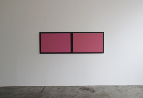
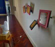
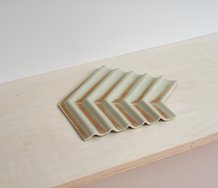
As for the aluminium diptyches with painted borders, the colour changes they demonstrate are related to the effects of duochrome paints now available for car and fingernail surfaces, except more subtle. Not so extreme in hue range, and matte, not gloss
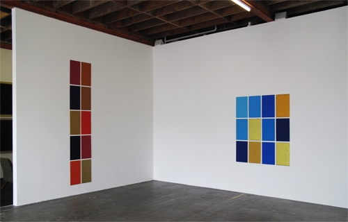
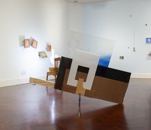
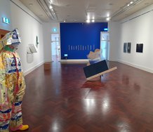
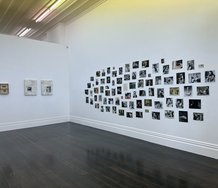
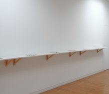
In this first exhibition at the new modified Jensen Gallery (co-ordinated with a Sydney branch that is about to open in Paddington next week) Winston Roeth presents some of his multi-unit paintings, the sort of work regular visitors to the gallery will be familiar with.
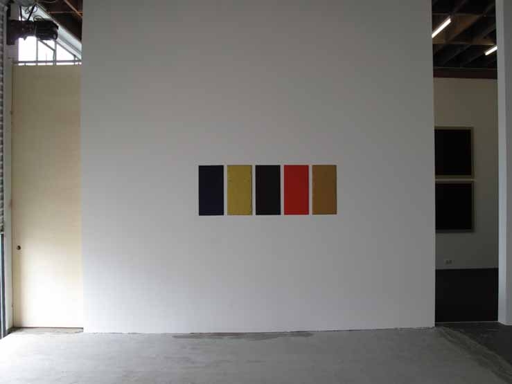
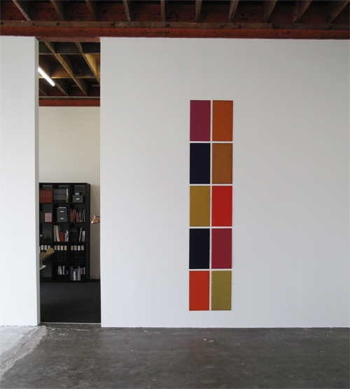
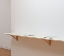
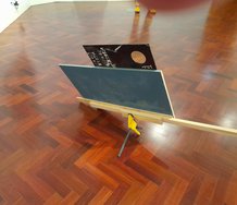
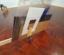
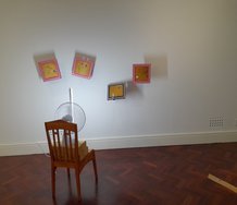
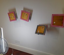
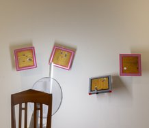
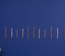
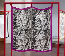
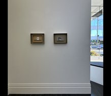
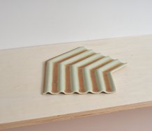
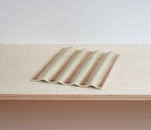
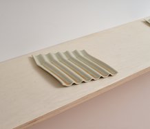
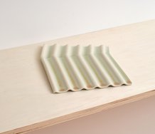
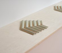
There are five new works: three using supports of vertical rectangles of building slate arranged in grids; two using pairs of square aluminium panels - each with a thin painted frame bordering the edges - butted together.
Roeth’s practice is preoccupied with chromatic change. Two types really. In one case it’s perception that is determined by colour context - as explained by artist colour theorists like Albers or Itten - the location of adjacent colours that seem to change a hue, and in the other, it’s colour that alters within seemingly uniform bands caused by the angle of the illuminating light and the position of the moving viewer. The first applies to the slate works where you are never quite sure if the same colour is repeated on another panel, the second to the double panels where you can definitely detect chromatic changes as you move, and that modulation is clear even if you are stationary.
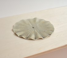
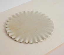
These properties are achieved with the use of marble dust ground that is mixed into the pigment and tempera binder. It adds a strange iridescence that looks like the wings of certain tropical butterflies - particularly with the light raking across the rugged flakey textures of the slate. The photos with this article don’t capture it. Not remotely. They are like looking at the moon from the back porch without a decent telescope. The inventiveness of the various sheens, their unusual chromatic peculiarities, have to be experienced first hand.
The slate panels are carefully positioned to exploit compositional rhythms and show off the hot versus cold moods of hue. It’s highly optical; immediately visceral. The chroma is especially intriguing in the variations within the metallic colours: between hot gold, brownish copper and blue-greeny bronze. Some glowing reds look like they have a silvery undercoat, which is not the case. It is the mixed in marbledust that makes them radiant.
As for the aluminium diptyches with painted borders, the colour changes they demonstrate are related to the effects of duochrome paints now available for car and fingernail surfaces, except more subtle. Not so extreme in hue range, and matte, not gloss. I’m guessing here, because the effect is very different from the slate colour, but I imagine some process with varnish is involved.
Such an exhibtion xeros in on the optical and the bodily; the brain discerning chromatic changes and the viewer’s height and head movement interacting with nuances of varoius contrasts alongside depth, plane and texture. Not forgetting of course the pleasure from sheer sensation that is embedded within all of these: the delights of standing before the work and attending to the metallic sheen of the radiating illumination.
John Hurrell
 Two Rooms presents a program of residencies and projects
 Advertising in this column
This Discussion has 0 comments.
Comment
Participate
Register to Participate.
Sign in
Sign in to an existing account.