


John Hurrell – 24 October, 2011
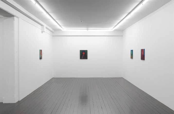
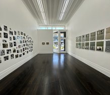
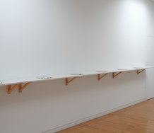
These works are still too restrained - despite their creepiness. They pine for Proust's time, not today's. So they need to get really wild, more pumped up and extreme - become more confrontational. The images are too small for the gallery space, and seem sleepy, drearily ‘sensitive', too art historic and conventional.
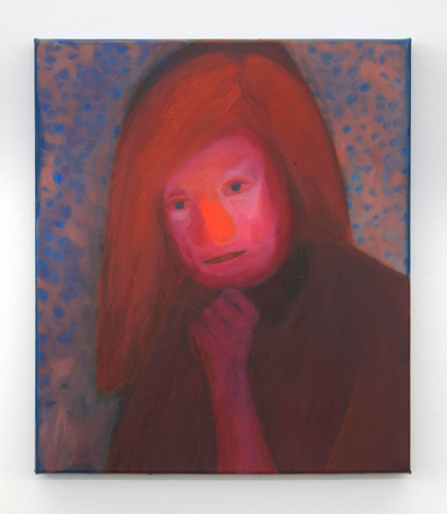
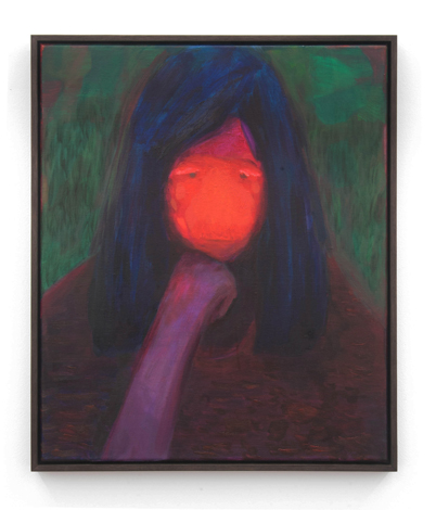
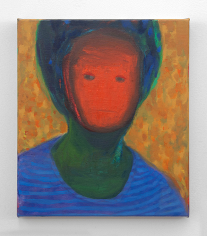
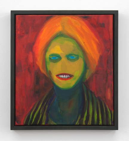
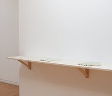
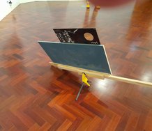
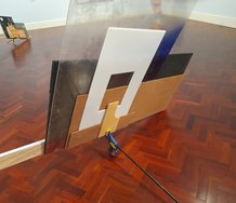
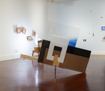
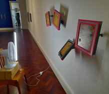
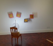
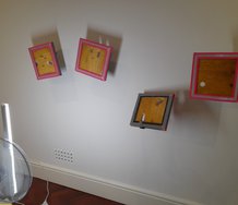
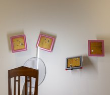
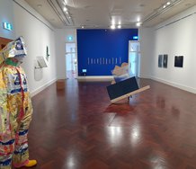
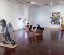
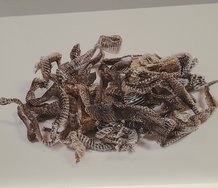
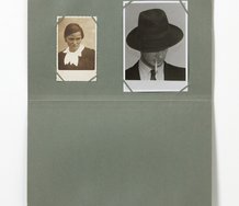
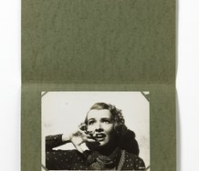
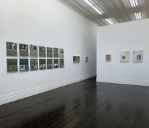
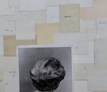
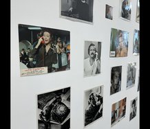
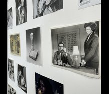
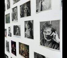
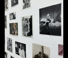
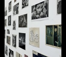
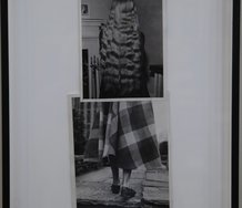
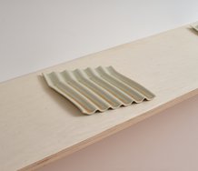
Nichola Farquhar’s eight small oil portraits of women are improvised extrapolations kickstarted by memories of people she knew as a child, but working within the nineteenth century tradition of the Nabis, and occasionally racing ahead to the twentieth century and the seventies expressionist/Fauve work of Jeffrey Harris in Dunedin. Some disturb because of the obliteration of detail (boneless noses, lipless mouths, lidless eyes) that you might get with skin grafts after burns, or hideous images of Indian women mutilated by jealous husbands. Others have dappled backgrounds and glowing (but absent) physiognomies that are not creepy at all, but more about psychic auras. They seem more Symbolist.
Most of the portraits are frontal but the one side profile image, Amanda, has all the facial detail blurred out in a smeary pink haze whilst there is a dominant dark dot high in the ear that could be a transplanted nostril or migrating eyeball. Two other images of erased faces, Paula and Katy-Lee, have faint vestiges of mouths and eyes peeking through scumbled masks where apertures or orifices appear to have been subtly cut out.
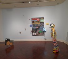
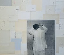
Occasionally Farquhar’s colour sense has a touch of crimson jungle flowers or lime green parrot plumage - an exuberant hint perhaps of the Chicago painter Ed Paschke, say here in her earlier Elam show with her use of chromatic facial parts. The Hopkinson Cundy show has her springing towards Bonnard where his light shimmers in the background. However as a body of images the works have an inwardness, a dullness of composition, an ordinariness, a lack of ambition. The colours glow more in the photos here than in reality - for face to face they are more muted, softer.
I don’t want to be too dismissive because the raw Baconesque aspects I admire; such incongruously ‘expressive’ elements placed over a 120 year old post-impressionist style - they do rattle you. But I would argue, not profoundly enough.
These works are still too restrained - despite their creepiness. They pine for Proust’s time, not today’s. So they need to get really wild, more pumped up and extreme - become more confrontational. The images are too small for the gallery space, and seem sleepy, drearily ‘sensitive’, too art historic and conventional. Farquhar needs to crank it up, impose a stronger more insistent vision - add some jarring vulgarity perhaps - and make works with intensified bodily presence that you cannot walk away from.
John Hurrell
Recent Comments
John Hurrell
Yes Janice, the violence I saw as a positive thing. Though related through colour to Paschke, maybe (as you say) ...
Janice Elizabeth Abo Ganis
I just found this work of Nicola's. I think the juxtaposition of the 'creepy qualities'with a certain naivity, that might ...
Andrew Paul Wood
I wouldn't have said John's tone was particularly nasty - he was just laying out other possible readings that may ...
 Two Rooms presents a program of residencies and projects
 Advertising in this column
This Discussion has 11 comments.
Comment
Lydia Chai, 4:09 a.m. 26 October, 2011 #
Hello John,
I agree that your assessment is dismissive but that's okay because it's all a matter of taste, right!! I couldn't disagree more with this review as I was greatly excited by this exhibition. It's one of the best ones I've been to this year and a few other people have remarked the same.
I'd like to point readers to Gwynneth Porter's well-written, deeply considered essay on this series of paintings: http://www.hopkinsoncundy.com/exhibitions/new-paintings/text/
You use the words 'disturbing' and 'creepy' - at first glance the paintings seem so, and if one thought of it abstractly one could be tempted to call them violent (as your reference to mutilated women indicates).
I just don't get that sense at all. The works are harmless but not static. In fact, I would say the ferocity lies in their intense colours. Gwynneth puts it well when she writes, "The colours could also be those of orchids for whom procreation is not a request but a fait accompli, an act of manipulation so smooth that no one is disturbed."
It is true that the colours glow more in real life than in the photos. They also glow a lot more in my mind's eye. It's as if the colours are burned into my memory so that a sienna becomes a vivid red. Forgive the tangent, but scientists have discovered a way to view the mind's eye. http://blogs.scientificamerican.com/observations/2011/09/22/breakthrough-could-enable-others-to-watch-your-dreams-and-memories-video/ If you pause at the second appearance of Steve Martin, it looks a bit like Nicola's paintings. Haha! I don't mean to be reductive at all. I'm merely pointing out the fact that Nicola's apparently defaced portraits are not wilful obliterations of the women's facial features (& hence identities). They are no more defaced than a wingless bird eg kiwi has been amputated.
Maybe some people find all this boring. I find it fascinating that despite their apparently alien quality, the portraits look so... natural and *right*. There is no need for jarring vulgarity (this phrase brings Rohan Weallans' recent Ivan Anthony show to mind). We may be content with the surprise that is brought on by the rightness of these works.
John Hurrell, 9 a.m. 26 October, 2011 #
God forbid, Lydia, that the works are harmless and not disturbing. You are inadvertently suggesting they are duller than I thought. The colours are more Les Nabis than Les Fauves and like you say, I have pointed out the associations they generate to do with mutilation. As I said, a good thing - but not taken far enough. The stylistic connections to art history hold them back and keep them tame.
That sentence from Gwynneth Porter you provide seems to imply the answer, that they aspire in their creation to be 'smooth', as if the artist is not to be detected or as you claim, images that are 'natural and right' in their manipulation. Doesn't that make them bland and boring? If they were that, I wouldn't have bothered reviewing them.
Your link about memory has a coincidental connection to one image only. Farquhar's paintings are not sufficiently blurry to relate to such representations of brain activity and even if they did, so what? Are you claiming she has insights into scientific research? She - according to what you are arguing - would never use the gallery or studio as a laboratory. Their Godgiven perfection prohibits that.
Lydia Chai, 9:27 a.m. 26 October, 2011 #
When I say the works are harmless, I mean that I don't connect them with violence like you do. Why on earth do they have to be disturbing, John? I mostly object to your suggestion that they need a jarring vulgarity.
It's true, I'm still finding the words to describe my response to her paintings. All I know is that it was mindblowing to see the elements come together perfectly when in theory it seemed like they shouldn't (ie they shouldn't have worked because of the so-called dull compositions, the still poses, the blank stares).
My point with the science link was that it was fun to see that sort of visual connection. I was also pointing out that the featureless faces in Nicola's paintings are not a result of any violent reimagining on the artist's part, instead they are simply her unique way of seeing/recording the world. The subjects in her portraits are not monsters or had anything monstrous done to them - they simply are. That doesn't make them static to me, any more than you as a human being are static by standing still.
I accept that you find them boring. But it's nice to have a different response to an exhibition to counter yours, and I didn't mind being the person to supply it :)
John Hurrell, 10:30 a.m. 26 October, 2011 #
So Lydia, where do you locate your affection for these works? There has to be more than their looking 'right' or 'natural' or 'smooth' - or is it only a craft thing?
Why do you find them exciting?
Anthony Byrt, 4:56 p.m. 26 October, 2011 #
John,
I have to disagree with your assessment of Nicola's work too.
I should declare my interest here - as you know, I've known Nicola for a long time.
I think in trying to locate Nicola's work art historically, you've missed where it sits in terms of a contemporary conversation. In particular, I think she relates really strongly to a very exciting strand of painting that's come out of the UK and US in the past few years. Here are some of the artists who she could be shown alongside, and who are gaining serious traction internationally:
Phoebe Unwin
Ryan Mosley
Peter Linde Busk
Guy Rusha
Eddie Martinez
Sigrid Holmwood
Carla Busuttil
I've worked with several of these artists. The reason they excite me is because they've found a figurative language completely different from the generation ahead of them - Dumas, Peyton, Currin and others - for whom figurative painting was, to a certain extent, art-political. This new group have been able to dance around that "painting is dead" baggage and tap into things far more fundamental to the medium - its theatricality, its unavoidable history, and its complex interplay between time, materiality and image.
I also think you could just as easily relate her work to older, more established artists. You only have to look at two major retrospectives in London right now: George Condo at the Hayward, and Wilhelm Sasnal at Whitechapel.
Looking at this stuff, it's clear to me that Nicola, whether she planned it or not, is part of a very big international conversation about figurative painting, and that the work has a greater breadth of thought than you give it credit for. It's still pretty raw, but I think there's plenty on those canvases to be excited about.
John Hurrell, 9:54 a.m. 27 October, 2011 #
It's lovely to have your participation, Anthony, but you miss the point of these conversations, that what I call 'disturbing and creepy', Lydia calls 'natural and right' and Gwynneth calls 'smooth manipulation'.
Who cares if Farquhar is a figurative painter like those artists in your very wide-ranging list? It is not as if I criticised her for those attributes. She has links with other imaginary portrait painters too, like Jim Nutt, but that has no relevance. I say this because the debate is around the associations her work generates - even if contrary to her intentions - and the significance of those associative qualities.
Having said that, from your list Guy Rusha and Carla Busuttil seem most related, through their interest in the expressive abstract possibilities of the head - like Jim Nutt - it's potential for morphological extemporisation. However as my review makes clear, I see the potential for ferocity and viewer subversion in Farquhar's imagery. If she and her audience have no interest in such aspects the work becomes commonplace and excruciatingly dreary. A wannabe twenty-first century Nabi.
Anthony Byrt, 12:09 p.m. 27 October, 2011 #
John,
The only reason I'm responding to your latest comment is because there might be one or two people actually reading this and expecting me to say something. So, here's my considered response:
Sigh. Why did I bother?
As for "If she and her audience have no interest in such aspects the work becomes commonplace and excruciatingly dreary." I'll be sure to check with you that a painting is "ferocious" enough (ridiculous, by the way) before I decide whether it's any good or not.
And as for: "A wannabe twenty-first century Nabi," there's a very big difference between intelligent criticism and straight-out nastiness.
"Spirited discussion" is one thing John, but ungenerous shouting is quite another. Way to shut a conversation down though.
l
Andrew Paul Wood, 6:22 p.m. 27 October, 2011 #
I wouldn't have said John's tone was particularly nasty - he was just laying out other possible readings that may be suggestive of weaknesses in the work. No artist is so great that they couldn't get stronger. If you want straight out nastiness, may I suggest Robert Hughes' eviscerations (not without a certain amount of substance) of Julian Schnabel and Jean-Michel Basquiat. Alas, you need a thick skin to put your soul out in the public arena, but in order to be an artist you can't allow yourself skin at all.
John Hurrell, 5:25 p.m. 27 October, 2011 #
Anthony, that stinging tone at the end was not excessive. Its value was that it stated very clearly what the work is reduced to if the 'disturbing' aspects (those things the works' admirers deny being present at all) are ignored. That is why those 'creepy' qualities (that stop it being cosy) need instead to be accentuated if the work is to become distinctive, and not studentish or, as stated, 'commonplace'.
Janice Elizabeth Abo Ganis, 12:17 a.m. 21 October, 2012 #
I just found this work of Nicola's. I think the juxtaposition of the 'creepy qualities'with a certain naivity, that might be found in such subject matter, is a sudden check in the work and not a lack. The idea that more 'creepiness' aka violence suggests some sort of tawdry CS! TV slot. The restraint used in the works has power in itself. They lack some of the sentiment found in the work of Phoebe Irwin and are free of the theatricality of Ed Paschke. This is a good thing. IMO.
John Hurrell, 1:11 a.m. 21 October, 2012 #
Yes Janice, the violence I saw as a positive thing. Though related through colour to Paschke, maybe (as you say) Farquhars' works are free of his theatricality, but they do have more the theatricality of Bacon, or Marlene Dumas, though tighter.
Participate
Register to Participate.
Sign in
Sign in to an existing account.