John Hurrell – 21 October, 2009
Morris’s inventiveness here lies in the dropping down (or raising up) of flipped-over returning modules to form a repeatable, intertwined relationship between the two overlapping linear directions.
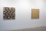
A dozen stretcher paintings and one wall drawing are currently being presented by Simon Morris in the large downstairs Two Rooms space. As most of us now expect from Morris, the focus in these works is the delicate nuances of brushed on diluted pigment, the textured textiles it is applied to, discreet tonally controlled underpainting over those textiles, and complicated (or simple) linear configurations that often state the time of physical execution within their titles.
The big, gridded up drawing takes up the central end wall. Its thin looping, double-jointed grey line snakes its way (up and down in stacked-up but joined round-cornered rectangles) from the left side to the right - and back again in a reversed alignment. The thin black acrylic wash becomes grey on the white wall and could almost be mottled India Ink but has no sheen. This transparency helps you grasp its pre-planned trajectory quicker through its doubling over earlier sections and through making chosen options unambiguous. Its sense of directional inevitability is more pronounced here than in, say, his recent wall painting at the Adam.
Morris’s mixture of liquid ‘grey’ paint highlights every flick of his brush edge at the corners (their curved lines seem to have been completed after the vertical and horizontal components), every little trail of bubbles or splatter, each minute drop in registered edge through horizontal templates. The line takes on a bodily vulnerability with its exposed building processes acquiring an unexpected metaphorical (let’s say ‘psychological’) dimension.
That ‘expressive’ (you could if pushed, almost say ‘expressionist’) quality is as if his bodily – er ‘manual’ – processes are linked to the contingencies of his emotional core. Not sweepingly of the arm of course but through wrist movement, within the narrow parallel contours of the moving grey ribbon.
Morris’s square stretcher paintings are less transparent and so less varied in his range of marks and tones found within the line. The yellow and orange trajectories that form very simple mandala-like configurations tend to have a gentle pulse. They are sufficiently opaque to make this throbbing a subtle sensation that can easily be missed. With the other black-lined works the opacity is sooty and matt, and with the thickness of line, solidly robust.
Some unusual inclusions for Morris in this show are a suite of Daily Paintings with thick vertical bands, where he applies paint every day but leaves untouched a strip that he painted the day before. These works are the antithesis of the wall work and so immaculate in their tonal control they look bland, as if seventies décor. Because the band shapes are repeated with no directional variation, there is a rippling sensation horizontally across the deepening tones or intensifying saturation levels, much like curtain fabric.
Personally I like the complicated ‘time’ paintings much more, especially those that traverse the picture plane only to double-back to the edge of origin - for they are brilliantly designed. Morris’s inventiveness here lies in the dropping down (or raising up) of flipped-over returning modules to form a repeatable, intertwined relationship between the two overlapping linear directions. This shrewdly calculated aspect, worked out beforehand on computer - more than the clever incorporation of time of paint application into the title - is what makes these remarkable grids mysterious and memorable.



 Advertising in this column
 Two Rooms presents a program of residencies and projects
This Discussion has 0 comments.
Comment
Participate
Register to Participate.
Sign in
Sign in to an existing account.