John Hurrell – 9 November, 2009
Of all those here, my favourite is Mark Geard’s subtly organic and discreetly fluid Artemis, based on Goethe’s innovative analysis of plant growth The Metamorphosis of Plants (1790).
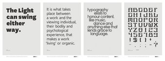
This Objectspace exhibition, organised by AUT lecturer and National Grid Co-editor Jonty Valentine, and its accompanying 64 page hardcover book of essays and notes examines a dozen New Zealand contributions to the world of type font and book design. Each of the selected designers has a ‘specimen sheet’ and a ‘example of usage’ (quoting part of each font’s essay discussion) converted into a published purchasable poster. These are laid out on the floor in rows, positioned on low polystyrene plinths that are wrapped in brown paper as if they were reams from the printer.
The twelve designs and creators – in order of discussion in the book – are: The Book Borders (Robert Coupland Harding, 1877); Churchward Marianna (Joseph Churchward, 1969); McCahon (Luke Wood, 2000); Wedge (Bruce Rotherham, 1947); National (Kris Sowersby, 2009); Décennie (Jack Yan, 1997); Pam (Marten Idema, 2004); Auster Regular A-Z (Narrow Gauge, 2004-2005); Black Grace (Shabnam Shiwan, 2006); Befriend (Warren Olds, 2003/2009); Artemis (Mark Geard, 2005); Air New Zealand (Tom Elliott, 1968).
Most of these gifted artists are comparatively unknown in this country, even within a large community of art lovers and appreciators of quality design. Valentine’s exhibition and publication (which contains texts by himself, David Bennewith, Adam Sheffield and the artists) sets out to change that.
In his introductory essay Valentine uses as a metaphor a character created by Ayn Rand in her famous novel The Fountainhead to weave a discussion of the image (or lack of) of typeface designers in New Zealand, and the ignorance of its history. As part of that he discusses the poet Denis Glover, who founded Caxton Press in 1933 with Leo Bensemann, and how Glover had no interest in designing local types, even when the published writing was deliberately severing connections with England and Europe.
Valentine comments ‘I hate to be the one to say it, but the formal quality of a typeface is of secondary importance in a literary (not to mention postmodern) world. Literary theorists (maybe just early structuralist semioticians) often stop at the ‘arbitrary’ form of the alphabet as signifier, and are not that interested in going closer in to examine decisions about the ‘material ‘or formal quality of signs – like the differences in shape of types.’
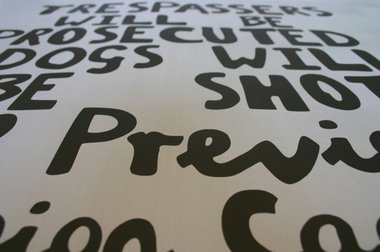
One font most will find particularly interesting is the McCahon one -designed by Luke Wood, co-editor with Valentine of The National Grid. A section of Wood’s essay asserts his work was ripped off by Saatchi’s to promote the touring McCahon survey show, A Question of Faith (Saatchis when approached said they had developped it independentally) unlike Charlie’s ‘Honest Juice’ who did pay him when they used it for their label.
Shabnam Shiwan’s lusciously decorative Black Grace font specifically references Pacific tattoo motifs, though it is ambiguous. The round forms can also remind you of ball bearing discs in car axles, or ornate fairground signage. Shiwan has an unusual lower case ‘t’ with an uneven crossbar. This lack of symmetry keeps surprising when you spot it amongst the other more orthodox alphabetical forms with their tightly packed, ribbon-like, parallel triple bands.
Marten Idema’s Pam is created for the tiny letters that spell out the individual names that sit inside the printed parallel lines of streets in city maps. One of the book’s highlights is Idema’s account of the specific problems linked to exceptionally small type. He discusses how he lets white space clarify the forms by lowering the junctions of diagonal strokes and vertical stems so the stems look taller, and also by decreasing the thickness of the diagonals before they meet the junction.
Warren Olds’ Befriend is indecipherable when linked to make up words or stacked up sentences, but as individual letters the angular forms look metallic with protruding mould tags. Olds’ bizarre calligraphic alphabet has delicate horizontal lines mixed with thick lumbering diagonals to create a humorous sci-fi hybrid of East and West.
Of all those here, my favourite is Mark Geard’s subtly organic and discreetly fluid Artemis, based on Goethe’s innovative analysis of plant growth The Metamorphosis of Plants (1790). The letter forms are divided into ‘Crystaline’ (straight lines only), ‘Mediating’ (both curved and straight lines), and ‘Flow’ (curved only). Geard has developed it so that the wobbly tendril-like undulations are kept in check and don’t become too distracting. By analysing the amount of usage for each letter, and balancing the use of ‘Mediating’ overall, the resulting text has a gentle rhythmic pulse that is never heavyhanded. (In comparison I find Bruce Rotherham’s Wedge too quaint.) It is carefully measured.
Objectspace and Valentine are to be congratulated for this most exciting project. My feeling is that not many Aucklanders know about it, and that more should. It is worth going to the Ponsonby Rd/Karangahape Rd intersection to investigate.


 Advertising in this column
 Two Rooms presents a program of residencies and projects
This Discussion has 0 comments.
Comment
Participate
Register to Participate.
Sign in
Sign in to an existing account.