John Hurrell – 28 February, 2010
It is extroverted work that sucks the visitor's attention away from themselves and out into the flame or water-like parallel lines, layered clusters of specks and exploding angular scrapes dwelling on the stretched skin surfaces.
Wellington
Judy Millar
Giraffe - Bottle - Gun
New Zealand at the 2009 Venice Biennale
26 February - 15 August 2010
Most people in New Zealand’s art world snort when you mention the galleries of Te Papa, namely the long skinny corridor on Level Five that has ended up partially replacing the many varied spaces of the old National Gallery. How odd then that for this show, involving the bringing home of the two exhibitions representing this country last year in Venice, that that same narrow space looks apt, even superior, to the original Italian venues.
Even though the ceiling is tilted, the projects have been placed in - what best can be described as - modernist ‘shoe boxes’, long rectangular rooms: divided into three with an artist at each end and in the middle, an account of the history of Aotearoa New Zealand exhibitions in Venice.
Te Papa’s austere white spaces, with their direct straight planes and ‘clean’ lines, are completely devoid of baroque ornamentation, undulating surface, religious ambience and competing Italian artists. They are much much simpler than the Venetian interiors. And it works beautifully.
In their psychological impact on the viewer the two shows are direct opposites. Therefore, instead of making point-by-point comparisons, I’ll discuss Upritchard’s contribution in Part Two.
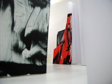
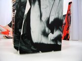
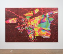
Millar’s Giraffe - Bottle - Gun is overwhelming in its scale. It doesn’t aggressively and confusingly compete with the architectural interior of the venue as it did in Venice, forcing the viewer to move close to the outer walls, but is focussed instead on Millar’s huge sculptural objects that are covered with photographically enlarged, dramatic paint marks. These undermine the solidity of the forms’ surfaces. The massive baroque-inflected arabesque lines have on occasion dissolving edges, a quality you don’t get with paint but do with enlarged photocopies.
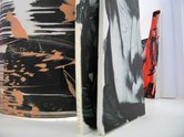
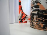
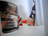
This display draws out Millar’s debt to Richard Serra, especially the huge central cylinder that curls within itself and is raised up and gently tilted to one side. Its curved surfaces dominate the room, and provide an intriguing foil for the leaning and overlapping rectangular and trapezoid forms, and of course the various ‘giraffes’, ‘bottles’ and ‘guns’ - the unusual right-angled shape Millar has invented with its distinctive concave, inner edge.
There is a strong sense of the sublime here, for the puny size of the viewer is accentuated. It is extroverted work that sucks the visitor’s attention away from themselves and out into the flame or water-like parallel lines, layered clusters of specks and exploding angular scrapes dwelling on the stretched skin surfaces.
What is impressive is the stunning physicality of Millar’s presentation. It shows what a great idea her use of digitally enlarged paint marks has turned out to be when mixed with architectural intervention. However her inclusion of four conventional ‘subtractive’ paintings on paper, and framed under glass, is a backward step. They are admittedly gorgeous but ruin the effect of the bigger digital components, and should have been omitted. They don’t fit in at all well into the space.
It is extremely rare to have an installation as immersive as this in Te Papa, one that is also optically painterly and bodily sculptural. It is not perfect - the four works on paper prevent that - but it is easily the most significant achievement of Millar’s career so far.
The above images are not in situ but made from preparatory models.
 Two Rooms presents a program of residencies and projects
 Advertising in this column
This Discussion has 0 comments.
Comment
Participate
Register to Participate.
Sign in
Sign in to an existing account.