John Hurrell – 7 April, 2010
Dornbusch here has come up with an exceptionally clever and evocative title, yet strangely very little of the actual art fits in with the ambiguity of the Duchampian concept. Instead of being open-ended and welcoming of mixed interpretations, almost all works are tightly thought through, and seem the opposite
Auckland
Boris Dornbush
Phantom Limb Construction Sites
31 March - 1 May 2010
‘Phantom limbs’ are those invisible legs that amputees feel are still attached to their bodies and which provide sensations of pain or itching. The legs or arms don’t exist yet the neural systems within the brain don’t seem to acknowledge the original limb’s separation and absence. They create illusions which are related to other sensations of music and taste that can be generated through exposed surfaces of the brain being stimulated with electricity or chemicals.
With his ‘construction sites’ Boris Dornbusch appears to be referring to the Duchampian notion of the viewer creating a large part of the artwork themselves; that they actively participate in the conceptual construction of the art. Their mental creativity generates meanings that almost like a sticky substance attach themselves invisibly to the object of their attention.
Dornbusch here has come up with an exceptionally clever and evocative title, yet strangely very little of the actual art fits in with the ambiguity of the Duchampian concept. Instead of being open-ended and welcoming of mixed interpretations, almost all works are tightly thought through, and seem the opposite. They provide definite clues that anticipate the ‘correct’ answers of these riddlelike artworks.
With these two types - decipherable puzzles that tease with ‘crackable’ codes, and works that are vaguer and which generate more ‘poetic’ impressions - there appears to be little overlap. One is viewer-driven whilst the other is artist-based and more controlling of possible readings, with certain correlations that have high priority. Artist and viewer in other words compete over imaginative control of the work’s meaning.
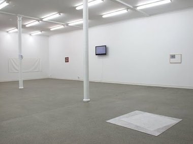
For ten chosen works Dornbusch has a wide array of clues carefully laid out for his well-educated audience. Two pieces are based on art historical references. Clear Moods and Crashpad (right door) allude to Malevich’s famous perpendicular black square and tilted white one - with jokes about Malevich’s paintings being vandalised by the art-going public. In Dornbusch’s versions one is liable to be scratched by opening car doors or Starkwhite’s audience running up the stairs, and the other they walk over coming in the door.
Three others use semantic logic and witty paradox. In In almost every season there can be a singular moment when something unexpected fails to materialise the title contradicts itself, an unopened canvas is shown facing the wall and a Braille text is screened off and made unusable by a sheet of Perspex.
Skalinada is similar. It shows a b/w photocopy of two dark derelict skyscrapers in the Dalmatian city of Split. They look joined but ‘split’ and the paper has tearable tags on its bottom edge with vertical cuts. The tile refers to an internationally famous Croatian pop song and the sheet is attached to the wall with sickly bubblegum.
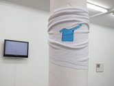
The third work coded in this way is Fighting An Old Problem. On a white jersey tied around a column, Dornbusch has painted a white jersey with a sweaty armpit and more importantly, short and long sleeves. They allude to the difficulty of putting on the garment while the sleeves are tangled.
Three other works have a logic that is media-based.
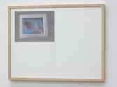
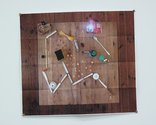
Directions for a Visiting Friend shows us a makeshift map of Berlin or Split (the two cities where Dornbusch lives) made by photographing objects on a kitchen table placed in a ‘cartographic’ diagrammatic arrangement. This photograph has been made into a paper photocopy and then folded like a store-bought city street-map. It’s very witty.
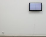
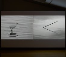
Slow Change presents an image on a LCD of three coin impressions fading from the palm of Dornbusch’s hand. The title refers to digital motion on a DVD, the difficulty of retaining cash, and the fading of ink in photocopies.
With 330 ml we see a running tap recorded on a short DVD loop. Because it is in Auckland, the water is paid for by the user, so Dornbusch amusingly has an energy meter fitted to the gallery power point to show the running costs to Starkwhite.
One large ‘blank’ sheet of white PVC features the use of vernacular language - like you would find in a cryptic crossword. The unfinished title The great white is completed by a tiny painted shark you have to look for, under a horizontal slit.
The tenth work involves the phenomenon of ekphrasis where words are used to describe a visual artwork and even replace it. In this case Dornbusch has written out a line from a Sonic Youth song that describes a paintable vista featuring foreground, figures, and trees used as compositional framing devices. He has translated A view through the trees to a couple standing in the snow into Braille and you can touch the embossed aluminium. However you don’t need to because the title tells you roughly what to visualise in the scene. The details of what you mentally see fit in perfectly with Duchamp’s theory, as you yourself provide the descriptive particulars for a sentence that is essentially vague.
Good art doesn’t have to be brainy, and often intellectual artists make work that is infuriatingly smug and convolutingly rarefied -particularly if the display is short on sensual appeal. Such art needs a carrot to draw the audience in, so that the ideas and materials strike an emotional chord that makes the work memorable and not sterile.
With Dornbusch, the fascinating exhibition title sets the scene for how you receive the display. Some items are indisputably one liners but that is not necessarily a bad thing. A good idea that is very simple can linger long in the imagination and provide continual pleasure and engagement.
So while this show at first glance does seem to be too cool for words, it is not really that icy. It will reward a couple of visits as various cross links - often to do with tactility - readily become apparent. Dornbusch’s ideas become much clearer in a solo presentation, far better than in say, previous Starkwhite group exhibitions. Here, with a little patience and a close examination of the printed list of works, patterns become detectable.
Recent Comments
Editor
Thanks Boris for the blunt, lively - and I believe fruitful - exchange.
Boris Dornbusch
Sorry John, but it is the way you write things that make me doubt your journalistic competence. You make your ...
Editor
Boris, you have no right to control another’s interpretation of yourself or your artwork, but it is reasonable and proper ...


 Two Rooms presents a program of residencies and projects
 Advertising in this column
This Discussion has 7 comments.
Comment
Boris Dornbusch, 8:40 p.m. 7 April, 2010 #
Hi John
Yesterday you entered into a private discussion with me and from that have extracted wrong information about my research and ideas:
The research behind the individual works - which apparently negated an open or imaginative reading for the viewer - were integral to my process, but were not intended to be published by me or Starkwhite as being part of the reading of the work.
Furthermore the following information you published is not true:
a) The title of the work 'Skalinada' is not referring to a specific 'Croatian' pop song. (When easily googled) 'Skalinada' explains a series of musical competitions that started out within the state of the socialist federal republic of Yugoslavia. These musical competitions took place in the city of Split. The place that the photocopy depicts is not part of the title and unknown.
b) The work 'Directions for a Visiting Friend' does not depict a map of Berlin or Split. It depicts some objects sitting on a table.
c ) I live in Berlin and I am in Auckland for some time of the year, but I do not 'live' in Croatia.
If you want your blog to be a professional forum for criticism, you should consider journalistic ethics - most of all not releasing poor researched or false information. My personal experience from our conversation is that in the future it is better as an artist to stay in 'eye-conatct' with you.
Cheers, Boris
Boris Dornbusch, 9:41 p.m. 7 April, 2010 #
P.S.:
Your review also quotes:
"Slow Change presents an image on a LCD of three coin impressions fading from the palm of Dornbusch’s hand. The title refers to digital motion on a DVD, the difficulty of retaining cash, and the fading of ink in photocopies"
Where do you have this information from: That the title refers to a digital motion on a DVD? This might be an interesting interpretation of yours but in your review you present this as a fact. So where is your support of such a fact?
If you are not sure what the title can refer to, wouldn't it be more appropriate to leave it up to the viewer instead?
Editor, 2:42 p.m. 8 April, 2010 #
Hi Boris
I'm sorry my review has upset you, because I was hoping it would encourage people to come and check the show out for themselves, and compare it with what I have written.
I am obviously only giving my interpretation, drawing out what I consider to be aspects inherent within the work and its titles, and revealing what I see as an overall contradiction - regarding the significance of the show's name.
I think my memory of our conversation is pretty accurate -you did say for example that those buildings were in Split, and that you regularly travelled between Berlin, Split and Auckland.
I believe there is a conceptual tightness to the works that is contrary to Duchamp. If you use obvious codes like Braille, diagrams, maps, or song lyrics, it is inevitable that people think they are like riddles, rebuses or crosswords. And whether you like it or not, I have tried to reveal those underpinning structures that set up apparent meaning.
It is often said I am prone to over-interpretation - but that usually comes from over controlling artists. One of the pleasures of thinking and writing about art, is looking at the evidence - and arguing a case. I think I'm good at that, and wish there were more around doing the same.
Boris Dornbusch, 4:44 p.m. 8 April, 2010 #
Hi John
From your answer it still does not become clear where you have certain information from: for example the reference to the title of ' Slow change' etc.
I do not agree with your position that you are good at what you are doing: Your information on my work is not well researched and you are still blurring the facts. We had a talk about what I was doing over the course of the last year and I can't remember you taking notes or double checking information.
As you have your freedom of speech I have a right that information that is being published about my person and my work is correct. This has nothing to do with artists 'over controlling'.
As the taxpayer supports you to run this blog I think that there is a certain social responsibility for you to consider journalistic ethics and getting the facts right.
Boris
Editor, 5:45 p.m. 8 April, 2010 #
Boris, you have no right to control another’s interpretation of yourself or your artwork, but it is reasonable and proper to correct factual errors. But in my case, where are they? And if they exist, how significant are they?
With ‘Slow Change’, the image on a digital print shows a LCD with a hand on the screen. There is no mystery here, anybody can see them and think about the title, and you pointed out to me the indentations on the hand were from pressing coins onto your palm. So what is the issue? If you don’t want information circulated don’t chat to art reviewers. And you seem to think that the fact that it is your hand creates a major, extremely sensitive issue. But the ownership of the hand is implied anyway.
So what other ‘errors’ are there? In one I’m speculating about the diagrammatic ‘Directions…’ It is folded like a map so I suggest two cities connected to you - because it is possible the diagram really works. It’s no big deal if I am mistaken and you made the whole thing up. I’m interpreting the image.
With for the others, you told me you move around between Split, Berlin and Auckland, and that those buildings were in Split. And as for 'Skalinada', I had Googled that song before I saw you. One can see it being sung by Oliver Dragojević on Youtube at the Split Festival.
Again, what’s the problem? The song is well known.
Best
John
Boris Dornbusch, 6:46 p.m. 8 April, 2010 #
Sorry John, but it is the way you write things that make me doubt your journalistic competence. You make your interpretations sound like facts. And I want to distance myself from these facts. Because I did not communicate these facts to you.
Your review says:
1. '...Skalinada is similar. It shows a b/w photocopy of two dark derelict skyscrapers in the Dalmatian city of Split.'
>You present this as a fact. But what tells you that these are skyscrapers in the city of Split? I didn't say that.
2. 'Directions for a Visiting Friend shows us a makeshift map of Berlin or Split (the two cities where Dornbusch lives)'
>Maybe I am wrong but I see only objects on a table. If this is an interpretation of yours than please make this clear.
3. ... 'The title refers to digital motion on a DVD, the difficulty of retaining cash, and the fading of ink in photocopies.'
>That is an interpretation of yours but it reads like a fact.
4. I doubt youtube is the forum for an in depth research on unfamiliar terms.
I think I expressed my concerns about the way you write and review. So please excuse me if I'm dropping out of this conversation now :
Editor, 8:46 p.m. 8 April, 2010 #
Thanks Boris for the blunt, lively - and I believe fruitful - exchange.
Participate
Register to Participate.
Sign in
Sign in to an existing account.