Creon Upton – 24 December, 2010
The Thornley draws us in because it is just so arrestingly honest and it actually, truly, seems like a genuinely real image. And that's kind of uncanny. And the flesh on this subject's body is tactile beyond all the Mueck tricks going on below our feet, and it is quite palpably only breaths and heartbeats that are keeping it, miraculously, moment-by-moment, from decay and putrefaction.
Christchurch
Cat Auburn, Marie-Claire Brehaut, Zhonghao Chen, Arie Hellendoorn, Rosa Scott, Roberta Thornley, Shannon Williamson
Uncanny Valley
Curated by Jennifer Hay
19 November 2010 - 27 February 2011
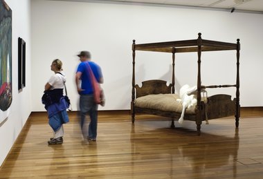
“Oh, look,” said the tourist mother to her young son, while her husband grumbled in from behind, “is that a horse on a bed?”
And I knew I was finally ready to write this review.
What I really like about Bill Culbert’s Pacific Flotsam - on the other side of the building from where I stood - is that it represents such an audacious use of such a huge piece of three dimensional, high-rent space. This impression is enhanced by the fact that its materials - the plastic bottles etc - are apparently floating (and are therefore lightweight - and that sense of lightness inheres in them and in their unnatural cleanness) while lying flat on the ground. To be literal about it, they’re floating on the floor - and on the floor is where the action is. But the great space of the darkened gallery above and around them is thus beautifully touched with a kind of wonder, an otherness, and what would seem to be a waste of space - wasted space - is in fact the most important thing in the room.
It’s almost uncanny.
And uncanny is a word that’s also been thrown around the Ron Mueck show downstairs - because extremely lifelike representations of life tend to draw attention to themselves as representations, so the sentimentally inclined viewer feels weirdly drawn-to and repelled-by, and, well, that’s uncanny.
But I’m upstairs, where we have Uncanny Valley, the fifth in the Christchurch Art Gallery’s emerging artists series.
To my eye, the most uncanny works in the show are Rosa Scott’s, each of which depicts a small, shadowy dog in a field of painted abstraction - somewhat nightmarish streaks and dribbles of liquoricegreenblack and yellow. In particular, the larger piece gives me a jolt, with the dog’s head turned to the viewer, gazing out in placid astonishment from a space-time of the human imagination rendered in appropriately appalling gestures of chaos and darkness. The painting does that David Lynch thing of situating the sentimental subject within abstracted projections of the human mind’s less delightful capacities, and that’s a difficult but potentially unsettling way to represent.
From here, somewhere at about seven or eight o’clock over your left shoulder is Zhonghao Chen’s painting on the opposite wall, and this is a good place to check it out from, actually, because the painting is quite a different beast from this distance, and that is always interesting: the paintwork is flattened out, but the shapes of the different zones within the composition more adamantly assert their relative planes of spacial logic, and the work becomes more abstract.
Curatorial coincidence or not, to me it sets up a nice dialogue between Scott and Chen, and the lesson for the latter is that he should trust more his inclination towards pure abstraction. While Scott is unabashed in placing a single figurative representation within an abstract field, Chen - and my admiration for his work has already been expressed in this forum - seems to me possibly too inclined to hover around the figurative/abstract bob-each-way borderline, where that oblongish thing might or might not be a fish - for example. (The text accompanying the work makes reference to stacks of food, but I’d rather see solely composition here, not representation. It’s meatier that way.)
So by now we are over here at the Chen, and, ignoring the horse on a bed that’s whinnying for our attention, we can go either left to two paintings by Marie-Claire Brehaut, or right, to a large, high res, framed photographic portrait by Roberta Thornley.
The latter draws us in because it is just so arrestingly honest and it actually, truly, seems like a genuinely real image. And that’s kind of uncanny. (There’s now a sense of the authentic attached to a seemingly unmanipulated, uncontrived photograph: the fact of representation is elided by technological nostalgia.) And the flesh on this subject’s body is tactile beyond all the Mueck tricks going on below our feet, and it is quite palpably only breaths and heartbeats that are keeping it, miraculously, moment-by-moment, from decay and putrefaction.
And more than any other work in the room it feels like a piece of NZ art, which isn’t necessary, but seems appropriate, in this necessarily parochial context.
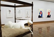
Shannon Williamson’s contribution - a triumvirate of pencil and watercolour works on the opposite wall, behind the bedridden nag - is the twin of Thornley’s photograph, in that it too is evocative of the disconserting fleshiness of human flesh. These are sketches within sketches, reminiscent of medical studies from another age but also the self-conscious products of an artist’s studio: ambiguously begun and arbitrarily finished, they are a student’s morbid experiments, investigations of line and the ways in which imagined versions of the human body, rendered in line, might meet, intersect, encase or enfold each other. They’re not profound, but they’re interesting to look at.
We have now reached Arie Hellendoorn’s matching portraits of a woman and a man, while behind us on the wall opposite are their twins, Brehaut’s portraits of a boy and a girl. To my mind the tedious heteronormativity and stale, self-conscious, art-historical postmodern ironies of these images constitute their greatest uncanniness - that is, they’re incredibly familiar and, in that, repellant: but the defilements of Hellendoorn’s subjects’ faces, and the Sapphire & Steel moments built into Brehaut’s paintings, are studied, unspontaneous and basically boring. Hung together, on a single wall, the essential blankness of these four paintings, together with the absurdity of their gendered fundamentalism, might have been interesting, but as it is their gimmicks dominate and detract.
On the bottom wall we find Cat Auburn’s Crying Cliffs, a strangely (uncannily?) uninteresting video work shot at Birdling’s Flat.
And Auburn is also responsible for the, ahem, elephant in the room: the horse on the four-poster bed, Rest Cure. A disturbing thing about this show was that I felt compelled, between viewings, to google the artists in order to get some more context. And the really disturbing thing: it helped. It was by way of an image on the internet that Rest Cure (which is from 2009) finally made sense to me. It is a beautiful and moving work, but it really is not working where it is at the moment.
Rest Cure is the extreme example, but I think it’s true of all the works here: they need more space in which to breathe, dimmer lighting, gentler conversation. They need more opportunity to actually be art, rather than being told to be art. They need to be left alone for a while.
Creon Upton
EyeContact hopes to be adding further documentation of this exhibition shortly.
Recent Comments
Creon Upton
Postscript: There's an interesting interview with Zhong Hao at http://keaandcattle.blogspot.com/2011/01/interview-zhong-hao.html
Creon Upton
Many thanks, Bevan. It's encouraging.
Bevan Shaw
Very Readable. Always enjoy your writing, Creon.


 Advertising in this column
 Two Rooms presents a program of residencies and projects
This Discussion has 3 comments.
Comment
Bevan Shaw, 11:28 a.m. 6 January, 2011 #
Very Readable. Always enjoy your writing, Creon.
Creon Upton, 9:52 p.m. 6 January, 2011 #
Many thanks, Bevan. It's encouraging.
Creon Upton, 10:53 p.m. 10 January, 2011 #
Postscript: There's an interesting interview with Zhong Hao at http://keaandcattle.blogspot.com/2011/01/interview-zhong-hao.html
Participate
Register to Participate.
Sign in
Sign in to an existing account.