Mark Amery – 21 November, 2011
The project’s positioning recalls the bike shed as a lean-to on the side of a building. Here at the Dowse it’s a corridor between the exterior world of recreation and the interior one of culture.
Lower Hutt
Scott Eady
100 Bikes Project Part 1
8 October 2011 - 5 February 2012
Deciding to go see Scott Eady’s 100 Bikes without my three young children was a testing decision. I’d previously taken the kids to Eady’s last Wellington installation Stupid Stupid Stupid Stupid Stupid Daddy at Mary Newton Gallery. It had proved a family bonding experience. Eady’s recent work has been explicitly about him combining his roles of parent and artist.
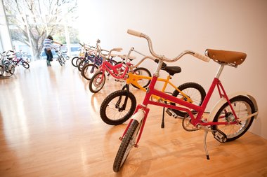
For 100 Bikes Eady has restored 50 children’s bikes, trikes and scooters rescued from the dump. These have been made available for children aged between 3 and 8 to ride around on in a designated gallery at the Dowse. The gallery reports it went through 1000 hair nets (required wearing under helmets to keep lice at bay) within the exhibition’s first week alone.
Going alone however proved valuable in judging the work’s success as an adult art experience. Eady is an accomplished and thoughtful sculptor who has long played with the found vocabulary of children’s toys in terms of their emotional and cultural pulls, and play with the language of age and gender. This work is as much a sculptural project as it is a performative one.
As an adult you can touch but you can’t ride. This is key. Nothing is above waist height, and what is below is beautiful. I’d expected all sorts of ‘pimping’ - loud sculptural extensions on the bikes’ skeletons, looking to outdress a dress-your-bike competition. Instead, Eady stays true to the original designs, treating them with a sculptor’s love and respect. The old is made new with a bright lick of paint and careful restoration of the mechanics. Each bike is given a beautifully made metal badge, featuring the words ‘100 Bikes Project’ and the artist’s signature ‘SE’. Some (not all) bikes have bells, featuring the same logo. Each machine is both a one-off and a branded product. Rather than an advertisement for the homemade it is one for the home restored and cared for.
Gathered together as a bright spectrum of colour they are also a museum of different ride-ons across recent decades. There is nostalgia, yet each has been made strangely fresh. This leads to much musing: how well-made things used to be, how we’ve replaced time and attention with plastic and cash, and thought for the heaps of rusted machinery out there that children have outgrown. Are today’s consumer objects worthy of this much love?
A few choices ensure some interesting spatial dynamics in the gallery space. There are very limited stand alone racks, leaving bikes spread around the space, and only some of these have their own stands, leaving others to lean against the wall. You wander through the gallery taking the bikes in as both varied exhibition objects, and as items in a bike shed (there are plenty of skids marks on a wall where recently there had been one of Simon Morris’s exquisite wall paintings). At the glassed in end of the gallery the bikes twist and shine on their stands like Harleys in a showroom window.
The project’s positioning recalls the bike shed as a lean-to on the side of a building. Here at the Dowse it’s a corridor between the exterior world of recreation and the interior one of culture.
I’d expected to be disappointed by the inability for kids to ride their bikes through the entire building. Equally, I arrived muttering about why the work needed the gallery as frame - why a local park wasn’t a more effective habitat. But in the next gallery comes a nice surprise. The white cube gallery is empty but for four low rise gallery seats (too often this space is a group show clutter). The empty space is strangely soothing. The lack of signage a release. Arrows quietly indicate that riding should be undertaken in a clockwise direction.
Visiting during school hours revealed only the occasional biker. Watching children ride slowly around a white gallery brings an unexpected beauty and charge to a confined space. On a busy day I imagine the experience would be crazier.
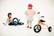
The room’s tight square dimensions require bikers to constantly turn, and the concrete floor has a slippery shine (it has been specially scuffed). When the children fall off or falter, the visual impact - the slap of colour on concrete - is impressive. Expecting tears I then realise it’s the close-at-hand impact on the ear and eye in a white, resonant gallery that is half the collision. It’s reminiscent of an ice skating rink, the clear gallery precedents being Maddy Leach’s ice rink and dance floor works in New Zealand.
I really don’t have a bad word to say about this project. It’s simple yet effective. Carefully calibrated for its site, 100 Bikes Project Part One is mentally stimulating, beautiful to watch, visceral in a way little art is, and for the little ones at least, terrific fun.
Mark Amery



 Two Rooms presents a program of residencies and projects
 Advertising in this column

This Discussion has 0 comments.
Comment
Participate
Register to Participate.
Sign in
Sign in to an existing account.