

John Hurrell – 3 June, 2015
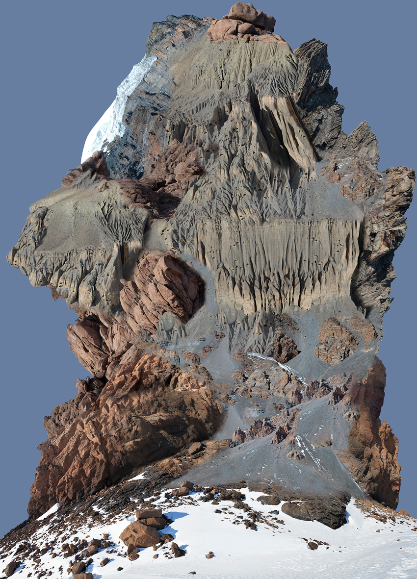
The repeated rock/ice elements, surprisingly, are quite difficult to ascertain, because they are not confined to the modular formats that define the works' grid - a structure which was imposed after the making of each digital image, not before. The A3 paper sheets themselves therefore are obviously not repeated, only portions of mountain ridge, scree slope or cliff-face scattered throughout them.
This is Jae Hoon Lee’s first exhibition with Trish Clark, and in it he presents two digital photographic landscapes like the coloured images he used to display in earlier shows at Starkwhite - but now unframed and (as pinned up A3 sheets in a grid) much bigger - along with four later, smaller, framed images (black and white on silvery metallic paper) that grew out of a recent residency in New York.
His very large coloured landscapes - Castle Rock (2015) and Peak (2015) - fantasies made by digitally repeating photographic elements and blending them into wild hybrid geological formations, are engrossing because of the vivid richness of their detail and their compositional invention. As grids of vertical paper sheets Lee’s Lightjet prints remain flush with the wall, blending into the architecture and dominating the space. If purchased and framed under glass they would become very solid, heavy, objects - and become something different.
As complex images based on photographs the artist himself took in Nepal, these works provide hours of pleasure through an analysis of their improvised constructed form, and the repeated rock/ice elements. The latter, surprisingly, are quite difficult to ascertain, because they are not confined to the modular formats that define the works’ grid - a structure which was imposed after the making of the digital image, not before. The paper sheets themselves therefore are obviously not repeated, only portions of mountain ridge, scree slope or cliff-face scattered throughout them.
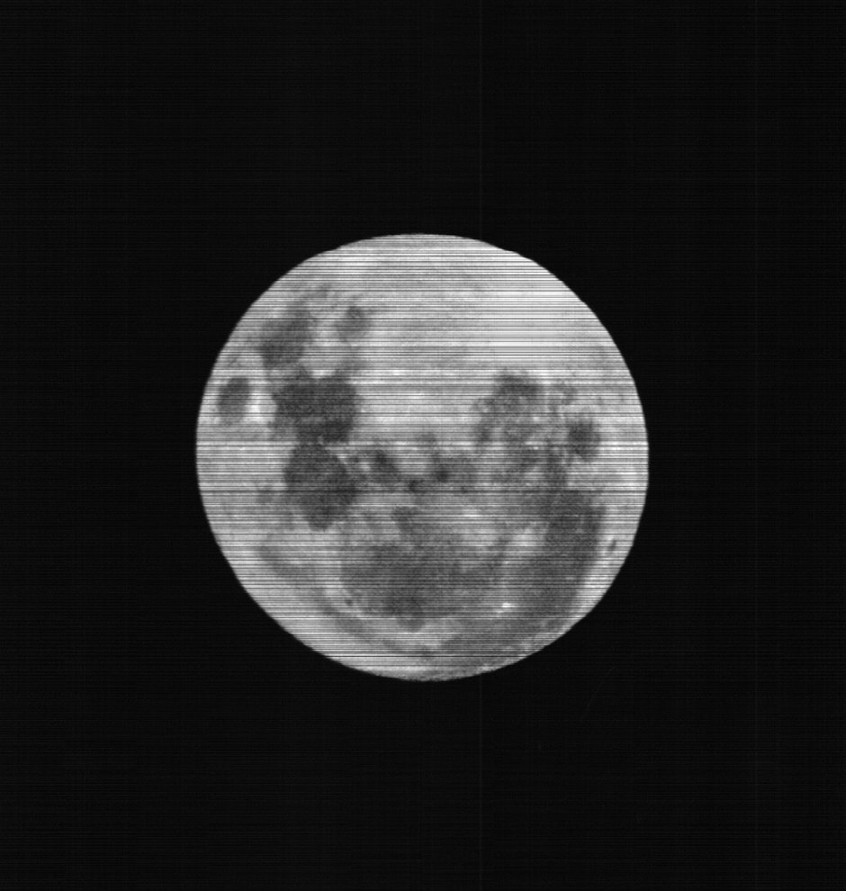
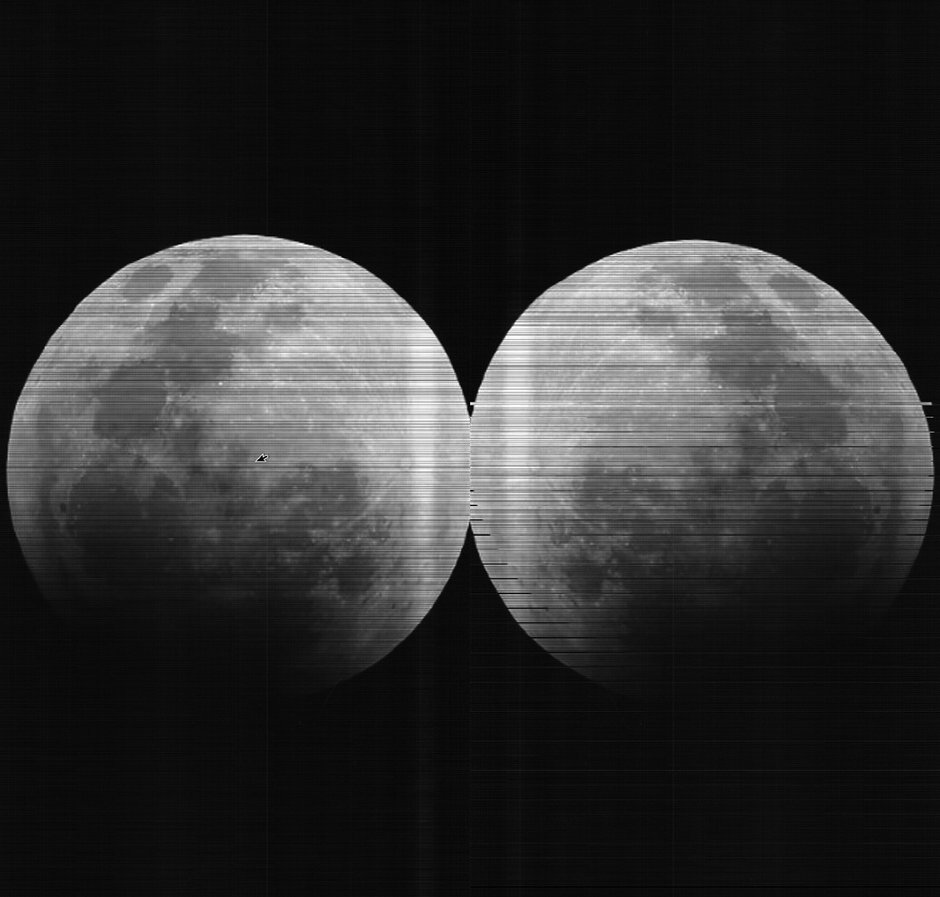
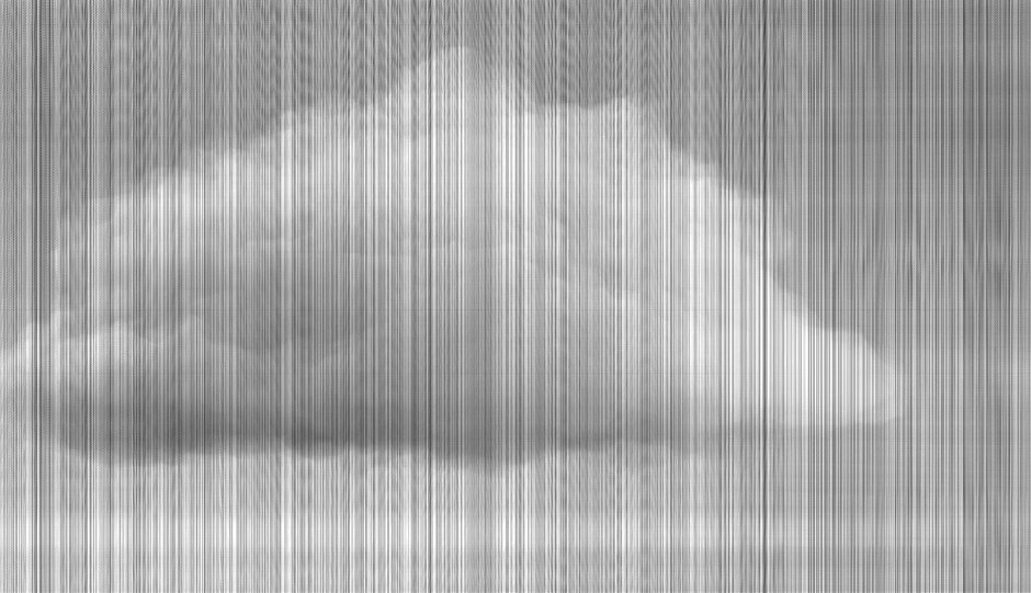
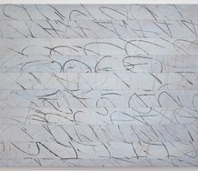
Lee’s other smaller works, the framed black and white images of clouds or the moon, taken from online sources, feature scanned strips, thin bands that breakdown the images so (vertically) they look like shimmering veils or (horizontally) some kind of evanescent stack. Because of the metallic paper, these digital prints subtly gleam and twinkle, and appear to be behind the paper, not on it. This is accentuated by their frames and frontal glass. They look like a form of permanent moiré effect, except that the delicate diagonal line patterns don’t change or disappear when you move around them.
These four images of clouds and moons vary considerably but it takes some close examining - with your nose to the glass - before you realise. The dominant strips all have faint lines that cross them at right-angles, setting up a fine-lined countermovement. In Moon (2015) - where the horizontal bands are piled up like circular slices that have been bumped so that they are not flush at the edges - the groups of descending fine vertical lines are not as pronounced as in Two Moons (2015), the same image of the moon mirrored: seemingly because we only ever see one side of the moon from earth. In Cloud 1 (2015) and Cloud 2 (2015) the faint horizontal lines are dominated by the vertical rainlike bands, but the hovering cumulus image in Cloud 2 is darker overall, while lit from below.
The chief difference between the two types of work is that of flatness and, paradoxically, objectness. The big paper grids emphasise the printed surface and the wall, yet are still basically illusionistic when you stand back (despite their strange flirting with each picture plane like a flattened chubby face pressed against a window), while the smaller framed prints accentuate looking through paper that is contained in a portable tray-like box that provides a ‘window’ through the wall, but which is a form of relief sculpture too. Both types of work (coloured and black/white) are compelling viewing, involving different sorts of looking and thinking: contrasting organisational structure and inserted repeated patterns of detail.
John Hurrell
 Advertising in this column
 Two Rooms presents a program of residencies and projects

This Discussion has 0 comments.
Comment
Participate
Register to Participate.
Sign in
Sign in to an existing account.