John Hurrell – 22 March, 2025
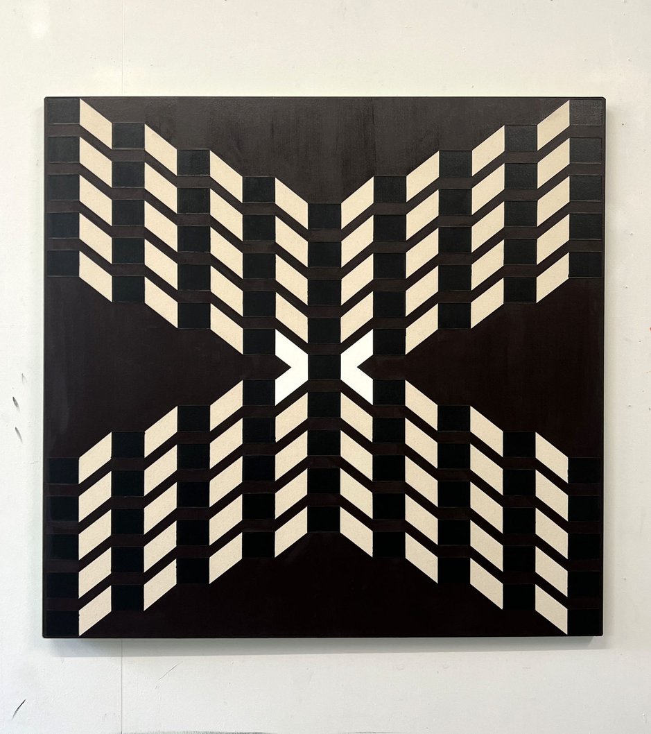
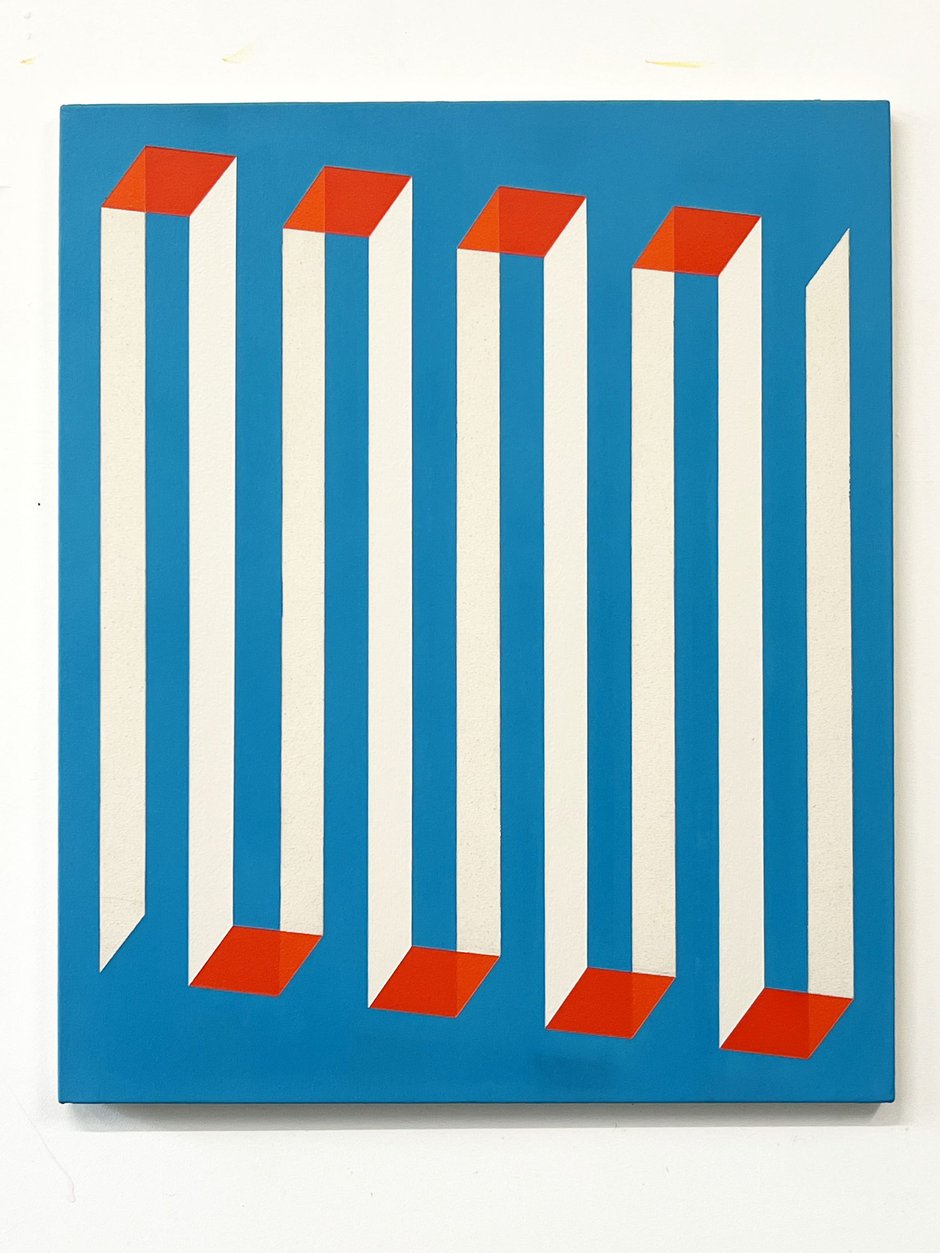
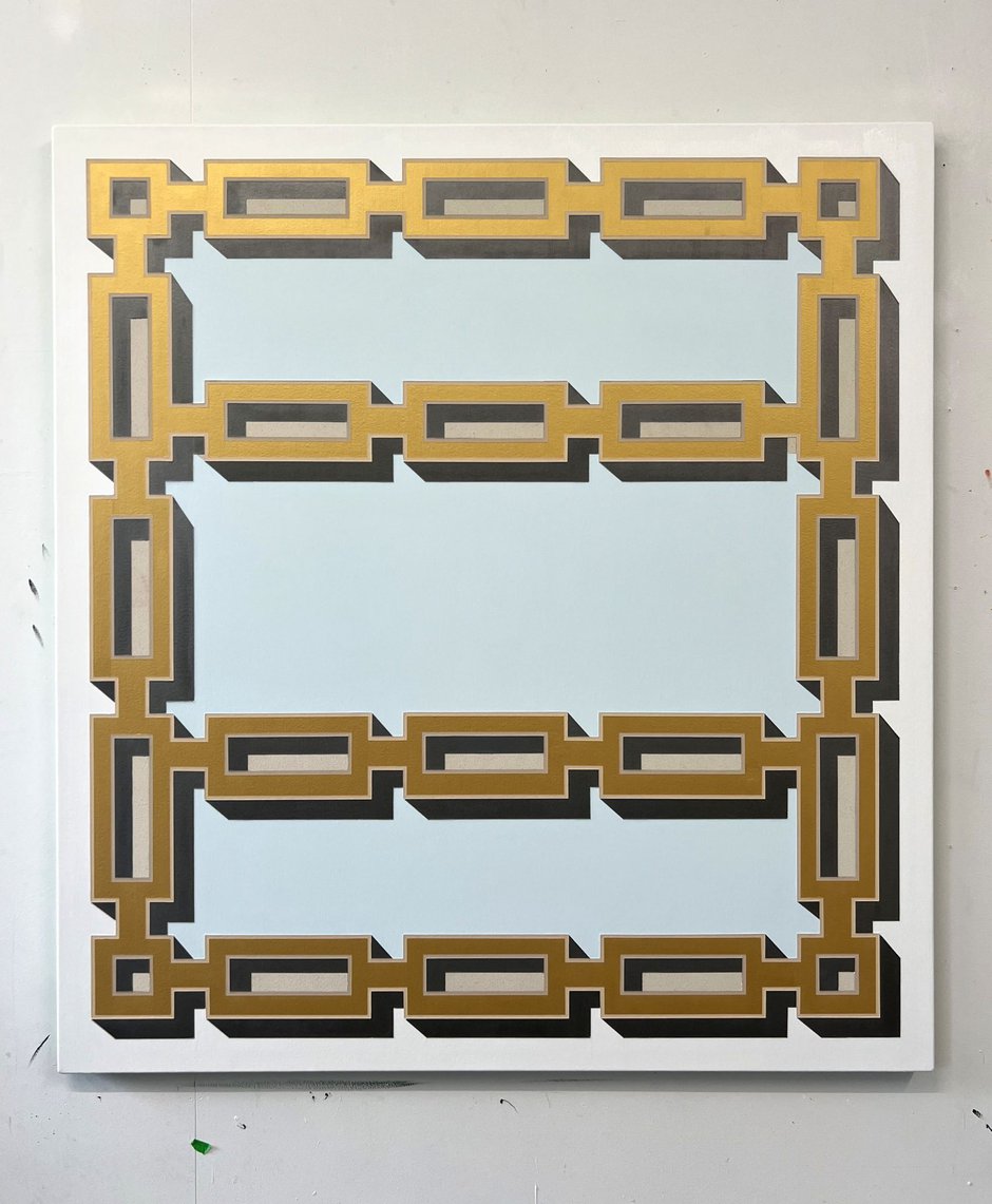
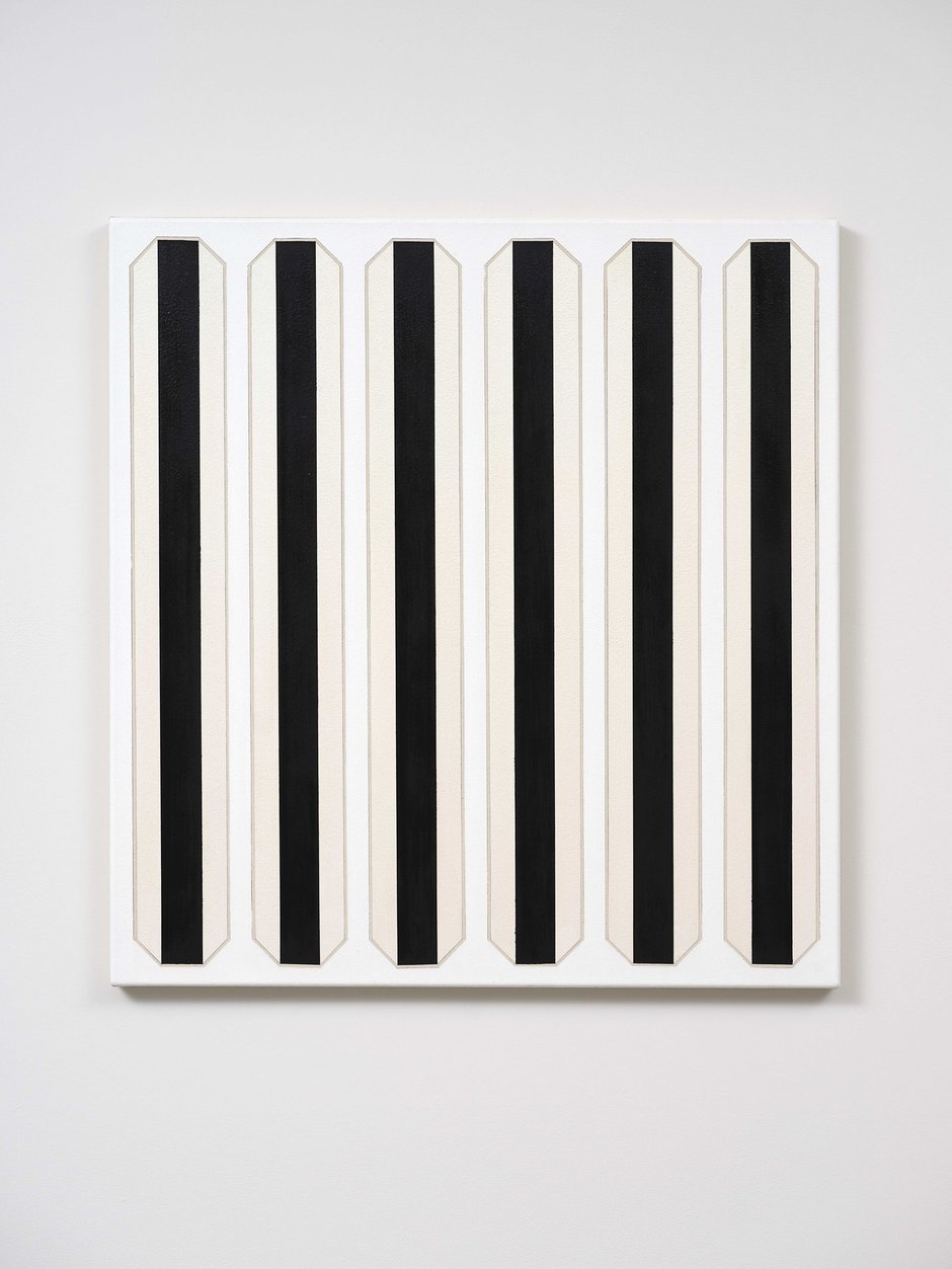
Almost all nine Fraser oil paintings play with the picture plane, teasing out the notion of ‘shallowness' while emphasising the pictorial surface with sharp-edged violent images such as wide St. Andrew's crosses, hollow three-sided columns of tin, vicious pointy clubs, vertical prison bars, squashed-vee barriers, lines of arrow heads, block chains, pen nibs, credit cards and paintings. These dark, dominant and aggressive motifs are mostly set against the cleverly nuanced pale backgrounds.
Contrary to what you might expect, this varied assortment of images is accompanied by a speculative title that vaguely promotes an anti-greed ethos often found in the philosophies of writers such as George Monbiot of The Invisible Doctrine fame. Surprisingly Robbie Fraser’s diagrammatic ‘abstractions’ are only partially the op-art high-jinks that you might anticipate, using repeated forms that are spatially ambiguous (seemingly from the late sixties) to illustrate perceptual structures.
Akin to ideograms, these peculiar linear images are like fables, providing warnings via the use of symbols, and featuring a nuanced but restless chromatic mixing that even within a light or dark tone is cleverly understated—a comment on the oft hidden but extremely volatile world we are living in.
Almost all nine Fraser oil paintings play with the picture plane, teasing out the notion of ‘shallowness’ while emphasising the pictorial surface with sharp-edged violent images such as wide St. Andrew’s crosses, vicious pointy clubs, vertical prison bars, squashed-vee barriers, hollow three-sided columns of tin, lines of arrow heads, block chains, pen nibs, credit cards and paintings. These dark, dominant and aggressive motifs are mostly set against the cleverly nuanced pale backgrounds.
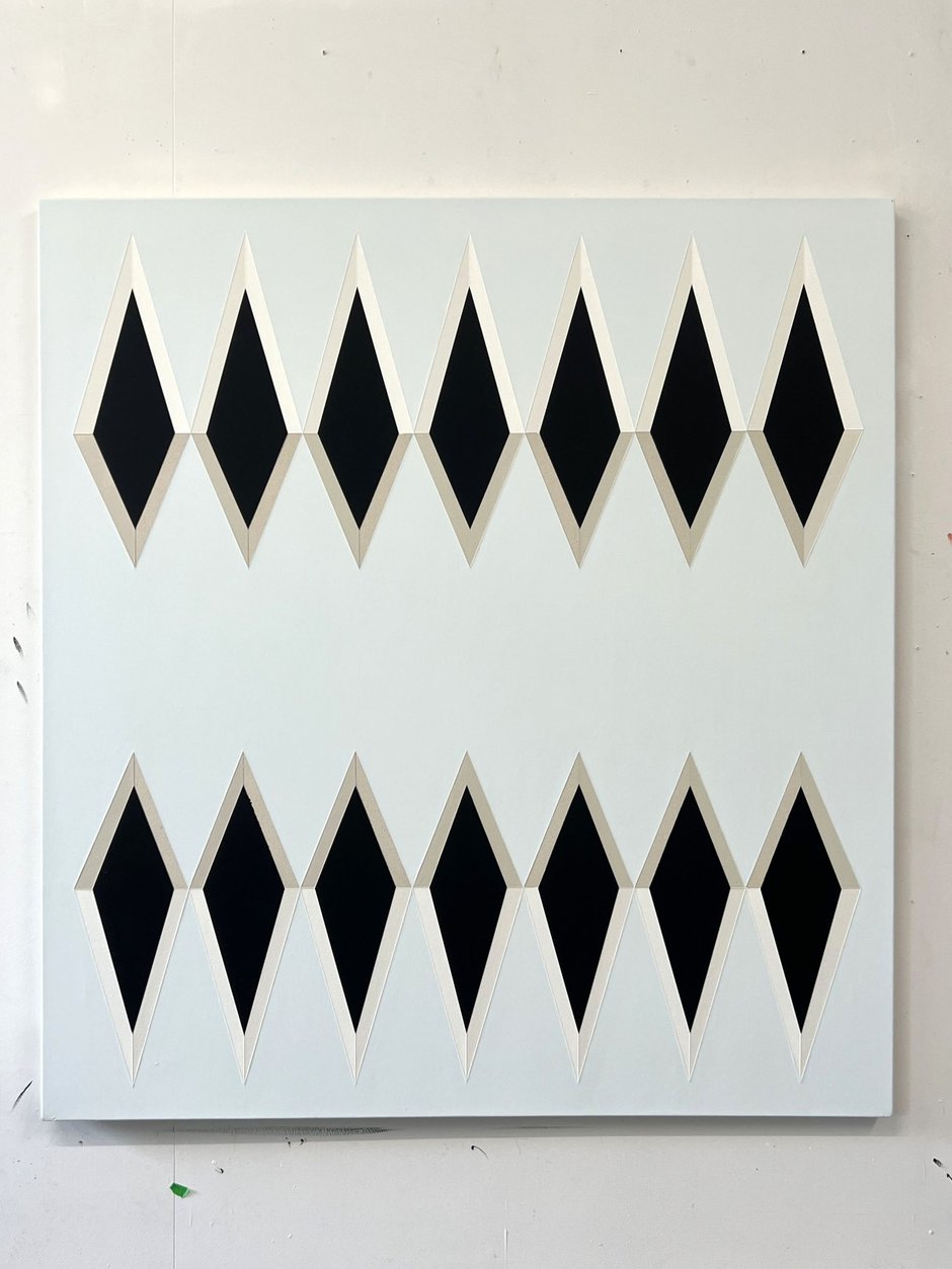
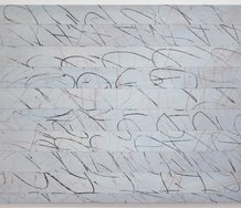
Some of these symmetrical images have a fascinating ambiguity. The Centre Always Drifts to the Right looks like two rows of fountain pen nibs (used for cheque signing), or lines of seven black diamonds, or a table with vertically sliding panels like the arcade game, Coin Pusher.
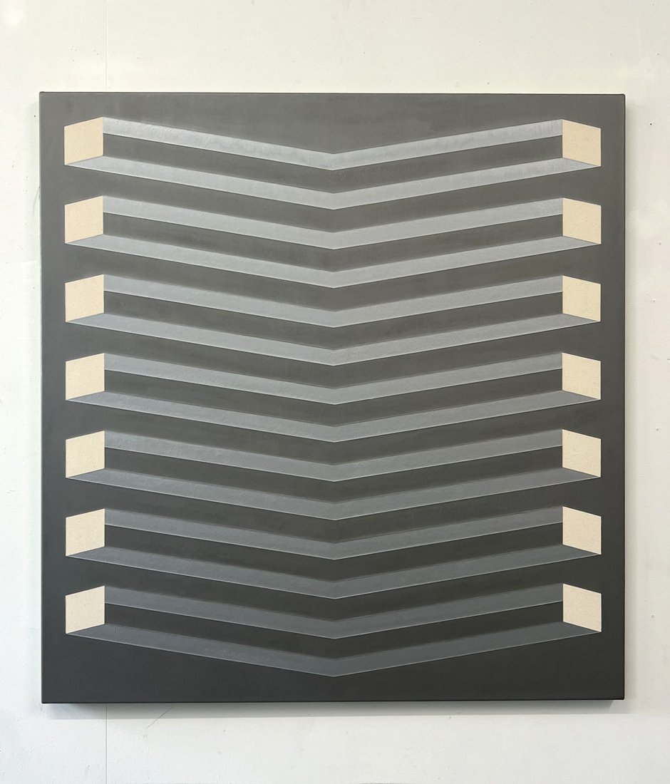
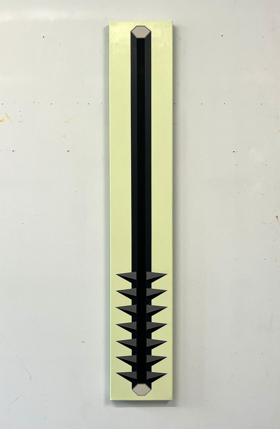
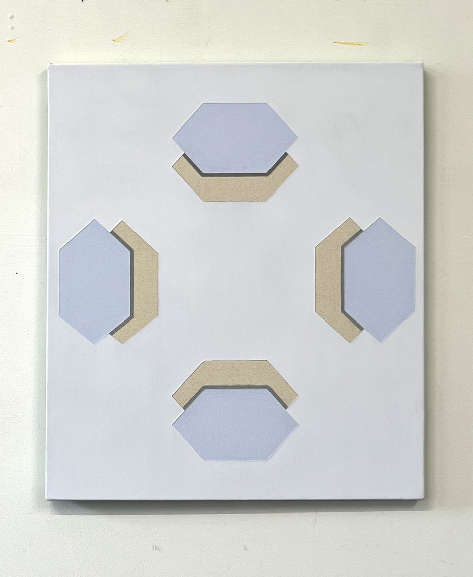
HARK and Crooked Argent are based on stacked vees, and really accentuate odd spatial qualities where the lower half advances and the top recedes. Real Eyes looks like a row of six cardboard portfolio covers with no papers inside. Descending Stereopsis appears to be a set of folded paper-money holding clips. Again empty. And the split title for Wield-Yield depends on which way up the weapon happens to be positioned. Orchid’s Warning in turn looks like four platforms hovering in a chancery, viewed from above, hexagonal trays suspended in mid-air.
Fraser’s paintings wittily interconnect to collectively form an oblique political critique aimed at collector avarice, fiscal speculation and what seems to be an alarming global voting swing keen to endorse fascism. The show demonstrates his considerable skill in constructing natty images that exude a passion for social change while looking to a better future.
John Hurrell
 Two Rooms presents a program of residencies and projects
 Advertising in this column
This Discussion has 0 comments.
Comment
Participate
Register to Participate.
Sign in
Sign in to an existing account.