John Hurrell – 6 April, 2009
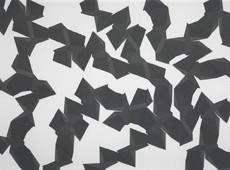
This wall painting of Jeena Shin’s is carefully rendered in five closely related tones of grey. Almost a monotone it is never bland.In fact it is highly energized, with light raking across raised edges that have been deliberately caused by brushing paint towards (and not away from) now absent, meticulously positioned, masking tape.
The ‘colours’ are Kodak greys and the wall looks as if it could be a photograph. At first glance you think the configurations are regular, as if a template from a pattern, but it is soon clear that is not the case. Each one is uniquely tilted, and the spaces between them all differ.
A small mural like this insists that the viewer look closely at its clusters of spikey shard-like formations - so they can grasp the uniqueness of each section of angular-shaped wall surface, its shifting tonal variations that still appear static.
That it is not a painting on a stretcher elicits a different response than from a support with a thickness. The fine ridges provide a drama separate from the precisely mixed tonal control. We see two parallel systems of manipulating light, one fixed once the acrylic on the wall is dry, the other evanescent, beholden to sculptural relief considerations, and dependent on the weather and the hour.
- John Hurrell
 Two Rooms presents a program of residencies and projects
 Advertising in this column
This Discussion has 0 comments.
Comment
Participate
Register to Participate.
Sign in
Sign in to an existing account.