John Hurrell – 24 June, 2009
Overall this is not a memorable show, though Leigh is the star with work that carries on from what she exhibited at Roger Williams a couple of years ago.
Auckland
Four Artists: Ana Horomia, Sue Novell, Esther Leigh and David Morrison
Curated by Antoinette Godkin
3 June - 4 July 2009
Antoinette Godkin, in her comparatively exhibiting new space in Lorne St, presents four slightly disparate artists: Ana Horomia, Sue Novell, Esther Leigh and David Morrison.
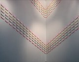
Ana Horomia’s work is positioned in a corner near the entrance to the gallery. Hundreds of identical Vinyl lozenges (rectangles with curved corners) are arranged in two bands that descend to meet in the central crease. Each band is five lozenges thick and though they are white on the outside, they are painted in four types of fluorescent colour underneath. Each unit is held in space by a Perspex stem so that the tinted lolly colour glows on the white wall, to be seen only indirectly, reflected.
I am not sure about the inverted v-formation in the corner. It seems too understated, and might work better as a block with horizontal bands in the middle of a whole wall. It lacks impact that is memorable.
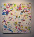
Sue Novell shows four canvases. Two have thinly painted coloured organic shapes evenly positioned throughout on white fields. They look vaguely landscapey. A third is of fragmented lines and dots - and is more interesting because it is not so regular but denser nearer the top right-hand side. It has a dynamic that creates an intriguing visual tension. Novell’s fourth work mixes line with translucent blobby shape. The interwoven formations have a complexity that holds your interest.
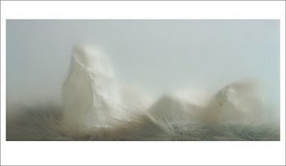
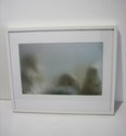
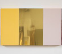
Esther Leigh is the most experienced artist here by far, and it shows. Her Glade and Wade images of papier maché forms and feather boas photographed through sand-blasted glass are remarkably evocative, suggesting underwater ruins or foggy cliff-forms. There are also 2003 works where she is using mirror paint and red ink with repeated layers of cut-through film matt to create abstract pink doorways floating in a beautiful milky haze.
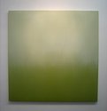
Leigh knows how to make haunting images by controlling light on reflected surface. David Morrison’s square oil paintings have similar concerns and are more minimal compositionally, but somehow the surfaces and scale seem inappropriate. The modulated tones and muted colours end up looking very ordinary. The problem is oil paint is too coarse a medium for his interests. Photographic digital techniques might be more successful.
Overall this is not a memorable show, though Leigh is the star with work that carries on from what she exhibited at Roger Williams a couple of years ago. Her Glade and Wade images are well worth a trip down to Lorne Street.
John Hurrell

 Advertising in this column
 Two Rooms presents a program of residencies and projects
This Discussion has 0 comments.
Comment
Participate
Register to Participate.
Sign in
Sign in to an existing account.