
John Hurrell – 9 December, 2009
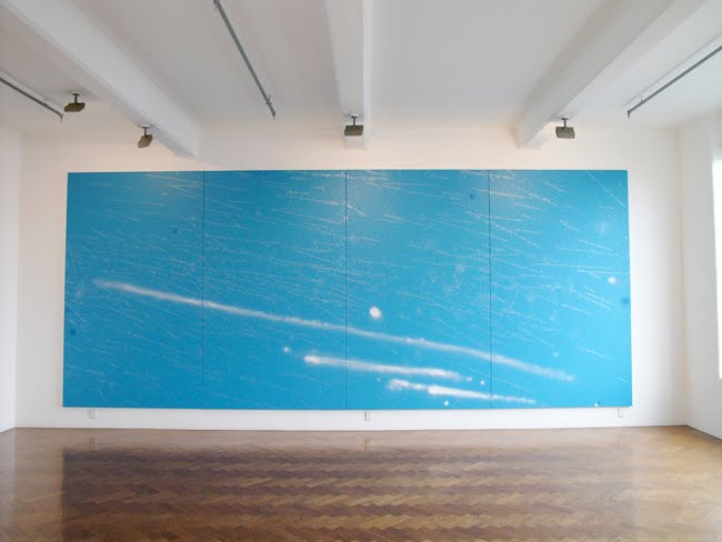
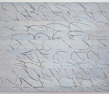
Most conspicuous is the big, four panelled work on the main wall – a painting that works. Nomadology, succeeds not only because of its lyrical, wistful sky blue and wisps of sprayed cloud and vapour trails, but also because of its dots (in that silver paint that I invariably find so loathsome), which though scattered have a compositional structure that is in essence linear.
It’s a nice, cunningly ambiguous title by John Reynolds for this Crockford show, and one that showcases his strengths – for there are no words anywhere. I dislike his dictionary-obsessed works that use written texts (I hate the pomposity of many of them, the look of the spindly printing and I’m irritated by the monotony of the evanescent silver paint) while I am fond of his paintings that emphasise drawing. Especially his linear, unravelling stringy, scrubbed and scratchy marks of chalk or charcoal of his old works. But naturally he has moved on.
So what is here amongst these six recent paintings?
Most conspicuous is the big, four panelled work on the main wall – a painting that works. Nomadology, succeeds not only because of its lyrical, wistful sky blue and wisps of sprayed cloud and vapour trails, but also because of its dots (in that silver paint that I invariably find so loathsome), which though scattered have a compositional structure that is in essence linear. The painted specks are like flocks of migrating birds, or herds of caribou. They thankfully link up in diagonal alignments. It’s when they don’t, as in some of the small canvases, that he runs into problems. They lack direction.
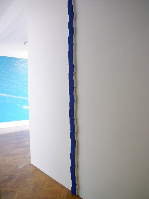
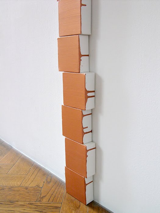
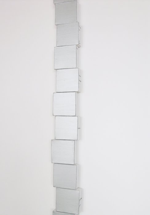
The main ‘lines’ in this show are three teetering stacks of small, mark-free monochromes that crawl up the wall to the ceiling and which seem to allude to the earlier brick work in this space by Kate Newby.(A nice ‘tip of the hat’ from an older artist to a much younger one.)
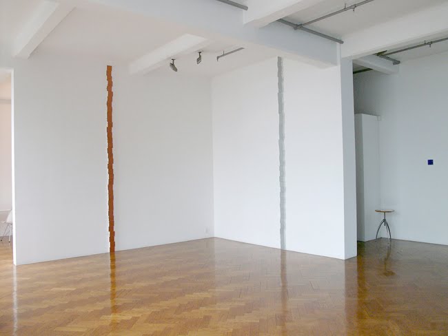
Because they are monochromatic and vertically link up, the choice of colour in these Birdsong works is crucial. The metallic copper and silver stretcher ‘lines’ are insipid and flat, but the Klein blue on the work by the gallery entrance is astounding in its penetrating vibrancy. It also has different edges from the other two - they have skinny drips running down the sides. This one has thick oozy blobs that lazily meander halfway down the stretcher sides – seepages from a weedy watery ladder to the heavens.
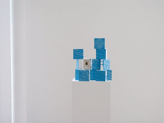
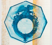
Other blue works are a single solo dotty work (Sad Song #7) on the wall in isolation, and, Refrain, a group of about fifteen small stretchers (again silver dotty) arranged on a plinth in a sort of balanced stack, that you can walk around.
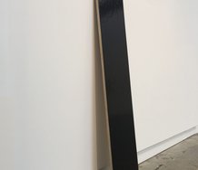
However it is the two largest ‘linear’ blue works that are the highlights of this show: one wall-sized, the other like a piece of wobbly down-pipe from your guttering. Both are buoyant in mood and sensual. Cool and refreshing in the summer heat.
 Two Rooms presents a program of residencies and projects
 Advertising in this column
This Discussion has 0 comments.
Comment
Participate
Register to Participate.
Sign in
Sign in to an existing account.