John Hurrell – 16 March, 2010
So we have (despite Foucault's opposite view) the repressive Victorians and the randy permissiveness of our current age: poster and title together as opposites. A sort of oxymoron
Anya Henis
Soft Rocks Stainer
24 February - 25 March 2010
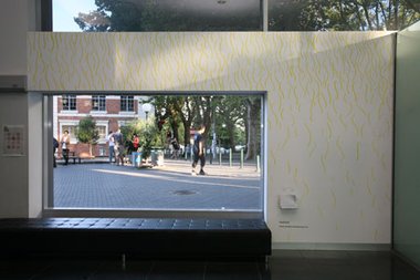
We have here something admirably unusual for Window, an impressionistic abstract wall drawing by Henis that is an installation around and in the Window gallery ‘box’. It has been made with what looks like coloured ink, but with spaced apart lines that have been brushed on. The artist has used only the three primary hues (i.e. paint primaries, not light) and this has been applied directly on the wall at the back of the gallery ‘proper’, and the two walls on each side - one adjacent to the wide stairs going up to the library; the other on the side of the courtyard and Alfred Street.
Before I describe the work in more detail, let’s speculate over the contextual information Henis has provided. Her poster (see above) shows a dozen eleven-sided polygons containing what seems to be marbling from Victorian book covers or pages. The title? I know I’ll be accused of having a one-track mind but I reckon testicles. What else can ‘soft rocks’ be? And a penis is ‘the stainer’.
So we have (despite Foucault’s opposite view) the repressive Victorians and the randy permissiveness of our current age: poster and title together as opposites. A sort of oxymoron
In a leaflet available on the gallery wall Henis publishes a poem:
Soft rocks stainer
a sound from one to the other
strokes of the sun
stream through glass
in layers of incandescent tone
waves of restlessness
throw your words away and practice keeping secrets
freedom forms
everything at once and all the time
It’s pretty oblique isn’t it? Or is it? Let’s describe the painted drawing. It uses a vocabulary of five sorts of mark spread out like an ancient cave painting. They don’t compose as such, but are dissipated and unconnected. They are quickly applied, and so not sensitively considered in their application, as say her paperworks are.
First of all there are the fainter and smaller, yellow vertical or diagonal curves that look like eyebrow hairs. These are usually aligned in thick vertical configurations that mainly are, by themselves, under the window that faces outside. (Perhaps these are strokes of the sun…stream through glass. Perhaps even a reference to John Donne’s The Sun Rising.) There are also a few on the opposite wall adjacent to the library.
Then there are the same sort of vertical ‘hairy’ mark constellations but in blue - found mainly on the library wall and a few on the righthand end of the gallery Window backwall.
Thirdly there also is a scattering of small blue dots under the window facing out.
Fourthly there is a much heavier variety of dark blue line that looks like inverted eyebrows. They gather in groups mainly near the top edge of the ‘library’ wall and separate more and more moving down. There is definitely a wave like quality present, not only literally but also in a sense of increasingly urgent dynamic. (waves of restlessness)
Lastly there are some bright red squiggles, short single twisting lines a bit like the edge of a mouth - scattered along the library and Window walls.
So what can we make of all this - the whole thing, the total package?
Well there do seem to be coital references here, and orgasmic ones too - especially in coordination with the ‘stream’ ‘strokes’ ‘waves’ and ‘secrets’ of the poem. But talking about it like this seems pretty crass. Yet Henis doesn’t seem to be a prankster or provocateur. The work is a serious project. And the drawing does appear preoccupied with the body as scattered floating repeated fragments - resulting from a process that seems unfinished or unresolved.
It is an interesting failure I think - this spatial experiment on three planes with coloured lines. The squiggly marks don’t draw you in to their surfaces and the dynamic overall is almost incoherent. Yet it is an exciting thing to attempt and I admire Henis’s courage. It’s great to use these walls, so hopefully it is the start of more spatial experimentation to come.
Recent Comments
Editor
Well Nell, I hadn't noticed your participation, so I stand corrected. I've noticed your excellent designs on other occasions but ...
Nell May
Hi John, It is nice to see somebody bring the poster design into their understanding of a show. I feel ...
Editor
Simon, it would be more helpful to talk about the art, not the coincidental phonetics of someone's name.



 Advertising in this column
 Two Rooms presents a program of residencies and projects
This Discussion has 4 comments.
Comment
Simon Glaister, 6:19 p.m. 16 March, 2010 #
and for those who missed it; Henis rhymes with penis too.
Editor, 11:23 p.m. 16 March, 2010 #
Simon, it would be more helpful to talk about the art, not the coincidental phonetics of someone's name.
Nell May, 9:28 p.m. 29 March, 2010 #
Hi John,
It is nice to see somebody bring the poster design into their understanding of a show. I feel the need to respond to the marbling comments though -
For this show it had been decided that there would be no visual cue to the work, partially given the nature of the installation I think. Which suited me as I happen to dislike designs that are a direct visual reference to a show, unless the artists themselves are creating them as in that case it makes more sense for a simple visual extension.
I think design in an art context is better viewed as a separate component, one that serves an obvious function but also acts as another interpretation, like how a guest piece of writing often can. Hence - those marbled patterns. They were my personal response to a conversation I had with Anya about her upcoming show, an insight made during this (which I think I should omit from here as it was a private conversation) later left me obsessed with a connection to italian marbled paper and the abundance of tranquil and beautiful variations in form that marbling enables....
Don't worry, this is the last Window poster of mine so you won't have to read into my strange logic with them anymore! And, as a side note, I think you do indeed have a one track mind in reference to the title.
Editor, 10:37 p.m. 29 March, 2010 #
Well Nell, I hadn't noticed your participation, so I stand corrected. I've noticed your excellent designs on other occasions but I slipped up this time. Sorry, I thought Anya had done it.
However I do think it is logical that people attempt to link a poster with the product it is promoting. I think good advertising does that. Gets 'inside' the item being marketed.
As I said, it is possible I have a 'one track mind', but remember I attempted to link poster, title, poem and gallery walls to support an argued point of view. Actually I think my interpretation is quite successful. Corny, but creative. I would be very happy though to hear about some other ways of looking at Anya's project. Assuming she is that cohesive in her approach to an exhibition.
Participate
Register to Participate.
Sign in
Sign in to an existing account.