John Hurrell – 9 October, 2010
There is something interesting going on here with the first part of the sentence in the paper catalogue flowing on to the canvas on the wall to be completed. The blending of disparate supports is intriguing, but the project needs more research to give the linking of vocabulary and applied shimmering background chroma more conceptual cohesion.
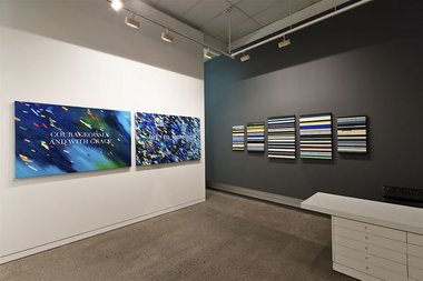
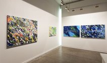
Elliot Collins, recently in Ready to Roll in Wellington, now has a new show at Tim Melville’s. It has two parts, though if you were irritatingly facetious you might say ‘three’, and include the long text he has written for his artist’s statement on the gallery website.
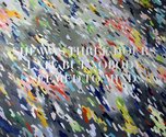
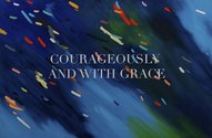
Firstly there are the text paintings, canvases with elegant seriffed lettering (he tries out different types) elucidating short phrases set against brightly coloured backdrops of diagonal brushmarks. The backgrounds are like the sloping structures of Bridget Riley or Larry Poons mixed with impressionist strokes of shimmering light.
The titles work closely with the brief texts, so that for example Marilyn says ‘She was three hours late but nobody seemed to mind’ and How I want to live each day reads ‘Courageously and with grace.’
To my mind the stretcher backgrounds undermine the power of the joined-up language, that the expressions are too short, and the artist’s statement (incidentally) too waffly. Earlier works Collins has made with plain black or dark blue backgrounds are far superior as reads.
Nevertheless there is something interesting going on here with the first part of the sentence in the paper catalogue flowing on to the canvas on the wall to be completed. The blending of disparate supports is intriguing, but the project needs more research to give the linking of vocabulary and applied shimmering background chroma more conceptual cohesion.
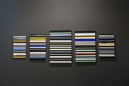
Collins’ other paintings have no obviously rendered language (though his preparatory working method uses collaged magazine pages) and work best as a group of five, not singly. They are different sized, vertical rectangles of thin horizontal stripes, vaguely in the style of Gene Davis, alternating light and dark as they descend. Because of the fact they are made with acrylic the largest panel has an unfortunate sense of thick plasticity, a subtly projecting skin that is accentuated by the use of masking tape that causes raised edges. (Technically he should have brushed away from the tape, not towards it.) The thickness on that canvas looks clumsy - but he has used another method (paint filled pen) for the others.
What makes them interesting is where in several traversing lines he has unexpectedly changed the hue halfway along, or on one occasion introduced an inverted flattened u-shape that looks discordant, but which somehow fits. As a toppled over bracket this shape (the result of a letter form from a magazine) suggests the over-arching unity of the group of canvases into which it is inserted - the merging of individual components to make one composition. Perhaps a reflective joke about the hang.
These paintings have the chromatic control that I think is lacking in the word works, and greatly succeed as a suite of five placed close together. To split them up would be tragic.
John Hurrell
![Elliot Collins, The Empire [Midnight] 2010, oil on linen, 1000mm x 1600 mm. Photo by Kallan MacLeod.](/media/thumbs/uploads/2010_10/TimMelvilleGallery_ElliotCollins_Midnight_jpg_380x125_q85.jpg)


 Advertising in this column
 Two Rooms presents a program of residencies and projects
This Discussion has 0 comments.
Comment
Participate
Register to Participate.
Sign in
Sign in to an existing account.