John Hurrell – 31 October, 2010
Oddly with the reinforcing rods and various layers of stacked polystyrene serving as trope, there is a suggestion that Robinson here is using metaphor to attack itself. He seems to be embracing the notion of rudimentary foundational skills and love of bodily experience - as opposed to over-rarefied ‘dematerialised' exhibits and convoluted interpretation. He seems to be advocating a return to basics.
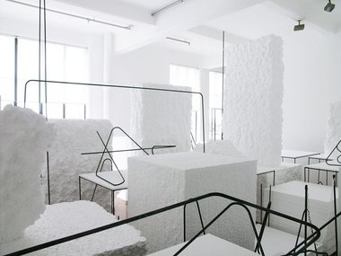
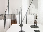
Like his winning work ACK in the 2008 Walters Prize, Peter Robinson here presents a polystyrene installation that is to be observed but not entered - made to be examined from two ‘look-outs’ or ‘stations’ that let you peer into the main gallery space: one just inside the gallery entrance to the left; the other to the right, on the far side of Crockford’s office, from the small back gallery.
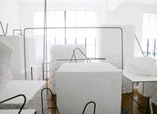
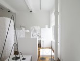
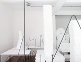
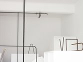
One looks across the space towards the main ‘harbour’ windows, the other looks along the wall that those windows are set in. The viewing alignments are at rightangles to each other to exploit the light streaming in through the windows. The effect is akin to Brancusi’s studio that is preserved in Paris, but which you peer into through large windows. Robinson’s version is a bit like Brancusi’s workplace mixed with those of Moore and Judd. Blocks of polystyrene reference cubes of freshly cut marble or stone, box forms in steel construction-site reinforcing rods allude to Judd’s plywood works, and other rods rise up to the ceiling like Brancusi’s wooden sculptures. The very act of filling up the gallery in such a dense manner seems to refer to Walter De Maria’s series of sculptures where he filled up galleries with earth.
As with the occasional blue linear forms in ACK the precisely bent, grey steel rods (some with a thread that spirals around them, some without) draw in a space made blindingly white by the cubes and slabs of carvable foam. The lack of colour - except for some splashes of pale brown in a couple of very roughly textured blocks - tends to flatten each vista out and make the images linear and graphic so that geometric solids start to optically dissolve. The volumetric space then becomes a page (a double page spread) resulting in the large white blocks referencing the parallel ceiling and walls - and the dark thin lines forcing the viewer’s eye towards the sprinkler system, black window frames, and small tilted rectangular lights.
With this work, and an ambiguous title that suggests empathy (and possibly nostalgia) for modernist formalism, a prototype of sculptural studio practice is humorously set up within the gallery ‘vitrine’ to be observed like a lizard under a heat-lamp in a terrarium at the zoo. Robinson seems to be making some wry observations about relational non-studio art through this non-social ‘studio’ project.
So whilst he is enjoying placing delicate linear ‘marks’ via distant steel rods throughout the ‘drawing’ he is also suggesting that perhaps such modernist ‘standards’, whilst no longer modern, are nevertheless valuable with their opticality and bodily awareness. The work is about spatial markmaking and looking at form, comparing the hollow with the solid, contrasting opposing planes and textures, as well as celebrating with the reinforcing rods (that as armatures can support clay or concrete) the joys of manual manipulation of materials and precise placement.
Oddly with the reinforcing rods and various layers of stacked polystyrene serving as trope (as well as alluding to functional elements of method), there is a suggestion that Robinson here is using metaphor to attack itself. He seems to be embracing the notion of rudimentary foundational skills and love of bodily experience - as opposed to over-rarefied ‘dematerialised’ exhibits and convoluted interpretation. He seems to be advocating a return to basics.
As for the show’s title: is it a joke? The show espouses modernist standards - an unmodern that is not contemporary - so the heading must be about the current art historical climate, the contextualization of Robinson’s exhibition, the sea of contrary values that surrounds his ‘retro’ island. It is a bit like the well-known signage motif of the pointing human hand, where it is not the straight index finger directed forward that is significant but the three lower ones aimed back along the arm. They are the vectors that carry the title’s meaning; they clarify its deliberate ambiguities: focussing on the community of lookers, not the exhibition being looked at.
John Hurrell


 Two Rooms presents a program of residencies and projects
 Advertising in this column
This Discussion has 0 comments.
Comment
Participate
Register to Participate.
Sign in
Sign in to an existing account.