John Hurrell – 29 September, 2013
Most people I know in the art world will say they adore early modernist architecture, but few would ever be seen dead eating in a McDonalds franchise. There is a wicked perversity in these images as a pairing of opposites - a mischievous twist on the alleged distinction between High and Low Art - with Ellwood and Kim successfully mingling the two, drawing attention to the fact that the architectural template McDonalds use is based on a late modernist style.
Pakuranga
Matt Ellwood and Yoon Tae Kim
Te Tuhi Billboards
3 August - 20 October 2013
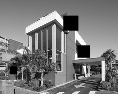
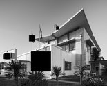
Three black and grey photographs of elegant modernist buildings dominate this set of billboards by Matt Ellwood and Yoon Tae Kim, placed on the block wall on Reeves Rd, behind the Warehouse and opposite the front entrance to Te Tuhi. With a compressed perspective so that the two vanishing points at the sides are squeezed towards each other, the roofs and windowed walls have acute angles, accentuating spatial depth, and exaggerating the pitch of the roofs. Oddly, at the front, three or four black squares emphasise the picture plane.
These buildings look like modernist icons, perhaps like something designed by the great Finnish architect Alvar Aalto. So it becomes a bit of a rude shock to realise that these three ‘documented’ buildings are not at all significant milestones in the history of architecture. In fact they are McDonalds fast food restaurants from around the suburbs of Auckland. And the hovering black boxes, seemingly there to accentuate the image’s picture plane, are also used to block out branding and Big Mac signage.
Most people I know in the art world will say they adore early modernist architecture, but few would ever be seen dead eating in a McDonalds franchise. There is a wicked perversity in these images as a pairing of opposites - a mischievous twist on the alleged distinction between High and Low Art - with Ellwood and Kim successfully mingling the two, drawing attention to the fact that the architectural template McDonalds use is based on a late modernist style. Because of all the distracting branding accoutrements we rarely think about this unless it is exacerbated and simplified in a drawing or photograph. Something normally dismissed as repugnant (kitsch) and dangerous (unhealthy food) is transformed into an icon that is austere, dignified and elegant.
Ellwood has a history of creating brilliant drawings (usually in charcoal), looking at fashion (eg. Sixties hairstyles) or disdained consumer products (like smoking), examining their profile or branding. The work here may suffer from being too subtle, especially for drivers whizzing past down Reeves Road; the makeover is so effective. Once it is understood however, the wit of this work is a wonderful way of getting people to think about the history of contemporary architecture. Franchise design suddenly becomes interesting.
John Hurrell

 Two Rooms presents a program of residencies and projects
 Advertising in this column
This Discussion has 0 comments.
Comment
Participate
Register to Participate.
Sign in
Sign in to an existing account.