John Hurrell – 15 November, 2015
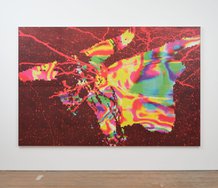
These paintings have the skewed edges of parallelograms, and present a strange synthesis of Cubism with Orphism, but with Cubism's chroma notched up, and Orphism's toned down. With numerous right-angled brackets depicted, they relate to the boxlike architecture that encloses them - despite their eccentrically angled contours that makes them seem like squashed arrowheads or lances, and constructed with symbolic political intent.
Auckland
Imogen Taylor
BODY LANGUAGE
Curated by Victoria Wynne-Jones
6 November - 5 December 2015
Three acrylic paintings on hessian-covered stretchers (two of them very large) are presented by Imogen Taylor suspended from the ceiling like trapezes, and surrounding a curved ramp (designed by Kimberley Read, built by Michael Lee) that you can walk up in order to get a closer look. A fourth is conventionally hung on a wall, near the entrance.
These paintings have the skewed edges of parallelograms and offer a strange synthesis of Cubism with Orphism, but with Cubism’s chroma notched up, and Orphism’s toned down. With numerous right-angled brackets depicted, they relate to the boxlike architecture that encloses them - despite their eccentrically angled contours. Plus, due to their unusual shape and method of hang, these works might imaginatively be perceived as flattened arrow-heads or lances: constructed with symbolic political intent. Two are sensationally successful (Bumping Ugly, and Beast With Two Backs) while the remaining two (Pillow Biter, Sink Piss / End Wet) don’t attain anything like an equivalent compositional dynamic.
Although the hovering stretchers and sloping sector-sliced ramp is an interesting experiment, it becomes a little like a rotating carousel in its mood. The flat spaced picture-planes of the canvases, their chopped up cubist vanishing-points, are a foil to the steep floor and their own acute-angled corners. Nevertheless, while the vertiginous movement implied by the floating canvases does intrigue, the two impactful works would work happily in a normal hang anyway.
In accordance with the exhibition title, BODY LANGUAGE, the ramp activates the body in ways not normally associated with attending to painting, even though the planar stability gained from having walls flush with the ‘diamond’ edges would better accentuate active looking.
Close by, the main Artspace wall presents a sprawling array of working drawings, a real mixed bag of styles, media and quality. Many of these sketches and doodles fit in with No Idea, the free zine / comic that the artist has designed to wrap around Wynne-Jones’ essay that links her with Michel de Certeau’s oft referenced book, The Practice of Everyday Life in its discussion of la perruque, a sort of ruse or slippery trick used by the weak.
The discussion seems to apply to the large cluster of pinned up wall drawings more than the paintings. That’s a shame because the paintings and ramp are so imposing they need an in-depth commentary not only on the imagery and space of the paintings but the muscular experience of climbing the ramp and moving up close to the hessian - even though the titles are clearly body-connected. One sarcastic drawing in the publication shows the artist being ‘cornered by art jocks,’ where one says ‘Give me one reason why I should care about your paintings.’ Readers can decide whether Wynne-Jones and Taylor successfully answer that question, and if the title of the zine is in fact extraordinarily honest.
Overall Taylor’s publication is more focussed than her drawings on the wall. She ‘ironically’ proclaims various causes for certain grievances or alleged miseries (no academic job, alcoholism, lesbianism, atheism, sexist critical neglect…) being provocatively lurid and narcissistic, while fitting in with the feminist content of other women graphix artists overseas like Julie Doucet, Aline Kominsky-Crumb and Phoebe Gloeckner. Surprisingly the wider ranging wall drawings and investigations seem to be overall more stylistically akin as illustrations to various New Zealand male artists like Richard Killeen or Nigel Brown. Taylor’s use of hessian likewise fits in with the use of coarse scrim with oil paint by Clairmont and Fomison (as she discusses) - to possibly usurp that male tradition.
I think this show would have been much better with the two superior works only - placed on opposite walls with no ramp - and with the drawings better selected. It is spoilt by inconsistency and what really is gimmickry. While the artist appears to be irritated by much that goes on around her - exuding constant anxiety, resentment and a disgruntled lack of humour - being represented by Michael Lett as she is, is hardly an indication of being marginalised or rejected. This Artspace project has provided the opportunity to be adventurous. To take a punt. The result is a show that - while puzzling - is memorably unusual, and not timid.
John Hurrell
 Two Rooms presents a program of residencies and projects
 Advertising in this column


This Discussion has 0 comments.
Comment
Participate
Register to Participate.
Sign in
Sign in to an existing account.