John Hurrell – 26 October, 2016
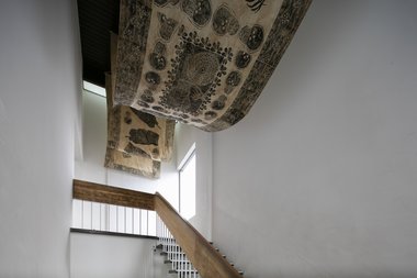
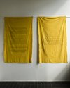
Quishile Charan dominates the staircase entrance to Artspace with her two fabric texts, floor-based turmeric bed and enormous overhead masi cloth, printed with indigenous motifs. The fact that Charan is Indo-Fijian is (as Lana Lopesi has put in a recent Pantograph Punch article) potentially ‘mucky,' especially in regard to the masi cloth. Maybe not as possibly mucky as placing coconuts on the top of turmeric coated obelisks, as she did in the Art Fair. Does honourable intention ever confine (or safely buffer) damaging political interpretation?
Auckland
National group exhibition
New Perspectives
Curated by Misal Adnan Yildiz and Simon Denny
23 September - 29 October 2016
So what do we make of this apparently motley collection of artworks; a selection that is deliberately intermingled, fluid and porous, that initially appears to be disorganised and without visual appeal but which admittedly starts to make sense the more you look at it - identifying its components gradually becoming easier. Artspace’s yearly national survey of emerging new talent is the result of picking 20 exhibiting artists out of about 125 applicants, and the director sharing curatorial duties with international Venice Biennial luminary (and local hero) Simon Denny.
Although I’m uneasy about these procedural aspects (firstly: brilliant art is not automatically careerist where creative people always avidly pursue ‘gatekeepers’ - it is reasonable instead to expect the curator to do independent research and seek them out - and secondly: does an experienced director really need a ‘star’ to help make decisions? Surely Yildiz is a strong enough personality to make selections by himself) the result is some conspicuous talent clearly strutting its stuff, though you have to do a certain amount of sifting (a lot) to find it.
My view is that there is too much dross, mostly from artists that are too young and inexperienced, students who need to get away from the protective umbrella of tertiary institutions for a few years in order to become independent thinkers; talents who require time to stand back and assess the passed-on values of their teachers. And there are too many contributors. The show needs a much tighter focus to introduce coherence. It doesn’t bother trying.
Looking at the line up, some of the individuals here have been better presented in other current (or recent) shows; for example Louisa Afoa (Influx at AUT), Charlotte Drayton (Te Tuhi’s courtyard) and Quishile Charan (Auckland Art Fair). As is the fashion, there are a lot of writers using text - and some, like Faith Wilson, have a real flair for language. Mostly though the visual presentation of written language is painfully dull. The formal manner of formatting their verbal content is uninventive, indicating a possible ignorance of the mindset of artists like say McCahon and Blake, or creators (like Joseph Churchward) of innovative typography. The notable exception is Owen Connors, where his intimate and fugitive text is almost unreadable (black print on black paper) but one can see that it is a calculatedly furtive anti-ocular strategy.
The highlights of this show come mostly from the filmmakers whose works were screened one evening at the Academy. They should have been among the installations, not just separate screenings, for they deserve far wider appreciation. On another level though, perhaps they are lucky.
Nine or ten artists only - spread out - would have made a great show. I think Yildiz and Denny should have avoided perpetuating the standard fetishisation of the young (always desperate for attention, their competitiveness comes from the major institutions constantly pumping out graduates) and instead focussed on assured reliable talent that has a very low profile, but which is committed and has thoroughly thought through its modus operandi.
Quishile Charan dominates the staircase entrance to Artspace with her two fabric texts, floor-based turmeric bed and enormous overhead masi cloth, printed with indigenous motifs. The fact that Charan is Indo-Fijian is (as Lana Lopesi has put in a recent Pantograph Punch article) potentially ‘mucky,’ especially in regard to the masi cloth. Maybe not as possibly mucky as placing coconuts on the top of turmeric coated obelisks, as she did in the Art Fair. Does honourable intention ever confine (or safely buffer) damaging political interpretation?
Inside, by Artspace’s glass door, Matilda Fraser presents her small circular sculptures in a wall-mounted vitrine. Her filmed documentation of the production of two replica dollar coins played a major part in the film screening programme but the finished works are more interesting than the making process. Her interest in remaking dollar coins so that value is greatly added via ‘excessive’ costs of materials, has similarities with ‘coin’projects by John Ward Knox. Fraser’s glass coin - covered with gold leaf - has a refreshing wit about transparency (as an inner core) that opposes an outwardly visible fiscal context.
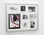
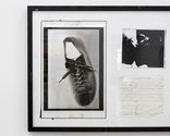
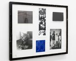
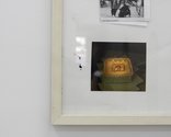
Along the wall in the large square gallery, George Rump contributes a suite of five collages that pitches a constructed generational sensibility via greying images of battered clippings, driver’s license (b. 1995), crumpled tattered photos; variously depicting (mostly) his ‘likes’: favourite cartoons, cameras, birthday cakes, drugs, footwear, cuddly toys and dancing friends at parties. It is an assortment of devised attitudinal positions, disparate yet (within the group) undeniably focussed.
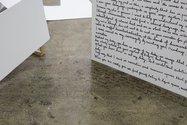
Faith Wilson’s formidable ability to verbally articulate the political complexities of her thought (a hesitant resistance to being accepted - added to her initial eloquently worded dispute with Yildiz and Denny) is obvious, but whether that makes her an accomplished visual artist (despite her video) is not clear. Her handwritten text descending down the wall and across the floor may sparkle conceptually in its breakdown of power relations, but visually it is commonplace.
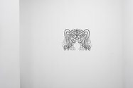
Despite being probably the most conservative work in the exhibition, Motoko Kikkawa’s delicate wash and ink drawings are tremulous, intricate, evocative, non-figurative, and occasionally cut out like a form of filigreed lace or paper doily. Imaginatively graphic, in the sense of comic strip art, Kikkawa’s compositions are usually improvised and holistic, exuding a botanical feel vaguely reminiscent of vertical stems and droopy leaves.
Charlotte Drayton’s architectural intervention, via three curved Spanish archways and two semi-circular lamps, provides wonderful entrances for the watery videos of Louisa Afoa and Diva Blair. It is an indoor companion to her opposite, the outdoor It must be nice to work outside on a day like today, recently seen in Te Tuhi.
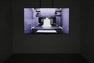
Tim Wagg’s filmed ‘documentary’ 1991 is about Ruth Richardson, the Minister of Finance who in the early nineties put in place National’s continuation of Rogernomics. Her audio interview, where she under the Bolger government advocates stringent austerity measures and a free market economy as a means of shaping New Zealand’s economic resources and spending, is subtly subverted by Wagg not through biographical imagery, but through tracking shots of an operating three dimensional printing machine. Cabinet Minister as God.
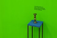
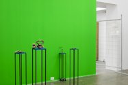
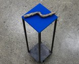
Hannah Valentine also shows clever humour by combining weighty (and - within the gallery - portable) bronze sculptures with a green screen background that if digitally filmed would dissolve their physical context and visually lessen their mass. Taut visitor muscles are effectively played off against mental envisaging of architectural and spatial dematerialisation. An idea for portable sculpture from Franz Erhardt Walther is cleverly extended via digital (and technological) implications.
Analysing the use and histories of various terms that make up the LGBTIQ bracket of sexualities, Louise Lever in Queer Words, her hour-long film, interviews various academics, educationalists and activists about the origins of words like queer, camp, gay, fag, dyke, bisexual, intersex and cross gender. The spoken answers her knowledgeable interviewees provide, alternate with filmed pages of hostile letters sent to parliament opposing the Homosexual Reform Bill. These last inserts are sometimes too long, and slow the pace of the film down considerably. The doco is saved by the fascinating historical and sociological information it presents, and the vibrant personalities doing that.
In Memoriam Marietta Burns, Theo MacDonald’s ten minute movie - made of sequenced images -expressionistic oil paintings (all b/w portraits) are combined with nautical photographs by William Archer Price. These, along with a voiceover and histrionic sound effects (piercing screams, shattered glass and soaring strings) are used to present a mock Gothic horror story.
In it Marietta Burns and her family in the 1870s leave Inverness on the HMS Venture to go to Greymouth, but when the ship is smashed up in a storm Marietta is the only survivor. She inherits the family fortune, and every four years the wealthy heiress commissions about a dozen portraits, picks one and burns the rest. (This seems to be a sardonic comment about the vagaries of art history.) Eventually some unspeakable horror is alluded to, her mansion burns down, and she dies of polio aged 68. There is even a suggestion she may have been a witch. It is an extremely well made and entertaining film.
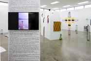
This is a complex convoluted show where the floor plan of work positions is essential for tracking down each artist’s scattered components. Varied, jumbled, entangled and hopelessly uneven, but with some great peaks.
John Hurrell
Recent Comments
Keir Leslie
Perhaps the most obvious clue to the Scott cartoon's irony is that it is, of course, an almost direct quote ...
John Hurrell
I guess another version of Richard's question is the search for verification of what Wayne C. Booth calls 'stable irony'. ...
Richard Dale
Focussing on one work in particular in this exhibition, the video 1991, (Tim Wagg) and John's comment that the ideology ...


 Advertising in this column
 Two Rooms presents a program of residencies and projects
This Discussion has 3 comments.
Comment
Richard Dale, 12:33 p.m. 16 November, 2016 #
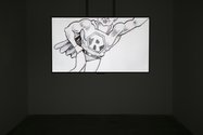
Focussing on one work in particular in this exhibition, the video 1991, (Tim Wagg) and John's comment that the ideology espoused by Ruth Richardson in the video as 'subtly subverted', I found I was not able to make this distinction on my viewing of it. The video includes depiction of a Tom Scott cartoon owned by Richardson and a section of it is recreated using a 3d printer, its laborious construction interspersed thoughout the duration of the video. The cartoon in question, drawn at the height of her success as architect of neo-liberal ideology in NZ, depicts the former Minister of Finance in allegory: Richardson as a flying muscular superhero, easily carrying a heavy weight, representing the economy:
http://www.rrnz.co.nz/images/cartoon1.jpg
And it is this weight that is recreated in three-dimensional form.
The reaction to the work will depend on the politics and life experience of the viewer, so unmediated is the presentation of this element and indeed RIchardson's ideas.
Her voice-over occupies the entire film, in which the ideologies of neo-liberalism, the free market and Freidmanite economics are presented as both reasonable responses to NZ's economic crisis – though actually an error with devastating results for all aspects of NZ society – and, most nauseatingly, as embodying a sort of heroism, a self-delusional construction of Richardson as libertarian ideologue, embodying risk, independence, freedom, creativity, revolution, innovation. Avant-gardism, even. In other words, as an artist.
Which is possibly why some artists, I am told, have got positive inspiration from this work, with its direct espousal of libertarian ideals.
Yet, neither the cartoon in its orignal form, nor filming the former Minister's office, nor the model are subversive, or even directly suggestive of such. Why should they be? Indeed, I am told that the ex-Minister was sufficiently flattered by the video to accept the 3d model once made.
Where, then is the mediation that allows and suggestions a critique of these ideas? After all, we are not living in subtle times. Our times demand more direct engagement with reactionary ideas, not their mere presentation, as if that in itself will condemn them. Instead such an approach is more than likely to affirm them, as I believe this work does.
The problem is that in many respects neo-liberal economics is so much part of economic orthodoxy as to have been 'naturalised'. Also, the period in which Richardson operated (though she still has background influence) is out of living memory for many of Artspace's viewers to know how awful it was living under her regime. In that respect both the gallery and written responses to the work could have served a more enlightening function.
John Hurrell, 11:32 a.m. 17 November, 2016 #
I guess another version of Richard's question is the search for verification of what Wayne C. Booth calls 'stable irony'. That there are definite clues that show that face value (in this case, straight biography) is not what Wagg intends.
Keir Leslie, 9:36 p.m. 17 November, 2016 #
Perhaps the most obvious clue to the Scott cartoon's irony is that it is, of course, an almost direct quote of Vicky's famous "Supermac" cartoon of 1958.
Vicky's depiction of Harold Macmillan was initially intended to be a piss-take, but ended up being part of the Macmillan myth.
I have no idea to what extent this is something you can read in Wagg's work (not having seen that show) but I think there's a pretty easy way to link Scott's depiction of Richardson with Vicky's depiction of Macmillan and a joint sense of irony.
Participate
Register to Participate.
Sign in
Sign in to an existing account.