John Hurrell – 2 August, 2024
Shanley's presentation relies on its energetic codes for feeling and emotional immediacy—via form, texture and colour—devoid of analytic mediation. As part of an agitated anti-minimalist backlash they perhaps represent a push against art that has become too word-obsessed, too articulate, and over-thought structurally. Their extreme rawness is celebrated via overt traces of the shaping hand, implying a direct connection through heightened manual muscularity, to the heart instead of the head.
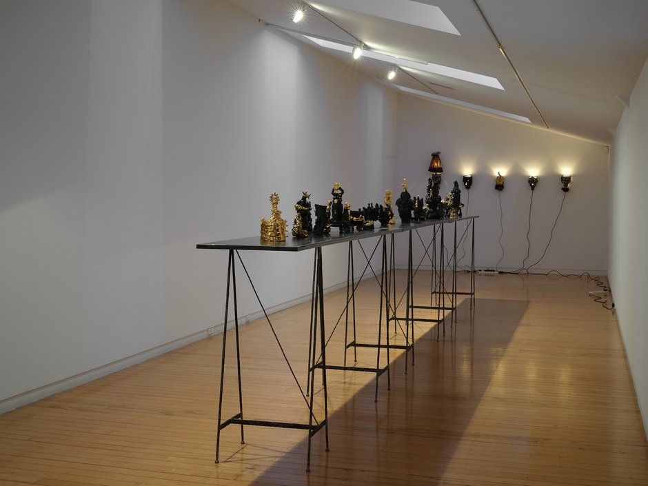
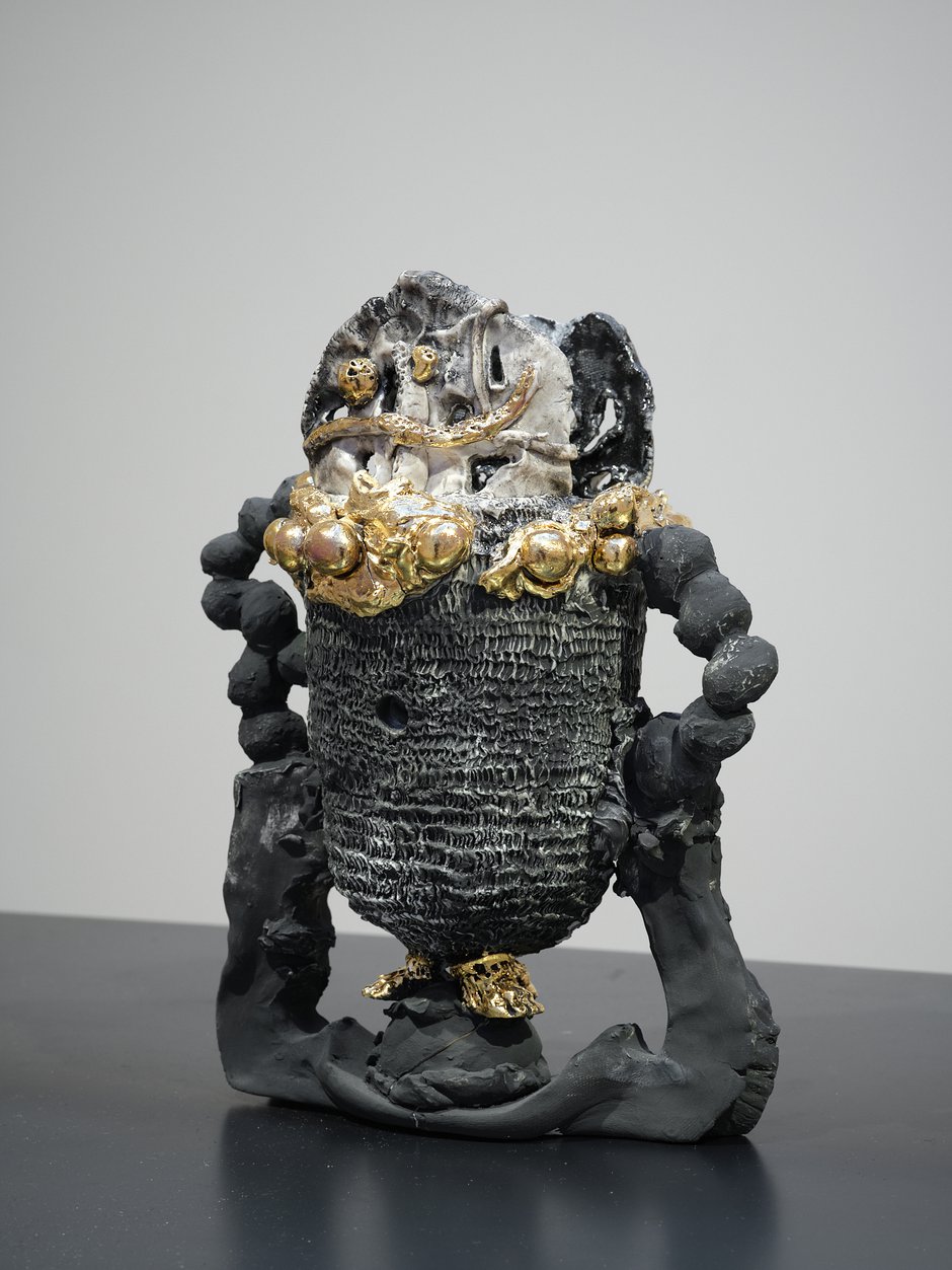
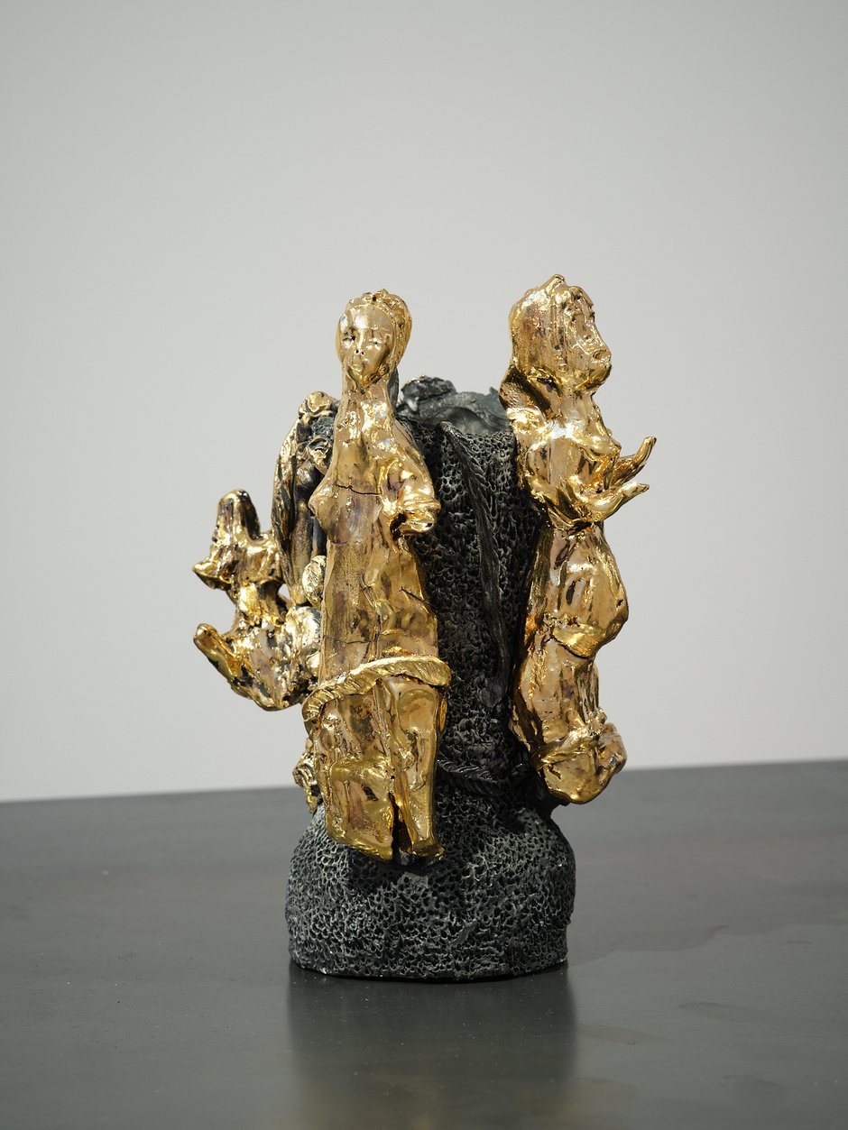
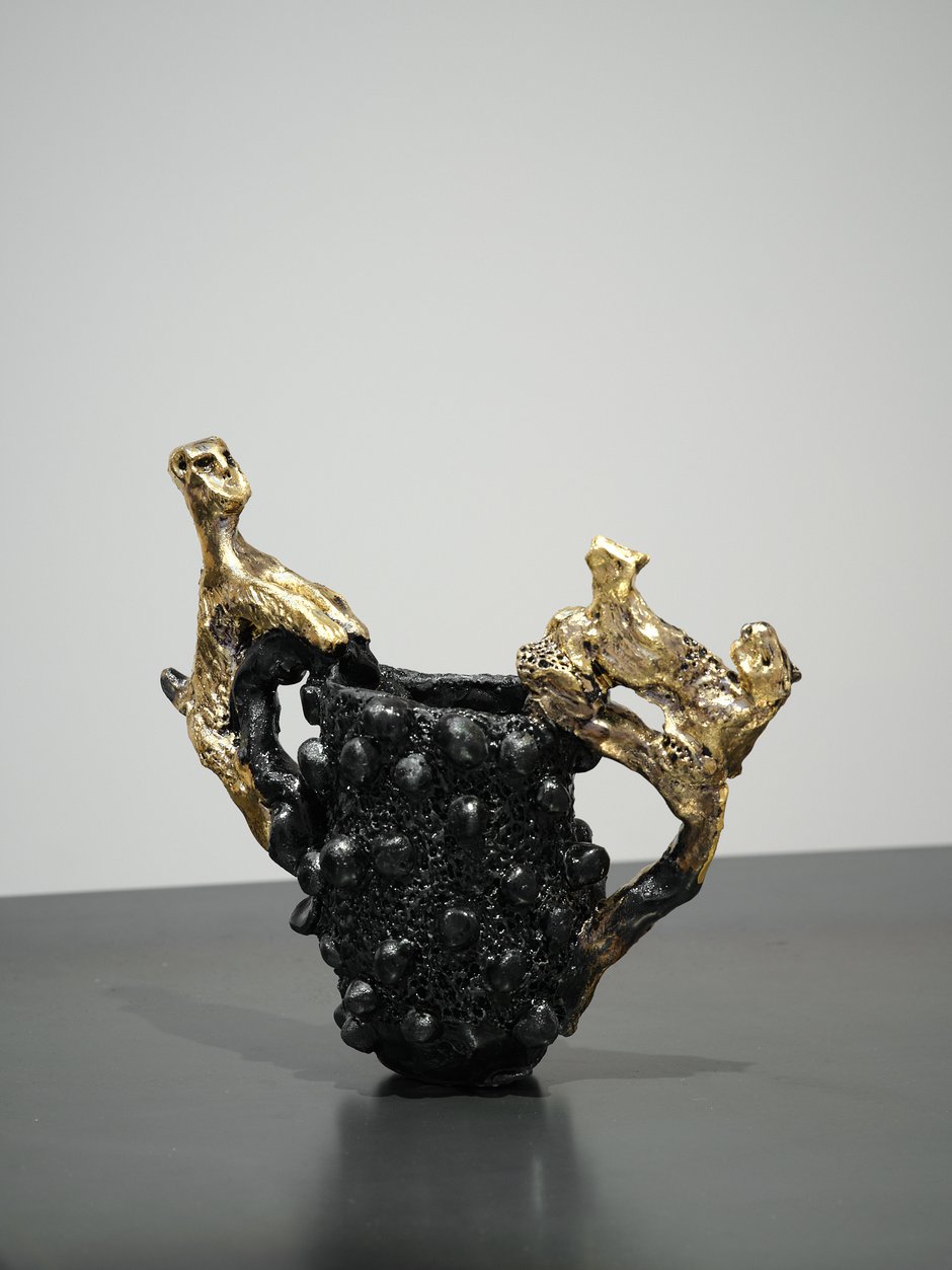
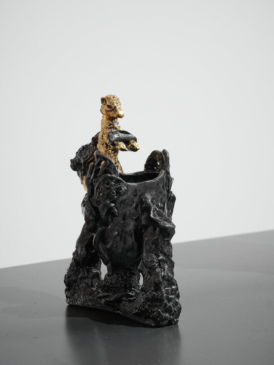
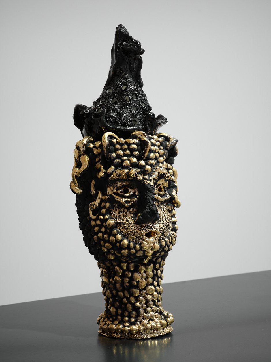
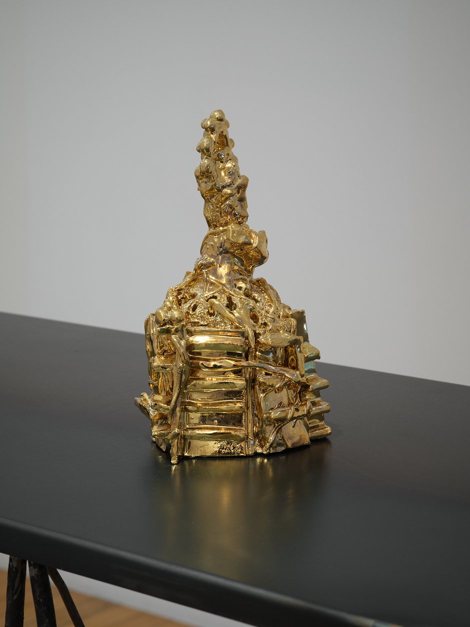
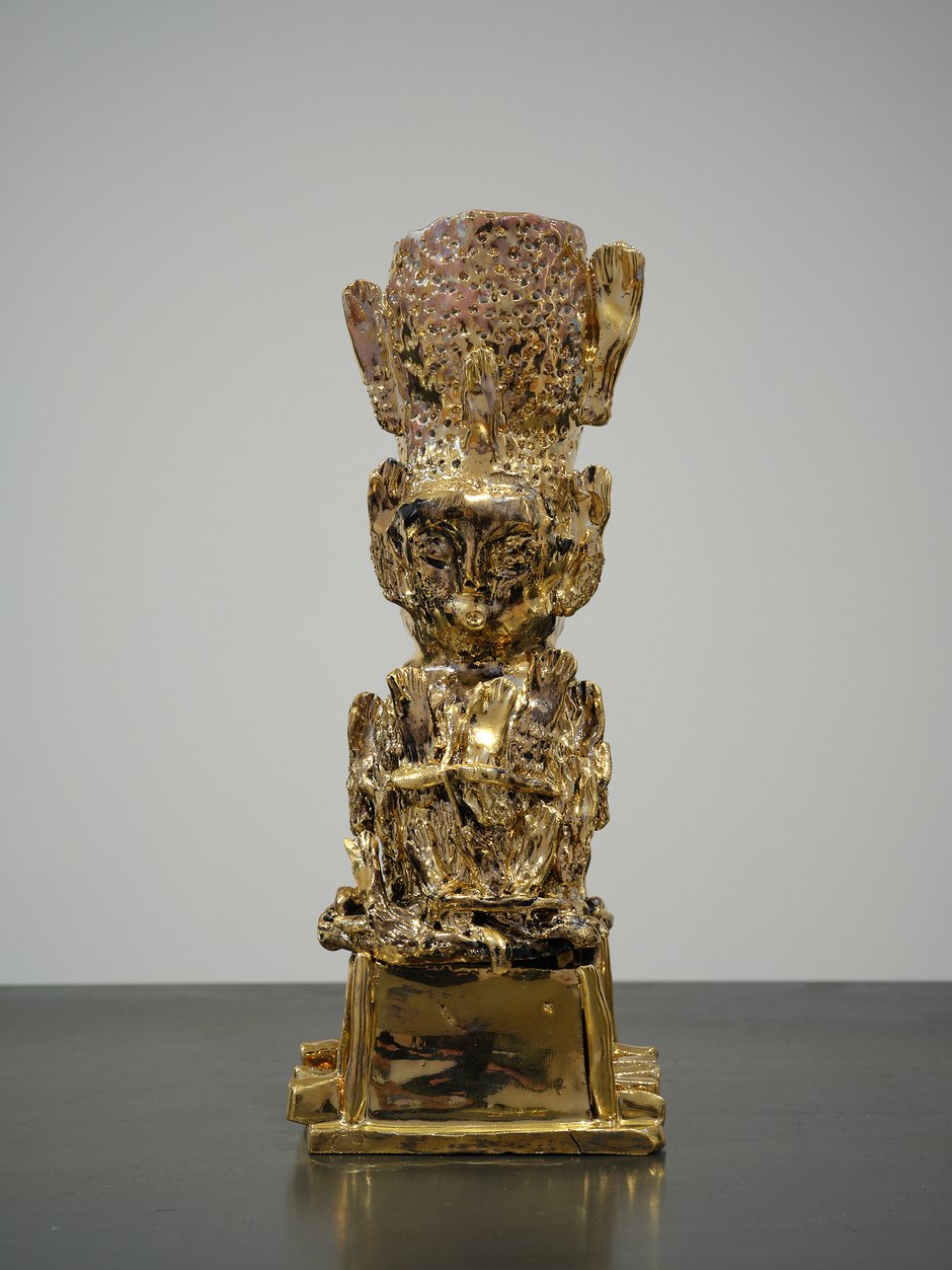
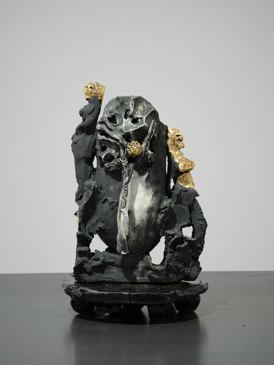
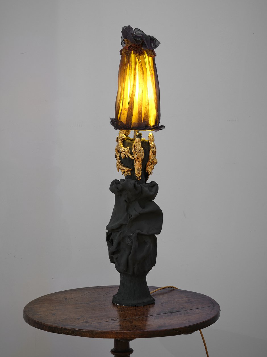
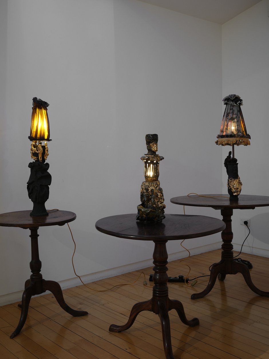
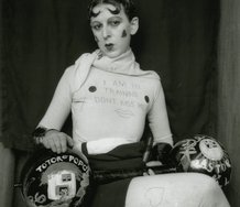
This unusual Nichola Shanley exhibition presents a range of strange (what I’ll call ‘Neo-Primitivist’ but devoid of sweetness) household accoutrements—vases, and lamps (with hand-painted filmy silk shades)—lumpy white porcelain sculptures coated in either glossy black, matte charcoal or gleaming gold lustre. Or in combination.
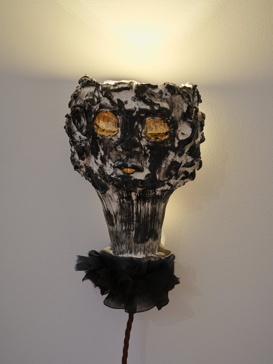
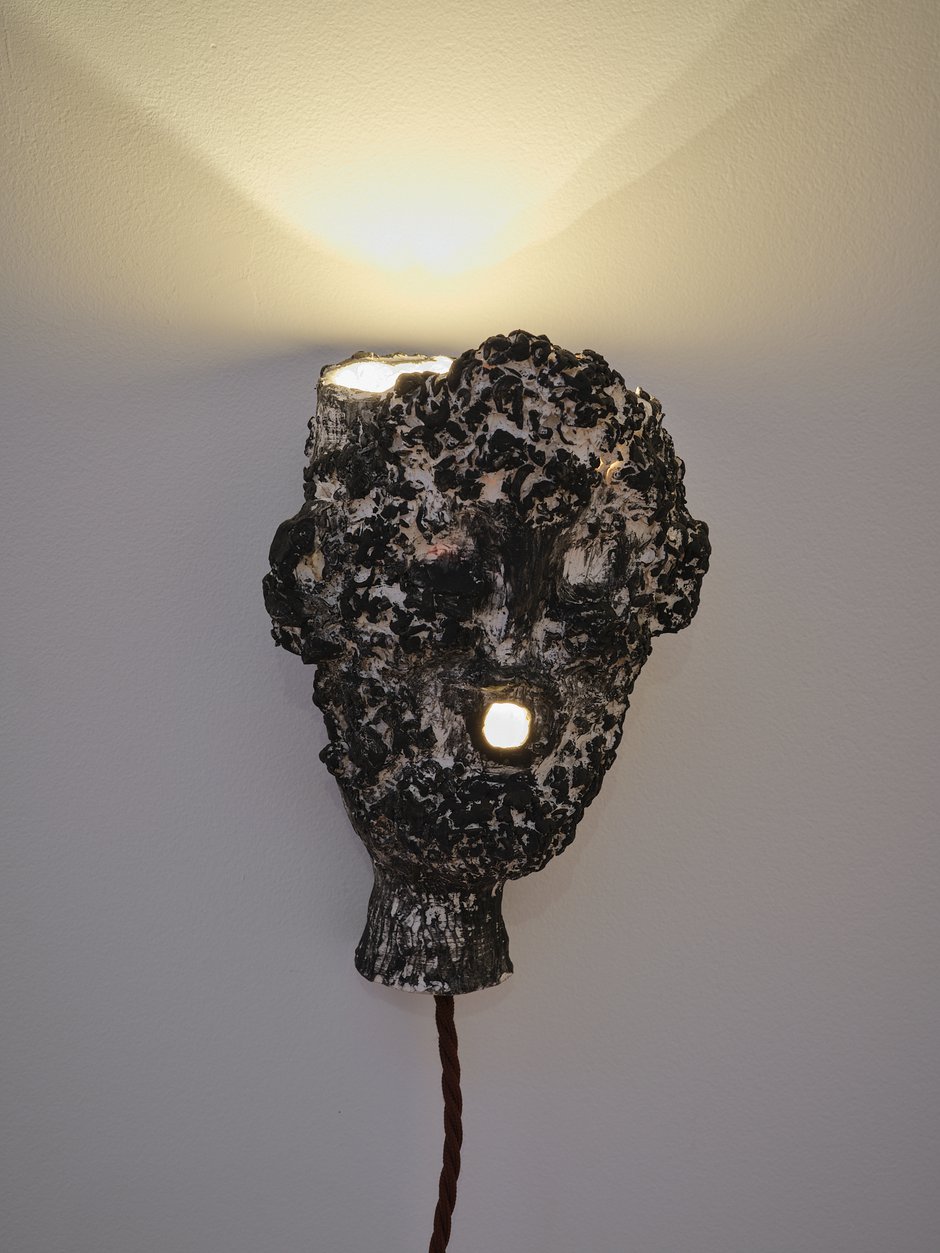
Although craft objects that use only two colours, they are clearly inspired by bronzes by artists like Matisse, Rodin, Daumier and SE Asian Buddhist art, as well as, most conspicuously, artifacts from ancient Crete that feature hollowed-out leopard or lion bodies and heads, and attached semi-naked human forms. These can be perceived as anti-elegant and deliberately clumsy. While the vessels used for the sacraments of the Catholic eucharist are mentioned in the artist’s gallery notes (explaining the gold) as inspirations, there is also an appealing pagan (pre-Christian) element within the references. Faces of feral animals, kings and female priests enliven these forms. Feminist connotations abound.
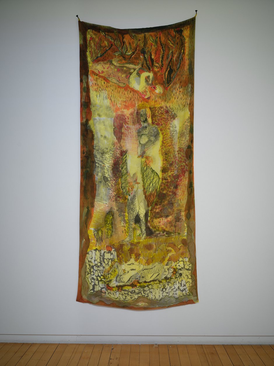
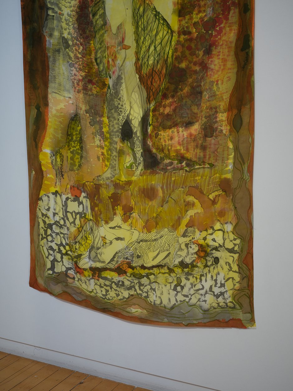
Two similarly ‘illustrative’ supplementary silk banners on the wall, depicting whimsically treated vertical figures emphasise the historical interests. One, via a pinch of Clairmont, shows an inverted figure wearing a turtle shell, and another, right-way-up, a spiderlike person who has twelve outstretched arms.
Being highly ‘manual’ in their deliberately rough execution, and cornily obvious in colouration, these ‘expressive’ ceramic objects are possibly made in opposition to academic or rarefied intellectualism, even though they are steeped in fin de siecle art history. The gold covering and black is somewhat tasteless; the forms too avoid finesse. In fact it can be argued, they celebrate cackhandedness.
These provocatively cloddish ceramics appear to be reactionary, but not neo-conservative. They are too determinedly oafish and over-the-top in their hammy nature for that, avoiding delicacy at all costs. As for architectural settings, such turbulently ‘emotional’ (even creepy) artifacts would easily fit in a dimly-lit, untidy gothic homestead owned by Miss Havisham, or maybe Norman Bates’ rambling house in Psycho.
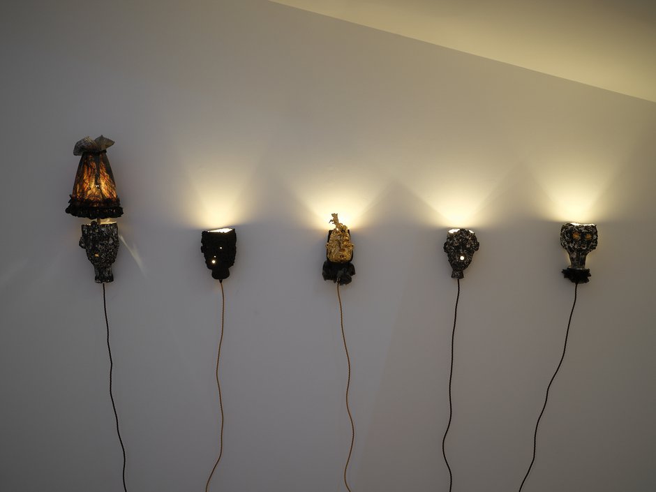
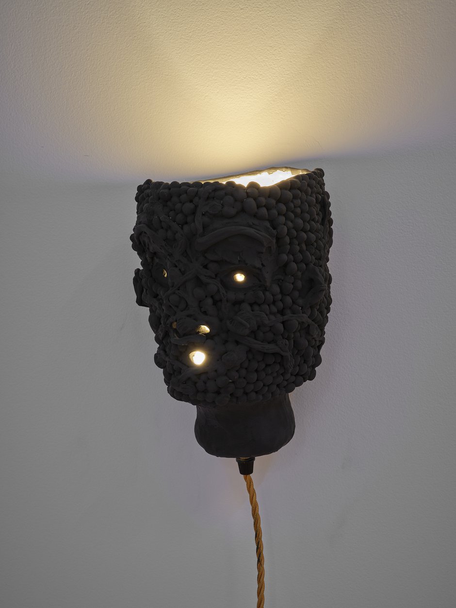
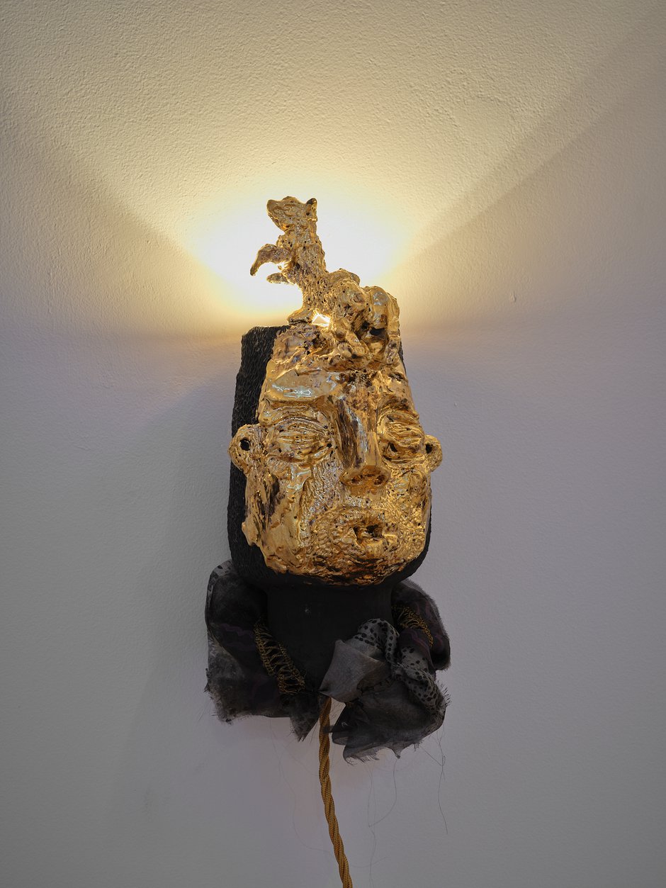
Amongst the works on the long table that dominates the narrow upstairs Two Rooms gallery, there are a couple of vases (For Looking, and Fragment Box) completely covered in gold lustre (with no black or grey) that to me seem gross because of their lack of chromatic sophistication. I much prefer three wall-lamps (Cowled Head, Remain, and Underneath) that feature large angular hollowed-out heads. Their decoration involves a white speckled texture with the porcelain peeping through—plentifully mixed within the flinty chiselled surfaces of the dark charcoal, staring physiognomies. They have an appealing intimacy and a cool direct gaze.
Shanley’s extreme presentation relies on its energetic codes for spontaneous feeling and emotional immediacy—via form, texture and not colour—devoid of analytic mediation. It could be part of a push against art that has become too word-obsessed, too articulate, and over-thought structurally, spurning technical finesse and conceptual complexity in favour of bulbous clunkiness. The sculptures’ incessant rawness is (despite the immaculate glistening surfaces) celebrated via overt traces of the shaping fingers. That implies a direct connection through heightened manual muscularity, linked to (if you believe they are separate) the heart instead of the head.
John Hurrell
Recent Comments
John Hurrell
Too 'woo-woo' huh, Julia? You might even be right, though I'm not sure what feminine work would look like these ...
Julia Morison
John, I am puzzled by your review of Nichola Shanley’s exhibition, The Agnes Dei Collection, at Two Rooms Gallery. It ...
 Advertising in this column
 Two Rooms presents a program of residencies and projects
This Discussion has 2 comments.
Comment
Julia Morison, 9:07 p.m. 16 September, 2024 #
John, I am puzzled by your review of Nichola Shanley’s exhibition, The Agnes Dei Collection, at Two Rooms Gallery.
It is an “unusual” contribution. You have described Shanley’s reduced colour palette of black and gold in the ceramics as “tasteless” and the execution cackhanded. One could, contrarily, choose to perceive these works as constrained and devoid of unnecessary technical fussiness; qualities that could be reasons to laud the exhibition, not condemn it.
Either way, it is undisputable that Shanley’s exhibition succeeds in evoking memories from classical times for the contemporary in a richly seductive contribution. It clearly provoked you.
This stuff certainly got under your skin. Is it too feminine, too ‘woo woo’, too gauche, too right-brain to be considered— seriously?
Ignore it, you can not and you have not. Your own response is heart-felt ‘feeling’ stuff, qualitative, denigrating and flippant. Your excessive list of highly emotive and derogatory descriptors, too numerous to count, is both revealing and ironical.
Currently, EyeContact might be the only site where there is any genuine critical discourse for the visual arts. I do thank you for the extraordinarily generous amount of time you give to considering exhibitions at your own cost. I would hope for more critical discourse, more support for writers.
However, in this instance, you are wide of the mark.
Julia Morison
John Hurrell, 10:07 p.m. 16 September, 2024 #
Too 'woo-woo' huh, Julia?
You might even be right, though I'm not sure what feminine work would look like these days. (I'm surprised you are so confident.) Lawd knows what masculine work would look like either.
One thing's for sure though, it is better to say what you really think than to avoid it. Surely it is better for artists and the art community in general to have honest responses, than no feedback at all.
And if artists can't defend their shows directly on sites like this, then they shouldn't expect credibility as exhibitors.
I'm puzzled why the emotional tone of my writing is such a surprise. Why would it be anything else? Readers would fall asleep otherwise. Passion surely (psychological investment) and skill in articulation of argument are the motors that drive convincing writing.
Participate
Register to Participate.
Sign in
Sign in to an existing account.