John Hurrell – 13 June, 2009
Almost all of the work here is about tactility of surface; sensual qualities of thinly layered coloured paint or ink within rectangles, parallelograms or line.
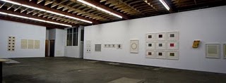
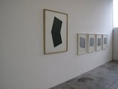
This Works On Paper show has a dozen artists participating and thirty-one items on display. Not all the works are purchasable: two (a Nauman drypoint and a Ryman aquatint) being on loan from private collections. Some of the works, like that of Ellsworth Kelly or Alex Katz, you rarely see in this country.
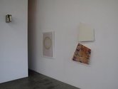
It is a good looking hang, with strategically positioned grids of prints arrayed amongst the rows of single items on the three mdf walls of the large downstairs space - and punctuated by the occasional lusciously painted block sculpture (on solid cardboard) by Elizabeth Vary.
Almost all of the work here is about tactility of surface; sensual qualities of thinly layered coloured paint or ink within rectangles, parallelograms or line. Two intriguing works by Winston Roeth of concentric circles are between Kenneth Noland and Ugo Rondinone in his use of that form. Impeccably spaced lines (dry tempera in one, soft fluffy pastel on coloured field in another) create their own internal tensions, but are not too big. They are intimate works that draw you in close to study the edges of their taut curved lines.
Taut but organic lines figure prominently in the suite of six 1993 Brice Marden etchings and aquatints (Han Shan Exit), a silvery grey homage to Pollock but even better. They feature a crisp thin wobbly line that is deceptively precise, used to create a superbly dramatic calligraphy that seems loosely wrapped around the human figure.
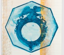
Callum Innes’s watercolours are like pages in an open book: transluscent layers of thin rectangular colour separately applied side by side and then over both. The dried watercolour pigment has left mottled ripples like those on the surface of a pool, but much much finer, with a delicate slightly cloudy chroma.
A drier stickier sort of surface, less liquid, is found in the aluminium and acrylic works by Stephen Bambury. They are of silver horizontal and vertical rectangles positioned at right angles to each other over a black square. Bambury inventively aligns the silver panels at different angles and alters the proportions of the black corners peeking through the intersecting edges. The surface quality of the silver paint has finely lined striations and smears, not so much scraped as direct application.
This is a good exhibition at Jensen - though perhaps it could have been more adventurous. It is very surface dominant, about seduction of the eye. One wonders about some of the non-painting artists this gallery shows like James Casebere and Tony Oursler and if they ever do preparatory drawings, and if so, on paper other than Arches. A scribbled text can be a drawing, and a brilliant writer like Oursler must make notes, and Casebere makes 3D models that surely he plans. The current display is a bit too much about finished product, whereas the rough and ready, more unpredictable processes of art thinking are immensely interesting too.
John Hurrell


 Advertising in this column
 Two Rooms presents a program of residencies and projects
This Discussion has 0 comments.
Comment
Participate
Register to Participate.
Sign in
Sign in to an existing account.