Peter Dornauf – 22 February, 2011
But there came an embarrassing point in the twentieth century when we simply ran out of newness. That stage was reached, some claim, back somewhere in the seventies when artists worried they'd reached a dead end and in order to move forward, started to advance backwards, reworking older styles and material, retracing their steps, making it newer, but differently.
Hamilton
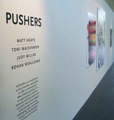
Judy Millar, Matt Heays, Rohan Wealleans, Toni MacKinnon
Pushers
Curated by Karl Chitham
12 February 2011 - 27 March 2011
MAKE IT NEW was the catch cry of modernism, contradicting the ancient sage who said there was nothing new under the sun. But there came an embarrassing point in the twentieth century when we simply ran out of newness (bigger, brighter, better) as artists exhausted every permutation, painterly and otherwise known to man. That stage was reached, some claim, back somewhere in the seventies when artists worried they’d reached a dead end and in order to move forward, started to advance backwards, reworking older styles and material, retracing their steps, making it newer, but differently.
The latest show at the Calder and Lawson Gallery (WEL Energy Trust Academy of Performing Arts) called Pushers, curated by Karl Chitham the University of Waikato’s Art Collection Curator, claims that his selection of artists are still making it new, setting an agenda that maintains the four on show present a challenge to “conservative notions of what painting is”. These are ‘pushers’ in the business, those who’ve gone beyond set conventions, bright individuals still carrying the torch for painterly innovation.
A quick look down the list reveals that the artists - Judy Millar, Toni Mackinnon, Matt Heays and Rohan Wealleans, do in fact represent elements of the avant garde in New Zealand painting circles.
Millar herself was one of the two New Zealand 2009 Venice Biennale representatives. But how much pushing is really going on here? Take the work Untitled, 2010, (acrylic and screen printing ink on canvas). For starters it comes straight out of the American Abstract Expressionist school of the fifties and does little more than what Pop artist Roy Lichtenstein did with it a decade later in his parody of the brushstroke, enlarging it so that we see it in all its gargantuan form for our delectation. Looking at Millar, ones sees Lichtenstein’s Big Painting V1, 1965, with little advance. The process is certainly different, subtractive rather than additive, but the look is much the same; a delight to look at but extension of boundaries is a mute point.
Abstraction of the cooler kind comes courtesy of Matt Heays. His canvas, Shift/Tilt, 2010, is sliced up into flat crisp geometric forms according to some mathematical equation. One cannot help but think of Mondrian or Malevich with their striving for purity a hundred years earlier. Heays does add long thin painted wooden stakes which lean up against the wall in close proximity to the work. Does that qualify as “pushing”? Not if one recalls the constructivist, Vladimir Tatlin and his Corner Counter relief of 1915, or Joseph Beuys with his pieces of dowelling propping up a stuffed hare from the early sixties. There’s more pulling than pushing going on here.
Toni MacKinnon presents the perennial trick of collage with found materials, a trope that reaches back to Dada. They are pretty works using a combination of gouache and digital print in engaging ways, but are hardly revolutionary. Modernism is employed and played with but not surpassed.
Rohan Wealleans technically is the biggest pusher of them all. If you prefer your art to look something like a picked scab, then he’s your man. Having seen this stuff before, one quickly tires of it unless you happen to be one of those curious individuals (pre sunscreen days) who loved pulling strips of peeling skin off the backs of fellow bathers. On viewing these viscous works, one is darkly reminded of Carrivaggio’s Doubting Thomas (The Incredulity of Saint Thomas), probing finger drilling halfway down inside the gaping wound of a post crucifixion Christ.
The exhibition as a whole is sensitively hung and a nice combination of contrary styles, but to call the space a gallery (even to give it a name) seems a bit rich. It’s just a corridor, an entranceway leading to the reception area. Still I suppose we should be thankful for small mercies in a town where art of this quality and kind is on the endangered list.
Peter Dornauf


 Two Rooms presents a program of residencies and projects
 Advertising in this column

This Discussion has 0 comments.
Comment
Participate
Register to Participate.
Sign in
Sign in to an existing account.