John Hurrell – 29 July, 2012
Impossible to photograph, these works are strangely cinematic or a variety of performance - focussing on you, your movement, your eye position and bobbing head, your intuitive assessing of the slowly changing natural light source at each particular moment - as you make ocular sorties from the edges into the centre and out again.
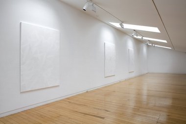
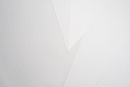
This exhibition of four paintings on canvas upstairs at Two Rooms is a typical Shin exhibition with its angular and slivered geometry, delicate raised shape edges, triangular sheen and tonal control. Although made during her recent residency in Seoul, they riff off precisely the same pale grey that covers the gallery walls behind the stretchers, and are cognisant of the proportions of the walls dictated by the architecture. Shin lets you bodily engage with the work so you discover the best angles with the light for exploring her glossy triangular formations, obtuse and acute angles, and softly matt, irregular polygons.
Impossible to photograph, these works are strangely cinematic or a variety of performance - focussing on you, your movement, your eye position and bobbing head, your intuitive assessing of the slowly changing natural light source at each particular moment - as you make ocular sorties from the edges into the centre and out again. They make you self conscious about your procedure in examining Shin’s canvases, spotlighting your own processes of looking and stretching your memory of constantly shifting evanescent sensation.
There are two sizes of canvas hung on two different sized walls: three works to the right, a single smaller canvas to the left. The smaller work has humour in that from a distance the detectable shapes look like diagonally applied, wildly impulsive brush marks, which when you catch the raking light suddenly snap into a field of hovering triangles ordered like a formation of horizontally aligned Escher ducks. The gloss over this positioned geometry brings an abrupt layering - a floating - different from the integrated, more woven, angular surfacing achieved with paint mixing and planning that lies beneath.
Shin’s larger works look based on permutations of folded A4 paper sheets where the doubled over planes overlap and differentiate using five subtly contrasting tones - as she did in the Artspace stairwell. The shapes within the smaller single painting in turn seem based on a sheet larger than A5 but less than A4, and have a different mood, one that contemplates the act of manually making marks. It could possibly drolly refer to the use of easels and vertically supported planes.
I like the thickness of Shin’s stretchers, the way they project out from the same coloured supporting wall as thin grey slabs, that they are objects not images embedded in the architecture - as a mural might be. Their palpability is muted and restrained, a light feathery sharp-edged caress; a pulsing planar flickering that is always insistent.
John Hurrell



 Advertising in this column
 Two Rooms presents a program of residencies and projects
This Discussion has 0 comments.
Comment
Participate
Register to Participate.
Sign in
Sign in to an existing account.