Kelly Carmichael – 25 December, 2012
I guess the typeface I feel ‘closest' to would be Joseph Churchward's ‘Marianna', as I spent a good part of a year thinking about it, writing about it and using it - all simultaneously. It was interesting to look at something quite specific, a particular work, and try to work outwards from it; I could compare the process to something like going through a prism, leading me to many different places and considerations, then always back to ‘Marianna' herself.
David Bennewith
INTRODUCTION:
New Zealand born/ Amsterdam based David Bennewith is a typographer, thinker and writer exploring subject of design. A graduate in Typographic and Graphic Design from the Werkplaats Typografie, Arnhem, he is currently a researcher in design at the Jan van Eyck Academy, Maastricht, and also works under the moniker Colophon. Although based in Amsterdam, Bennewith has kept a firm New Zealand connection, most visibly though his collaboration with NZ/ Samoan alphabet designer Joseph Churchward and his recent publication presenting an overview of Churchward’s work. Designer of those tricky shrinking letters on an eye-chart (‘Churchward Normal’) and the typeface of the Lonely Planet logo (‘Churchward 70’), Joseph Churchward [b.1932] is having a well-earned Renaissance, thanks to the interest of David Bennewith.
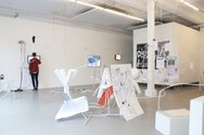
Note: This is an interview published in two parts. Part Two gives David Bennewith the chance to reflect in depth on his recent exhibition *Latent Stare*, a Casco initiated project exploring the practice, methods and messages of type-design. Inviting proposals from all those interested in the form and production of the published word - including artists, linguists and toponymists (those who study the origins, meanings, use and typology of place names) - *Latent Stare* is also a research structure that is currently hosted at the post-academic research institute the Jan van Eyck Academie, Maatstricht until the end of December, 2012. The research structure currently includes three researchers: Vasilis Marmatakis, Roman Gornitsky and Christoph Knoth, who are all working on projects that have bearing on the discipline of type-design. In addition, Part Two of the interview delves more deeply into the nature of typography and how it might approach the metaphysical.
Kelly Carmichael - There is something about typography that reminds me of Japanese haiku. In a sparse three lines and only seventeen syllables, haiku - so suggestive, stylised and evocative - manages to not only isolate a mood but also subtly draw the reader alongside and into sharing the poem’s emotional landscape. In much the same way typography imparts feeling and emotion to communication, making language visible and becoming implicit to our understanding of and attitude towards the text. What prompted your interest in design & typographic design?
David Bennewith - An interaction with a computer in 1999, while I was studying for my Bachelors in Photography at Elam describes a sort of ‘special’ moment towards my sustained interest in - and awareness of - typography. At the time I was busy and preoccupied with making photograms [contact prints straight onto light sensitive material] by ‘drawing’ forms in the vector-based computer graphics application Freehand, then using these out-put forms in the darkroom for printing. A pretty convoluted process… that was partly motivated by a disinterest in computer applications like Photoshop. I had decided Photoshop was only an image ‘cleaner’ and, I guess, I was [naively] trying to be a kind of ‘purist’ in photography - trying to understand in a personal way the film, lens and paper-chemical [analogue] material I was drawn to. Somehow the vector-based applications in the computer seemed more attractive to me, lighter. Through using Freehand I discovered that you could convert digital (typed) letterforms, texts, to outlines… and this conversion - from a selectable rendering to individual points and Bézier curves (exposing the border of a letter) - gave a very different, maybe figurative, ‘materiality’, or malleability, or manipulability to letters that I hadn’t previously noticed in a digital environment. Letters that previously seemed ‘acceptable’. I felt like the forms I had been drawing and investing in for photogramming could be like letters (with burnt edges). This opened up many possibilities in typo/graphic arrangement and meaning to me. In retrospect it was like finding out how, in practice, language production is mediated by many kinds of devices that render communication. And that these devices and applications are usually marketed as creative tools.
KC What prompted you to start Colophon and how does the organisation operate?
DB I decided on the name ‘Colophon’ in 2004, while I was working as a graphic designer at Inhouse Design in Auckland. Back then it was just a name that I could produce and publish non-commissioned work under, then it became more ambitious… The name is a bit corny, a bit literal, on reflection. But I prefer working under some semi-arbitrary name, as opposed to using my given name, for example. I also settled on the name when a (graphic designer) friend of mine thought it sounded silly when spoken: “Colophon”, “Colophon”. I guess it kind of does sound silly, like trying to talk with a mouth full of mashed potatoes.
I’ve always been attracted to having an independent practice, something that I can try to develop or grow and something that is susceptible to risk and failure. So, with Colophon I try to find a balance between commissioned work and more ‘initiative’ [for want of a better word] work that directs a specific interest in graphic design, more specifically type-design and typography. One thing supports the other, through different forms of exchange and vice-versa. Lately I’m finding this meeting can be kind of uncomfortable as it can produce slightly schizophrenic feelings. The upshot being that I start to find it harder to place myself within a commission, which is a pretty important part of my job as a graphic designer, but perhaps should remain open for negotiation… On a more physical level Colophon is situated in a shared studio space in Amsterdam and it’s usually can be an intern and me, but mostly it is just me.
KC - What was the first typeface you fell in love with? Is there one you feel is overrated?
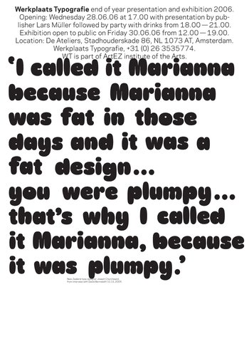
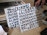
DB - I guess the typeface I feel ‘closest’ to would be Joseph Churchward’s ‘Marianna‘, as I spent a good part of a year thinking about it, writing about it and using it - all simultaneously. It was interesting to look at something quite specific, a particular work, and try to work outwards from it; I could compare the process to something like going through a prism, leading me to many different places and considerations, then always back to ‘Marianna’ herself. For me it was a really worthwhile exercise and something that definitely has informed the way I approach things at this present moment. There are plenty of typefaces I feel are overrated but this is maybe more a question of practices - not so much results - I’m interested in.
KC - In the documentary film Helvetica, German designer Erik Spiekermann said that a nation’s culture, the stuff that surrounds us, is made of good architecture and building, good food and cafes and supposedly inconsequential things like the small type in timetables for public transport or the signs in stations. How you see NZ stands in this regard?
DB - I don’t know if I can agree with Spiekermann’s quote. I’m becoming disheartened with the use of the word ‘good’ in regards to design - it’s too easy and represents a very routine kind of rhetoric used by designers who just want to squabble about taste. Because of this ‘good’ and ‘bad’ are pretty much inter-changeable terms in Design. The consistent use of these kinds of adjectives reflects [badly, I think] on the discipline itself. I prefer the idea that the qualities that define a work, or a design, being the variant levels of attention and thought put into it. I think I’m interested in practice, not good-ness.
It is interesting and telling that the things singled out above are manufactured or processed things, things that perhaps place us above the world - our humanistic project. I’m sure he is not discounting them but other things contribute as much to a nations culture and inform the design of things: thoughts, speech, smell, taste, folklore, rules, laws or atmospherics, to name a few… Only regarding an outcome doesn’t help to discover a true conception of a thing or an object - and has only capacity for a limited kind of dialogue. Which, I guess, is a quality most required of a designed thing nowadays. Designers seem to excel at hiding things.
I prefer to think a design can ‘inform’ things (inspired by the ideas and writings of philosopher Vilém Flusser), that what informs something is a myriad of different factors that are edited or contrived in someway towards an outcome. This means to me that design is not conditional, but a process; that has derivative social qualities, not its reverse. A design can be an experiment that is susceptible to failure, provocation or directness, or can lead to something surprising or unexpected. This is a design that values risk, not platitudes.
I couldn’t say how New Zealand stands in this regard; it is too general a question. But there are some great initiatives happening in New Zealand that are exploring and testing established boundaries of graphic design, like The National Grid and its contributors; projects by Split/Fountain, Warren Olds, Kelvin Soh and Nell May come to mind as well.
KC - You live and work in Amsterdam and I have recently been working in the Arab world where I became aware of the bilingual typographic needs of contemporary design. As we all increasingly work within a global context, how do you address the larger role of typography within contemporary culture and multilingual, multicultural environments?
DB - I don’t really feel qualified to answer this question, as I only work with the Latin alphabet. I also know very little about Eastern scripts. But I have noticed that a lot of digital type foundries are directing their production efforts towards the growing markets to their East. The last few years I’ve been slowly learning Dutch and sometimes I have to deal with bilingual texts (Dutch/English) in commissioned work. Through this I have learnt that the organisation of a language has a strong connection to ideas in the culture. That the way things are said (or typed) can reflect basic values or habits of a society or a nation, via inherent ideas informed by histories, gestures, organisations, productions, etc. I guess what I’m trying to say is that particular morphologies can be produced through language production and sometimes, quite often, you can find these ideas in a made object.
KC - This is really intriguing…. can you expand a little and give examples of these made objects which reflect this?
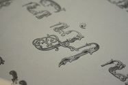
DB - A typeface (of course) could be a good example of this, like those referred to above. An example that was a contribution to the *Latent Stare* exhibition was historian and designer Jo de Baerdemaeker‘s essay and supporting type specimen showing a decorated display typeface designed and produced in Holland for the [former] Dutch colony of Java - the ‘Gefigureerde Javaans Alfabet’ (Figured Javanese Alphabet), produced in 1833 at Joh. Enschedé & Zonen typefoundry. The Joh. Enschedé & Zonen typefoundry was one of the Dutch companies who, at the time, were making a lot of money supplying type and printing machines to the rest of the world. The flora and fauna ‘decoration’ covering the Javanese letters evoke an emphatic symbolism of European tradition, popular in advertising at the time. The decoration appears to grow over and smother the letters and, in parts, even penetrates them; perhaps producing a metonymic representation of a colonising process. Looking at this work from the present day’s perspective, it might show us that: If something is proving difficult to naturalise, conceal it. I don’t think this kind of typeface would be made nowadays, or if it was it would be approached very differently, which makes it an interesting comparative example.
Retrospectively, objects refer to a specific time period in which they are made [and are somehow preserved], and return as anachronisms. But they are still culture and this somehow defines their accessibility. Production has to invest in form at some stage and this investment mostly becomes a matter of [familiar] choices.
KC - Futurist and Dada artists have been singled out for their brilliantly innovative use of typography that blurred the boundaries between visual art and literature. They were so interested in typography and its affects, and their use of it so shook up the conventional graphics of publications, that it has been called a ‘typographical revolution’. Is there a contemporary equivalent?
DB - That is hard for me to say, revolution is perpetual. But, the movements you refer to seemed to capture and crystallise a certain moment, perhaps in isolation.
I could suggest a few practices that I really appreciate and find inspiring at the moment that happen to be in type-design. These are the work being done by Frank Adebiaye with his open-source typefoundry VTF, computer scientist Luc Devroye‘s archives of type-design practices, histories, politics on his self published and maintained website; the developments in type-design being made by people using scripting and coding in search of complex parametric type-designs, like Christoph Knoth‘s work in *Latent Stare*. This latest technical development (that will probably never eliminate the designer) will give the user more formal control over the typefaces they might like to use, coalescing the appearance, function and perhaps (as you previously suggest) confidence in their writing and typing. Something Frank Adebiaye once intriguingly described to me as ‘extensive writing’.
Recent Comments
John Hurrell
Readers interested to know more about David Bennewith's book design - particularly his involvement with two publications by Ruth Buchanan ...
![Gefigureerde Javaans Alfabet (cut by Gottlieb Schlegelmilch at the Joh. Enschedé & Zonen typefoundry), 1883; reproduced in Oostersche schriften, Joh. Enschedé en Zonen, Lettergieterij - Haarlem, [ca. 1913], 302mm x 208 mm (closed format).](/media/thumbs/uploads/2012_12/04_JdB_DSC_0029_Colour_Sharp_165_jpg_380x125_q85.jpg)
 Advertising in this column
 Two Rooms presents a program of residencies and projects
This Discussion has 1 comment.
Comment
John Hurrell, 7 p.m. 25 December, 2012 #
Readers interested to know more about David Bennewith's book design - particularly his involvement with two publications by Ruth Buchanan and Simon Denny - will find Laura Preston's article 'The Book as Scripted Space: Alterations, Ruth Buchanan and Simon Denny' in the latest Reading Room (2012, #5) particularly valuable. http://www.aucklandartgallery.com/library/reading-room-journal/issue-5-2012-the-space-of-reading
Participate
Register to Participate.
Sign in
Sign in to an existing account.