John Hurrell – 22 July, 2013
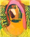
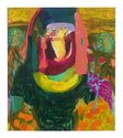
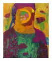
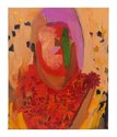
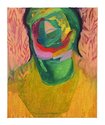
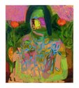
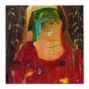
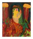
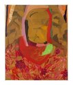
In each woman's head, in the space beneath the hairline and above the neck, Farquhar has inserted other spontaneously invented worlds, abstract compositions of swerling brusherly sweeps or hovering clusters of ‘erratic' marks.
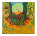
This is Nicola Farquhar’s second Hopkinson Mossman show of female portraits, works that with their thinly applied but densely modulated painted surfaces exude a sense of Symbolism blended with Fauvism: Symbolism in the sense of the pointed incorporation of flowering plants - as in Shakespearean flora - and Fauvism in its abandoning of conventional physiognomies and colour, incorporating instead brusherly sweeps or hovering clusters of ‘erratic’ marks.
Thus in each woman’s head, in the space beneath the hairline and above the neck, Farquhar has inserted other spontaneously invented worlds, vaguely related (I think) to some of the postcard / film still portrait pairings of collagist John Stezaker where landscapes invade each subject’s cranium. Although there is a Surrealist air that links some of Farquhar’s works to (for example) those of Julian Hooper, the mood seems to be contemplating the Self, a rumination on identity, or perhaps - avoiding Culture - Woman as an elemental force of Nature.
There is also an oft repeated symmetry in the backgrounds reminiscent of Rita Angus’s self-portraits, such as single flowers visible behind each shoulder: botanical images of implied personal significance.
The works now seem to have more overall unity and confidence. They are more intricate than previously, with finer, more delicately rendered forms and occasional Vuillard-style leaf patterns. This new, busier, more worked approach over the last two years has created a restless energy that is more decorative and less feral, more fluid and less rigid. Not so psychologically intense, though organisationally more complicated. It is a far better show than last time. Less cliche bound.
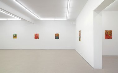
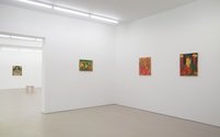
In Hopkinson Mossman’s space however the paintings seem a bit out of place. They would probably work better in a more intimate domestic environs with closer walls, coloured backgrounds and hanging drapes. Indeed Farquhar has quite sensibly introduced some stools for viewers wishing to linger, though the actual modernist architectural ambience is unaltered. Here with the clean white background and wide floor, larger works like Emily and Denise are more successful, their greater surface area enabling the marks and coloured shapes to be less pinched and confined, the bigger images having added presence and weight.
Amongst the slightly smaller items the two most striking paintings are Rachel and Julie, the former because of its expansive simmering colour and ornamental liquid plant forms, the latter because of its Ernst or Hodgkins-like inventiveness with angular shapes and textures. Rich in detail with deftly considered placement of shape, these highlights from Farquhar’s lively show have an exceptional freshness that places them apart from the rest: paintings that all together keep exploring and restlessly evolving.
John Hurrell
 Advertising in this column
 Two Rooms presents a program of residencies and projects
This Discussion has 0 comments.
Comment
Participate
Register to Participate.
Sign in
Sign in to an existing account.