Daniel Webby – 13 February, 2014
The new on offer here is not that of the category collapse of life and art posited by certain 20th century art movements, or a more pragmatic 21st century “participatory art” position, but rather functions as something of a conceptual conceit, a turning of the social practice paradigm in on itself (with social potential diminished), in order it would seem, to provide greater agency to the objects being presented.
Auckland
Sam Thomas
New Gallery Models: Assured Quality - Discreet Service
22 January - 22 February 2014
New is such a bald descriptor. Declaratory, unambiguous; laying claim to the contemporary while simultaneously describing a path toward obsolescence. Forever New, an Australian clothing retailer with a presence in the Sylvia Park shopping haven provides an optimistic solution to this paradox, assuaging consumer anxieties arising from the ephemerality of fashion with its efficient branding epithet. Last season’s inertial end of history line becomes this seasons static optimism, spelt out above the entrance in glittering chromed plastic studded with small LED lights.
And this showroom logic, the incitement of desire toward the new, with its attendant images of consumer log jams queuing to be first to possess the latest iteration in a product line, seems a useful point of entry into Sam Thomas’ New Gallery Models at PLAZA - an artist-run space not far from the cafés and bars of Kingsland.
Who would argue that the promises of a new model are not compelling - higher resolution, more power, less power consumption, enhanced usability, reduced environmental impacts and, of course, with additional features. Accordingly, Thomas has delivered a feature packed model for PLAZA.
In reductive terms, the layout of Thomas’ exhibition is conservative; paintings hung at regular intervals around the available wall space, an object discretely suspended from the ceiling above. In this model, at first glance at least, the new has been featured by way of a transactional drop box, built into the wall between gallery and adjoining studio spaces.
The drop box itself provided a means for serving drinks on the opening night, with visitors required to call an unseen (and voice distorted) host via a modified intercom system. Without active engagement to attest to function, the utility of the feature is carried by way of a scrolling LED sign, imploring viewer-come-user to “press buzzer for service”. The scenario brings to mind the after-hours, hands-off interactions afforded by 24hr service stations, although in this case with zero visual apprehension possible between attendant and attendee. As detailed in the exhibition ephemera, discretion is assured. In contrast to notions of conviviality commonly found in art which purports to deal with themes of social relations, Thomas’ relational feature wall is conspicuously antisocial, in attitude if not appearance, with the unselfconscious DIY construction and use of repurposed technology presenting an affable character to the proposal.
While not incendiary in the manner of Christoph Schlingensief Thomas’ drop box is something of a provocation. To return to the showroom analogy, the new on offer here is not that of the category collapse of life and art posited by certain 20th century art movements, or a more pragmatic 21st century “participatory art” position, but rather functions as something of a conceptual conceit, a turning of the social practice paradigm in on itself (with social potential diminished), in order it would seem, to provide greater agency to the objects being presented. In this sense there is a reactionary quality to the exhibition, a certain turn away from any allusions (illusions?) that the gallery space is capable of producing novel contexts with which to reconsider social relations; and in so doing, a turn toward the streamlining of the underlying commercial premise of a gallery, allowing for the uninterrupted consumption of the objects on display. Total browser anonymity inside a self-service modality.
The PLAZA gallery space is a double-height warehouse-cell with exposed cinder blocks and steel trusses bearing down from above, giving a sense of compression to the white space delineated below. This compression adds to the perceivable weight of the wall mounted works in the show. A chandelier made of plastic grapes and LED lights is suspended overhead and provides relief to this compression, bridging the containment beneath with the empty volume overhead. It isn’t immediately clear what light the chandelier sheds on the other works in the room, although in relation to banana chandeliers Thomas has previously exhibited, the plastic grapes can perhaps be read as an attempt to cater to the palate of a different (more refined?) cultural consumer.
On the far wall, unusual objects float in the foreground of two separate paintings. Both objects are set against the incongruous backdrop of a fir tree lined snow covered path, leading to a snowy mountain range. The palette is simple; two flat tones of green, white, and the exposed metal of the support. Without the objects in the foreground the scene is reminiscent of a 1950’s chocolate box painting, possessing a certain generic European-ness emanating from a cultural memory I don’t directly possess but seem to indirectly access nostalgia toward. The objects in the foreground have been described by punching indentations into the surface of the metal, creating a slight bulge to which paint has been applied. This technique was witnessed in artisanal workshops Thomas visited while travelling through India. The depicted objects oscillate between sculptural and ceremonial ambitions, conjuring a relationship to non-specific indigenous traditions, in the spirit of Henri Gaudier-Brzeska via The Simpsons. Both paintings are set in stained wooden frames embellished with diagonal striations, marks produced with mechanical precision at odds with the uneven, hand-crafted quality of the paintings themselves.
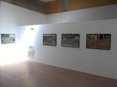
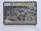
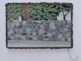
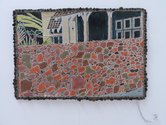
On the opposing walls, images, again produced with the folk art inspired technique of punched metal, describe flattened suburban settings dominated by large stone walls - glimpses of ubiquitous Auckland villas just visible behind the imposing structures. The palette is muted, greys and browns are prominent and the paint is thinly applied. There is a sense of urgency in creation strangely at odds with the constancy of the depicted scene. This tension is mirrored by the opposing sensibilities of the high stonewalls themselves; bold in raw material presence, timid with reference to the invisibility sought by those living behind. The works have been mounted in cement frames studded with scoria. Not a light touch, but in the language of the exhibition, precisely heavy handed.
The homes depicted in these images are from Auckland’s infamous “double grammar” zone - the holy grail of high property prices underwritten by guaranteed access to two of Auckland’s more prestigious secondary schools; the cycle of cumulative advantage writ large. The depicted stonework flirts with abstraction, lending levity to the perceptible labour of the image construction. These images have been built methodically, idiosyncratically, dent by dent, stone by stone, and seem less concerned with attesting to the skill of the maker as to a sense of the maker’s industry.
As a demonstration model this exhibition can be considered in several ways. There is the assemblage of divergent dispositions as object, conceptually cohesive by way of the internal conflicts described above. Equally, each disposition can be read as an independent effort to locate a mode of address within a marketplace beset with internal contradictions; let it be or maybe it should be otherwise, in either case currency is required in order to proceed. The language employed by Thomas is one of mixed metaphors, half-way states and double-handed gestures. Earnest in its declaration of ambivalence toward an internationalist contemporary, Thomas’ New Gallery Models reads as a material and pictorial working through of the psychic space afforded under various globalisms - overdetermined economic realities as landscape, dislocated cultural memories and traditions as portrait. Seriously goofy stuff.
Daniel Webby


 Advertising in this column
 Two Rooms presents a program of residencies and projects
This Discussion has 0 comments.
Comment
Participate
Register to Participate.
Sign in
Sign in to an existing account.