John Hurrell – 24 April, 2014
The Port appeals because of the juxtaposition of Wells' vividly descriptive language discussing 'time travel', with allegedly timeless landscapes, ‘eternal' natural forces, evocative solar and lunar imagery and stellar observational ramps; its strange synthesis is compelling.
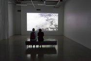
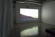
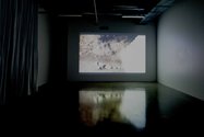
The Port is a surprising project for those expecting a sequel for last year’s This Fine Island, Hipkins’ short film based on Charles Darwin’s account of his stay in the Bay of Islands in 1835 - though there are thematic connections. It uses a loop format - instead of a straight forward synchronised narrative - with sound and image reliant on two separate loops of differing duration. This causes the voiceover and (subtly) moving image to change their positions whenever each cycle is repeated, for there is about 3 minutes difference between the two. The relationship between sound and image is not only unpredictable, but the appropriated written texts and filmed images are better too. Less contemporised mocumentary and more playful; less diaristic and more constructed fiction.
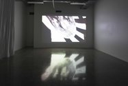
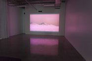
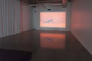
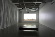
Hipkins’ new film is in St Paul Street’s Gallery Two as part of his Leisure Valley exhibition. It has a voiceover that uses text from H G Wells’s 1895 novella The Time Machine, blended atmospheric portions taken from several chapters (mainly the fourth and eleventh) and narrated by Mia Blake. These describe the narrator moving backwards and forwards between distant centuries, and between subterranean and above-ground zones in the London region. Landscape and environmental details and the contents of the sky are vividly recounted, as are fleetingly the power relationships between the plot’s two competing tribes, the Morlocks and the Eloi. Obviously Hipkins sees some parallels between this story and contemporary Aotearoa.
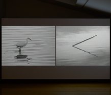
The images that Hipkins uses as a foil for this auditory commentary at first glance seem to be still photographs, related to earlier projects like his nineties Zerfall strips or the 2009 series The Island, with its colour reversals. Only a few are static, for most have movement that takes a short time to notice. The sharp acuity of each image (like architecture or foliage) is also penetratingly spectacular, often being linear, graphic, or tonally dramatic.
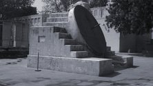
There are about a dozen types of shot spread out methodically in a regular sequence. These include images of the sun taken with dark coloured filters; torrential water pouring through narrow rapids; shots of the Southern Alps (I think) in the Tekapo region; ferns waving in the breeze; ruins in Chandigarh - the modernist city designed by Le Corbusier - featuring scratched on graffiti; architectural astronomy instruments in Jaipur and New Delhi; houses in Stonefields suburban community in Auckland; and fluffy clouds and mountain peaks filmed from a plane at high altitude. Some feature natural colour, others are chromatically reversed, some filtered, some black and white, even a few silvery grey. Most of the images reference utopian themes.
Certain images, especially the solar ones and the Indian astronomical calculating devices, are haunting. Overall the film is similar in mood to the apocalyptic film work of Amie Siegel, and the soundtrack, featuring a woman’s voice, akin to those created by Chris Marker or Michael Stevenson.
The Port appeals because of the juxtaposition of Wells’ vividly descriptive language discussing ‘time travel’, with allegedly timeless landscapes, ‘eternal’ natural forces, spooky solar or lunar imagery, and stellar observational ramps; its strange synthesis is compelling. Particularly intriguing within that are the shots of the massive calculating devices in observatories in northern India. (There are several types. Some look like sundials that double as skateboard ramps, others like block-moduled jigsaws.)
What grabs you is the visual tactility, the sheer sensuality of Hipkins’ film (much more than the rest of the exhibition next to it), very cleverly combined with Wells’ highly evocative text. Conceptually the two layers work well together, despite never locking permanently.
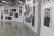
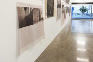
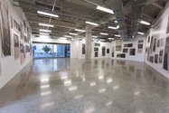
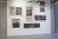
The film is also a foil to the brutalist university architecture that one can see attracted Hipkins to this site, and his use of cheap wrinkly newsprint for printing his images on (a material quite outrageously anti-ocular with its flimsy, matte, non-depth surface - a quality he sees perhaps as ‘raw’ and sympathetic to the concrete columns). His title, The Port, demonstrates a dry wit, describing an accessible lead-in (a gateway or sheltering harbour - possibly here a decoy) to the larger, more puritanical, anti-retinal pleasure show it is attached to.
John Hurrell




 Advertising in this column
 Two Rooms presents a program of residencies and projects
This Discussion has 0 comments.
Comment
Participate
Register to Participate.
Sign in
Sign in to an existing account.