Andrew Paul Wood – 4 November, 2014
Whereas we are used to Parsons' industrial spray-coated metallic pieces with their braille and numerical codes, these works have been pieced together by the artist in studio from a diverse palette of wood, plastic, steel and aluminium, with an eye to the subtleties of colour, grain and texture. There is something much more intimate and personable about them, their presence more visual than cryptographical.
Christchurch
Anton Parsons
Inside Outside Upside Down
28 October - 22 November 2014
Anton Parsons’ new exhibition at Jonathan Smart Gallery, Inside Outside Upside Down, reveals a far more “painterly” side to the artist than would otherwise be familiar. Whereas we are used to his monolithic, immaculately engineered, industrial spray-coated and metallic pieces with their braille and numerical codes, these works have been pieced together by the artist in studio from a diverse palette of wood, plastic, steel and aluminium, with an eye to the subtleties of colour, grain and texture.
There is something much more intimate and personable about them, their presence more visual than cryptographical, which is interesting given the artist’s fascination with mute communication through secret codes and semiotic structures, which are never far from the back of the viewer’s mind. Contemplating a Parsons sculpture often feels a bit like looking at some alien artefact that’s conveying a message in the simplest of mathematical terms, but with the key to the solution ever just out of reach. Despite this, there is ultimately a passive quality to Parsons’ work that invites the viewer to contribute their own readings and meanings.
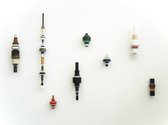
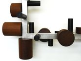
Two works leaning against the wall, Life is short and On and on and on, resemble carefully selected beads or spools threaded onto a rod, with an emphasis on the conversation of the counterpointed organic and synthetic materials, and a harmonic scale of volumes and colour accents. They have a totemic feeling to them which offsets the more design/décor-like impressions given by the other wall works which suggest expensive designer Art Deco light fixtures or giant resistors as much as they do exercises in constructivism. Parson’s private game of code and syntax has been translated here into colour and material; not entirely dissimilar to the coloured bands on a resistor indicating their resistance capacity. Both the leaning and small wall works are full of vitality and visual rhythm; lacking the internal lacunae characteristic of much of Parsons’ work. They taunt with their closed and contained inscrutable nature.
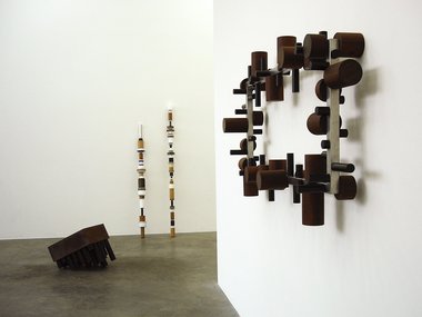
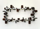
The design/décor sensibility is also quite resonant with the wall work Duopoly, and we return to the compositional central void. A constructivist, domestically-scaled rectangular aluminium frame clustered with modular cylindrical forms of wood and black plastic, one can’t help but think of the aesthetics of Scandinavian design perhaps more so than the elaborate constructions of Don Peebles, because of the slick minimalism of it, channelling Donald Judd (an artist with no qualms about blurring the lines between furniture and sculpture). The cylinders have an almost musical arrangement to them, hinting at a carefully plotted out baroque fugal complexity. It is a static visual mechanism, and like all Parsons sculpture, a puzzle. Duopoly is the most obviously decorative of the works in the show in that it would be equally at home in a show room as an art gallery. I don’t think this is an insult or diminishment, but rather a testament to Parsons’ attention to accessibility and continuity with an environment.
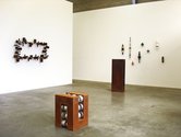
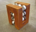
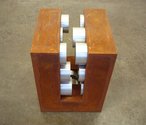
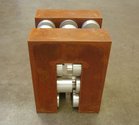
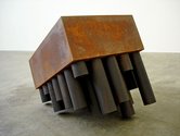
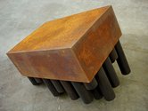
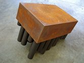
The echoes of Judd, and a hint of Smithson, are most strongly felt in the floor works with their approximately cuboid shape and their corroded steel textures. The sculpture Gate seems to be a sort of robot cross between a caterpillar and a coffee table, drunkenly raising itself up on a lean on multiple legs (the cylinders in coded variable lengths frequently found in Parsons’ sculptures. It is full of character and personality, more so than the eye-bending meander of Braid which is a far more elegant and reserved composition of interlocking forms. Stuck in the middle with you retains the rusty cube as a framing device, but returns to the metal and colour-accented plastics of the wall works to fill its insides.
As always, the key to the visual codes remain out of reach of the viewer; the artist’s secret. Knowing that there is almost certainly a hidden meaning to the work gives it a piquancy, but does not distract from the retinal pleasures of the aesthetic.
Andrew Paul Wood
Recent Comments
Zig Smith
"Echoes of Judd, and a hint of Smithson" - how about the influence of Peter Robinson's recent work? Seems striking ...


 Advertising in this column
 Two Rooms presents a program of residencies and projects
This Discussion has 1 comment.
Comment
Zig Smith, 5:36 p.m. 5 November, 2014 #
"Echoes of Judd, and a hint of Smithson" - how about the influence of Peter Robinson's recent work? Seems striking to me - from the image alone I actually thought the exhibition might in fact be a new progression for Robinson ...
Participate
Register to Participate.
Sign in
Sign in to an existing account.