Mark Amery – 10 September, 2015
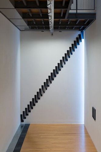
On the wall below, with 'Shadow Strips Cascades', Beck responds to a tall vertical slit window you might otherwise not notice running down the corner. It's a stepping fall of 29 pieces of photographic paper, making a diagonal cut from one corner of the wall to the other. Each piece curls towards the light, each holding a corner imprint of the form of the piece of paper above it that is shaded from the light. From one angle they curl into black sculptural cones, from others they produce a trail of licking shadows.
Wellington
Andrew Beck, Colin McCahon, Keith Tyson, David Claerbout
The Specious Present
Curated by Christina Barton
11 July - 20 September 2015
How much time and in what space does the present occupy? Does it end when someone walks around the corner, leaving your vision? Do you and them co-exist together in the same present moment or in different ones?
Something that is specious is that which seems plausible but is actually wrong. The term ‘Specious Present’ was named by E. Robert Kelly in 1882 and further defined by philosopher William James in 1893 to explain the time period within which we consider our perceptions to be in the present. It is that time - as this exhibition’s introduction notes - that is between the past and future, but that is more than just the singular moment of “the actual present”. James “developed the concept to tackle the problem of the perception of time, which is the only dimension that cannot be grasped by the senses.”
Beyond the actual, in the perceptual we’re in a splintered complex space of impressions. Here art thrives. It’s a smart theme for an exhibition, beautifully explored at the Adam with the selection of works by four artists. Our experience of time in the present in relation to space is the starting point.
The works relate to each other in very thoughtful ways, whilst being given their own sensitive charge of the space so that the gallery experience becomes part of the exploration of the subject.
The exhibition installation allows us to consider how the present operates when we approach a work of art, pass by it, and stand or sit before it, pondering it over time. How we experience an exhibition itself as one insulated period of time.
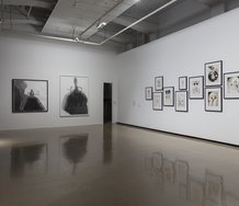
Aside from the Beck installation there are only four works in the show. With the gallery’s exceptional attention to localised lighting needs, and adjustments to the architecture, this sparseness works very well, making good use of the anticipated journey through the Adam’s distinctive multi-leveled connected spaces.
I’m not aware of another gallery in New Zealand currently that comes close in its attention to the relationship between concept, art and the space it occupies. This is testament to the now long tenure of Director Tina Barton and her team, and the Athfield Architects designed space itself.
Everything about arrangement and selection shows careful thought by Barton as curator. There’s no shyness of crossing art historical space and time: two significant early ‘70s paintings by Colin McCahon, a significant public gallery exhibition of the work of an outstanding relative newcomer Beck, a ‘90s video work from Brit Keith Tyson and a film by Belgium’s David Claerbout, which appeared in the 2014 Sydney Biennale.
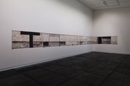
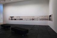
McCahon’s Walk (Series C) from the Te Papa collection is positioned to walk by as you enter, the long horizontal line of eleven unstretched canvases hung to run around a corner linking two walls, as if time were a hinge threading together opposing viewpoints. This powerful meditation on the horizon line at Murawai Beach, sees each frame like those in a series of images in a strip of film, taken sequentially, demonstrating how in the moment, in the ever changing light, the view is constantly changing and capable of being seen differently. The final panel reduces the lines of the horizon and of clouds to a series of dots reminiscent of ellipses, indicating the present has the potential to never stop.
Around the corner, McCahon‘s The Days and Nights in the Wilderness Showing the Constant Flow of Light Passing into a Dark Landscape from the Govett Brewster collection is the sole work in the far upstairs gallery, on the end wall. You have to journey in the present to approach it. The work brings together at least two different landscapes held by a tau cross (itself a vessel for skirmishes of light), where we see the track of the weather changing in ways that operate beyond what the camera can capture. The work is a powerful consideration of how you might see and perceive time, through the change and fall of light. McCahon is quoted as saying of Muriwai that he is painting “what is still there and what I can still see before the sky turns black with soot and the sea becomes a slowly heaving rubbish tip”.
The apocalyptic vision is echoed more humorously in Keith Tyson’s mid ‘90s Art-Machine Iteration: Angelmaker Part 1, 15 Seconds Prior to Apocalyse, 100 Views. Arguably best known here as the winner of the 2002 Turner Prize, out of art school Tyson’s interest in generative systems saw his work playfully created by the method of an art machine - a combination of computer programmes, charts and books that gave him random art instructions.
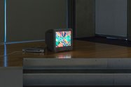
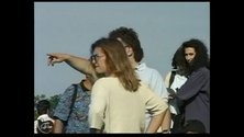
The instruction for this work was the generation of 100 moving image views. Installed on a TV monitor of its time period on the floor, as if to emphasise its aesthetic baseness, a series of 15-second clips are presented in random order. Yet what ends up being emphasised is how much care and selection, how much choice, is still taken, no matter the originating instruction. The large quantity of the artfulness within the bricolage arrangements and their framing is random, the work teases you to consider.
Certainly there is great pleasure taken in the encaptured beauty of the ordinary. Perceived is the smallness of one person’s journey through the world. If this is one present moment in time it feels like it’s one small part of the potential, the result of a location and situation. A man fixes a bicycle, two young lads hang out smoking, captured within the everyday routine of spending time at leisure while the world is slowly turning black.
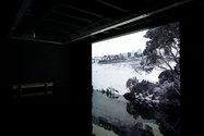
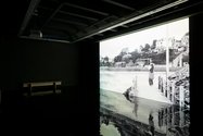
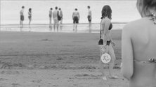
The leisure of our mind and eye: the present moment as a time filled with our gaze fractured across the space we inhabit - looking at others, or into space, our minds partly elsewhere. This elusive space is beautifully conveyed in the ambience of David Claerbout‘s The Quiet Shore, which depicts a single moment in a holiday beach scene in Brittany broken into what must be over 100 visual perspectives. A slide show of over 30 minutes of still black and white images reflects in the liquid gloss black floor installed for the work in the gallery, imitating the play of light in the water-soaked sand. Frozen in time, it is as if an action of a boy splashing at the water’s edge has sent an immediate signal summoning all attention towards him - across all in the line of sight, from the many milling on the broad stage that is the beach - to a woman on the deck of an apartment far away.
Like Tyson, Claerbout’s work depicts a single moment, but in a far more technically complex way. Like McCahon we are in that liminal human space of the beach, the meeting of water, land and sky emphasised by the reflective floor. The Quiet Shore is unusually captivating, difficult to leave as you look to find where we next might gain a perspective on the scene, hunting for clues to how the entire space is constructed and what story might be told. The Quiet Shore is both stagey and cinematic - like something theatre director Robert Wilson and film director Eric Rohmer might make together.
Beautiful in its wet, hazy and languid stillness, there’s the sheer challenge of trying to figure out how the work has been assembled. Why can’t we see cameras? If the figures have been asked to freeze like musical statues, what of the boy splashing? For a while I wondered if a featured seagull was a stuffed prop.
Whatever through Photoshopping or large numbers of photographers, it’s technically quite a feat. Yet like any groundbreaking work (thinking of how the cubists broke up the picture plane) it is also widens our perception of the world.
Meanwhile making outstanding distinctive work that marries photography with painting, sculpture and installation is New Zealander Andrew Beck who has been given the entire bottom floor. As is also demonstrated by his current mesmerising dealer show at Hamish McKay, Beck is going from strength to strength.
Claerbout‘s light-soaked black floor is Beck’s terrain. Working with photographic paper, acrylic and frames, Beck’s method is to keep simplifying to draw out the interaction between surfaces, forms and media in space, and make the impression of light his subject.
For all its extreme elegance, the installation here slightly confuses those works that clearly respond directly to the Adam space and its light, and smaller works where the relationship to the space seem more tenuous. You sense a tension between the public site-specific commission, and discreet artworks ready for sale.
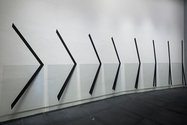
The two large site-specific works are exceptional. For those coming down the stairs and turning a corner, Linear Split (8 Phases) provides what appears to be the hands of a clock or sundial, or a road-sign indicating the corner, tracking time and space against our own movement. Extending McCahon’s exploration of the change of light in space, this is a new kind of painting to walk by.
Painted strips or pleats run down the wall to then, at a gentle angle, cross over non-reflective glass, in turn creating shadow marks at a different angle on the wall behind, continuing the painting. Lighting and wall angles are vital to the work’s effect (you become aware that this wall at the Adam is in fact two, with a fold in the middle). As is common with Beck you spend time trying to work out exactly what media is what, and which surface falls behind which, and in so doing end up being caught in a latticed zone of dimensions that takes you out of your own space in time.
As McCahon’s The Days and Nights upstairs tracks falling light, on the wall below, with Shadow Strips Cascades, Beck responds to a tall vertical slit window you might otherwise not notice running down the corner. It’s a stepping fall of 29 pieces of photographic paper, making a diagonal cut from one corner of the wall to the other. Each piece curls towards the light, each holding a corner imprint of the form of the piece of paper above it that is shaded from the light. From one angle they curl into black sculptural cones, from others they produce a trail of licking shadows. Beguilingly simple, exquisitely executed, Beck keeps finding new ways to extend visual language.
One of the joys of any gallery experience is the pause in time that it enforces on us. The Specious Present could be said to take that pause as its subject.
Mark Amery
Recent Comments
John Hurrell
For me (personally) I am struck in this show not by the cross but by McCahon's apparent interest in comics ...
JoAnna Mere
Thankyou for your review of The Specious Present, Mark. It is McCahon's painted tau cross/es that seized me most. The ...


 Two Rooms presents a program of residencies and projects
 Advertising in this column
This Discussion has 2 comments.
Comment
JoAnna Mere, 11:13 p.m. 13 September, 2015 #
Thankyou for your review of The Specious Present, Mark. It is McCahon's painted tau cross/es that seized me most. The solidity and symbolism of all types of crosses have this effect - everpresent as they are in some form in our architectural and spiritual journeys. In this exhibition, whether walking by, standing nose to canvas or gazing from across the room, time was suspended as thoughts collided. The history of the emblem, the currency of the form and the shadow falling forward held me in a questioning space. Examining the past/present/future of this black representation of light. Use of the cross in art is nothing new to viewers, golden symmetries are easily found in NZers European travels, Ralph Hotere works, more recently in Bob Brassant's (retrospective in Mahara Gallery). What does a/the cross symbolise to us today?
John Hurrell, 11:44 a.m. 14 September, 2015 #
For me (personally) I am struck in this show not by the cross but by McCahon's apparent interest in comics (extension of mediaeval narrative painting structure) with the horizontal accentuation. His late forties interest in Rinso packets (the speech bubble) is often discussed,and - more recently - claims made for film, while comics tend to get ignored.
The David Claerbout work also looks fascinating. The simultaneity seems to have grown out of Jeff Wall's 'Eviction Struggle,' 1988.
Participate
Register to Participate.
Sign in
Sign in to an existing account.