John Hurrell – 14 October, 2015
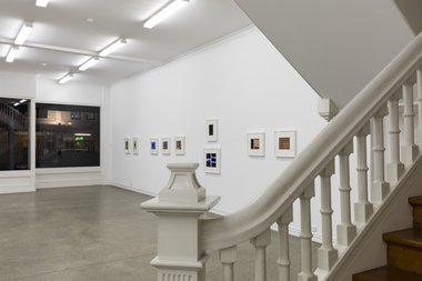
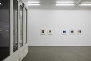
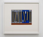
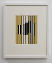
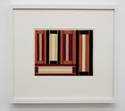
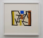
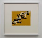
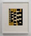
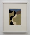
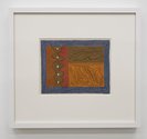
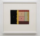
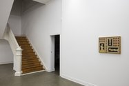
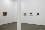
In Starkwhite's downstairs space, Simmons has subtly arranged the eighteen framed coloured gouaches on paper (and one acrylic on canvas painting) in groups of singles, pairs or trios. The separated clusters are thematically linked internally, using aspects such as transparency, rhythm, horizontal /vertical contrast, shape structure, or edge quality. All with gouache, which has its own particular dry and velvety surface attributes, and a range of earthy to synthetic chromas.
Auckland
Gordon Walters
Gouaches and a Painting from the 1950s
Curated by Laurence Simmons
21 September - 24 October 2015
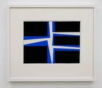
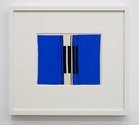
In this valuable, revelatory show of fifties Walters gouaches, beautifully put together by Laurence Simmons, using Simmons’ lucid essay as a guide, we can see the connection between works sparked off by Theo Schoon’s enthusiasm for Rolfe Hattaway‘s pencil drawings and Ngai Tahu rock art, and Walters’ later paintings of the sixties with their modernist horizontal straightening of the koru motif. The Hattaway/Schoon axis provided an awareness of the potential of flattened picture planes, grids and nuances of shape edge, while the rock art drawings sensitised him to the positive-negative aspects of the raw rockface central bar of the figure, and the possibilities of vertically straightening out the spindly arms and legs.
In Starkwhite’s downstairs space, Simmons has subtly arranged the eighteen framed coloured gouaches on paper (and one acrylic on canvas painting) in groups of singles, pairs or trios. The separated clusters are thematically linked internally, using aspects such as transparency, rhythm, horizontal /vertical contrast, shape structure, or edge quality. All with gouache, which has its own particular dry and velvety surface attributes, and a range of earthy to synthetic chromas.
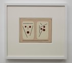
Fascinatingly, the presentation shows Walters’ high degree of experimentation at that time, especially around 1954, where he seems to have been closely examining the perceptual (gestalt) theories of people like Rudolf Arnheim - pondering for example how lines and dots ‘cohere’ in our minds to represent faces. Many investigations started here are abandoned and later picked up in the late eighties when he moved away in a more pronounced fashion from the more well known koru format.
There are also a large number of gouaches here I find exciting because they lock into a personal fascination I have with the American painter Jonathan Lasker, whom I see as carrying on the explorations in logic initiated by the young Jasper Johns. Superficially they look like doodles by Len Lye (say, drawings for Tusalava) but in reality the mindset is very different and not at all ‘Old Brain‘, looking at notions of enclosure, freedom, hermeticism, and sequential progression. Groups of marks or similar motifs are compared and analysed, with differences and similarities dissected.
Three gouaches in the right-hand corner (by the office) I find particularly intriguing, all called Untitled and made in 1954, and all inspired by Hattaway via Schoon. One predominantly green study, with various Naples yellow, burnt sienna, black and white elements, uses a lariat-like line attached to one fat bar to encircle two other skinny vertical oblongs with their own meandering attached loops. Another one of pinkish buff, uses two threadlike lines to surround grey and white bands (sandwiched within vertical black rectangles) to showcase a changing left-to-right progression of increasingly wobbly edges where the tones clash. A third in yellow ochre, has peglike black and white door frames in different sizes, playfully hovering in space and receding backwards away from the viewer.
These particularly inventive images (Len Lye, say, meets Jonathan Lasker or Peter Halley) are all the more extraordinary when one ponders their sixty-one year old age. They look so vibrantly fresh and witty. Not to be missed.
John Hurrell
 Advertising in this column
 Two Rooms presents a program of residencies and projects
This Discussion has 0 comments.
Comment
Participate
Register to Participate.
Sign in
Sign in to an existing account.