John Hurrell – 10 August, 2016
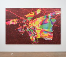
You get the sense that Cousins' imagery deliberately thwarts an easy 'iconic' take, that mixing and blending clashing forms is the purpose, that the colliding, bending and shimmering ‘fragmentation' of imagery is Cousins' desirable aim, that planar separation and clarity are counterproductive, and that this very process of denying the power of any one isolated single image - a sabotaging, wounding, morphological mash-up - makes exhilarating painting.
James Cousins has had quite a bit of exposure over the last year, but for good reason. His work was quite easily the most consistently exciting contribution to Necessary Distraction and his large paintings the best gallery selection presented in the second half of the recent Auckland Art Fair.
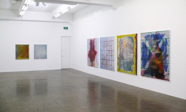
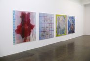
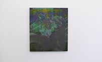
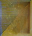
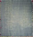
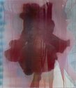
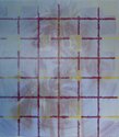
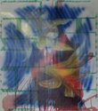
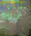
This new Gow Langsford show presents seven smaller works. Most have the optical overload we expect from Cousins: works that are utterly impossible to photograph due to competing layers of intricacy via masking that only the naked eye can detect and the swirling moiré effects that result from digital photography when it’s faced with dense configurations of parallel lines.
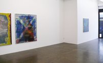
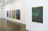
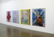
Within the gallery space Cousins has installed what seems to be a peculiar hang, understandably eschewing regular spacing but embracing instead groups of two or four canvases, and so encouraging horizontal mental - not optical - interference between stretchers. Half the gallery walls are ignored. It is wilfully perverse.
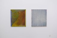
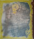
Most of these works have a screened flowering bloom or cluster of leaves as a background base, and thin lines of sprayed on dribbling paint, often added after the complex tape formations have been removed. The work I find most fascinating is Untitled (pl 187) which is relatively ‘blank’ and pale in its centre, and where certain clumps of whitish wiggly lines light up at regular intervals. You are not sure whether this is directly because of Cousins’ skill with colour mixing or due to the afterimages he also provokes - some lingering retinal interference.
Around the edges of the rectangle are sprayed blobs and bursts of saturated colour that give the work a slightly sweet Olitski feel. It is less Polke-ry (with overlapping graphic transparent forms) than the rest of the show.
With these works you get the experience when standing back, of finding that the colours (all the colours) tend to be muddy and that the masking patterns are not so obviously detectable. Close up the complicated overlays are much more apparent, and colour juxtapositions purer and more sophisticated.
You get the sense that Cousins’ imagery deliberately thwarts an easy ‘iconic’ take, that mixing and blending clashing forms is the purpose, that the colliding, bending and shimmering ‘fragmentation’ of imagery is Cousins’ desirable aim, that planar separation and clarity are counterproductive, and that this very process of denying the power of any one isolated single image - a sabotaging, wounding, morphological mash-up - makes exhilarating painting.
John Hurrell
 Two Rooms presents a program of residencies and projects
 Advertising in this column
This Discussion has 0 comments.
Comment
Participate
Register to Participate.
Sign in
Sign in to an existing account.