John Hurrell – 28 May, 2022
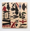
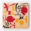
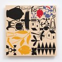
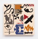
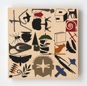
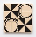
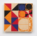
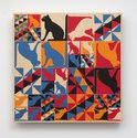
Although within each subtly gridded plywood or synthetic paper square the motifs are fixed in position, the compositional emphasis changes with each of the possible four orientations on the wall: particularly in relation to the ceiling and floor. Increased semiotic status is maybe correlated with vertical height where visibility is increased. As found in our book culture, the left-hand side of a ‘page’ it might be argued, has priority over the right.
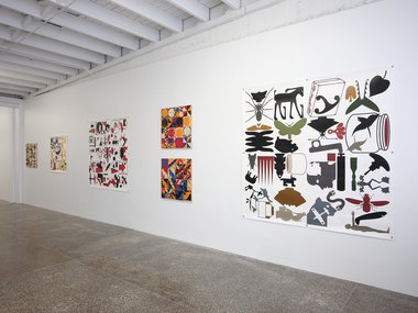
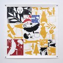
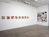
With these sixteen works (all square in format) Richard Killeen continues some of the themes initiated with his early cut-outs of the late seventies—and even earlier grid paintings—but now perhaps more user friendly in terms of physical participation. It is more obvious now he juxtaposes the square plywood panels with the much larger square paper works in the same show.
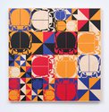
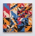
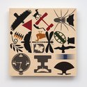
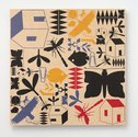
Although within each subtly gridded plywood or synthetic paper support the motifs (usually profiles of animals, plants and tools now recycled from earlier works) are fixed in position, the compositional emphasis changes with each of the possible four orientations on the wall: particularly in relation to the ceiling and floor. Increased semiotic status is maybe correlated with vertical height where visibility is increased. As found in our book culture, the lefthand side of a ‘page’ it might be argued, has priority over the right. This turning of the square support process Killeen has been exploring since 2016.
Sometimes motifs are repeated inside modular units within each square; sometimes they even rest sideways, being no longer beholden to gravity with its obligations to nature and the laws of physics—there being no ‘correct’ finalised orientation. Sometimes motifs are blended hybrids of 2 or 3 other more ‘natural’ motifs. Abstraction and figuration coalesce. The images are tightly packed to accentuate unanticipated peripheral white negative shapes. Some modular units are extra complex so that the grid edges get blurred and are not so easily discerned.
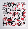
Killeen’s solid plywood panels are in two sizes (350 x 350 mm; 750 x 750 mm), while the grommetted Yupo paper sheets come in three (2000 x 2000 mm; 1600 x 1600 mm; 1000 x 1000 mm). The bigger squares are much more intricate and complex than the more easily decipherable smaller ones—being more varied numerically. Image shapes are either flat unmodulated silhouettes or perspectival linear drawings of box-dwellings.
Something intriguing happens when these images are flipped on their ‘sides’ or ‘inverted’. Within their squares, the narrative content of each horizontal, sentence-like (left-right), syntactical structure miraculously changes. What was previously horizontal in terms of retinal scanning, becomes vertical, and vice versa. That alters the verbal content.
New ‘sentences’ emerge when the supports are turned around on the wall, fresh ways of combining ‘subjects’, ‘verbs’, ‘adverbs’, ‘adjectives,’ ‘gerunds’ and ‘objects’. (And new sequences emerge of comicstrip-like frames, or varieties of rebus.) ‘Parts of speech’ shuffle into new positions—far more than simple concrete nouns are involved—and assorted possibilities for each part compete for dominance. Some motifs (or groups of them) change colour or alter in size, implying an ongoing expanding process or transition over time.
The result, in terms of narrative, is not when decoded, a sequence of perfectly formed sentences that are clear in meaning—like say ancient hieroglyphics—but rather a kind of pulsing stutter that focusses on the taxonomic classification of species—due to the repetition of certain motifs that don’t go away. Particularly in the large works. Like melodic or percussive themes in music, it exploits the same shapes differently organised, differently grouped; focussing on the pleasures of recognising sameness, and the thrills of discovering new unexpected juxtapositions.
John Hurrell


 Two Rooms presents a program of residencies and projects
 Advertising in this column
This Discussion has 0 comments.
Comment
Participate
Register to Participate.
Sign in
Sign in to an existing account.