John Hurrell – 20 November, 2009
Millar is hesitating when I think she should be more theatrical, treating surface with the same lack of preciousness that she treats architectural space. She needs to tease her audience even more than what she is doing already.
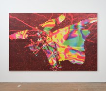
With this current Judy Millar exhibition we get the chance to look closely not at the actual works of her Venice installation (it comes down in a week) but at some ‘unshaped’ rectangular works made at the same time, using the same scanning technology.
There has been a certain amount of controversy around Millar’s methodology here. Some feel she has abandoned the surface qualities of painting, and that she is somehow cheating by scanning a small painted image that is then considerably enlarged to suit the spatial and architectural circumstances of each venue. That by using digital and photographic techniques the claim to be painting is forfeited. That she should have used very big brushes like brooms, or assistants for muscle-power if needed, to make the whopper subtractive ‘paint-marks’ she displayed. That small paintings on paper used for scanning cannot possibly provide anything like the fine grained texture of directly applied viscous paint when enlarged.
The counter-argument I think would go like this. The above comments are fair enough if Millar was trying to work in the same tradition as say Bernard Frize, where the boundaries of the notion of manual control in mark-making are being extended – but she is not participating in that discussion. Her work’s methodology is really akin on one hand to Roy Lichtenstein’s pretend comic-book brushstrokes which are enlarged drawings of brush marks, and on the other, the digital scanning technology that somebody like Christopher Wool often uses. The notion of the wiping hand or sweeping arm correlating to 1:1 ratio sized marks is not so relevant now – though it was of course earlier on.
Millar’s priorities have changed because she is concentrating now more heavily on architectural intervention – an interest she first proclaimed with her Robert Leonard curated show at the New Gallery in 2005. This the Gow Langsford presentation clearly and brilliantly demonstrates. The planes of the two very large stretchers and the marks their ‘fake’ surfaces bear calculatedly thwart the palpable real space of the room – to the extent of one even being jammed between a white column and wall so that a section is hidden, and the other being suspended out towards the centre of the room away from the wall surface. The canvas is an object to be played with as a movable barrier as well as a depth-laden illusionistic ‘window’.
Apart from methodology, a second issue is surface, the lack in the enlarged images of the different matt and gloss sheens detectable in her older ‘proper’ painting. I imagine Millar could have faked these qualities if she had wished, by screening strategic lines of glossy varnish over parts of the digital images – particularly mark ‘edges’ - but she decided not to bother. She let them stay consistently matt.
Let us consider the fact that some painters varnish their image surfaces (the whole picture plane), not for reasons of physical protection but to integrate the surface qualities of different media – to provide a less optically disruptive uniformity, especially with dark tones. The scanned works have those qualities as given, and Millar could have varnished her smaller works to match them
The problem she has with her Auckland show is that she is mixing up her painting-surface types and that jeopardises her aesthetic rhetoric – it undermines her argument. She should be consistent, take a definite position and stick to it. The small conventional, non-scanned works could be matt varnished over their entire surfaces to correlate with the large stretchers, or the whoppers could have fake glossy streaks or edges superimposed to mimic the smaller ‘authentic’ paintings. Or else have all works placed under glass - as one work on paper is.
Millar is hesitating when I think she should be more theatrical, treating surface with the same lack of preciousness that she treats architectural space. She needs to tease her audience even more than what she is doing already. What if she scanned all her works and rejected surface qualities altogether, making the two sorts indistinguishable. By abandoning any interest in tactile surface she could focus entirely on site, forget the historically entrenched mores of painting and concentrate totally on it as an idea without a past, concentrating on ‘pure’ installation as architectural intervention instead.
Recent Comments
Matt Wilson
Good point
Timothy Kelleher
Interesting article. Thanks.
Matt Wilson
Yes John, you may.



 Two Rooms presents a program of residencies and projects
 Advertising in this column
This Discussion has 14 comments.
Comment
Matt Wilson, 6:25 p.m. 20 November, 2009 #
In the 2004 publication IS / NZ Judy Millar expresses a delight in the finest quality paint and says "It's even more pleasurable to buy the most expensive yellow and turn it brown" (p26)
Perhaps the same corrupting impulse is at play here; turning a painted surface into a print. For me the question isnt 'is this a painting' but is it any good?
Matt Wilson, 6:25 p.m. 20 November, 2009 #
Yeah but good what? Painting or installation? She has gone through a significiant head change since 2004. Now she seems keen to tackle architecture head on, more through real than illusory space. And if she includes small 'conventional' paintings they are there as part of a bigger strategy, working in coordination with the whoppers as mechanisms of intervention. I don't she has really been a painter for a while. Paintings are now her tools for a grander (more total) sculptural method.
November 15, 2009 2:36 AM
Blogger name said...
John that is way too generous. The work stinks - literally - that material oozes bad smells. The work stinks in other ways too of course - its not clever or interesting - its not good painting nor good sculpture, and no where near good in terms of its reading as a spatial intervention (and i use the term good as it was used in the above q + a). Anyone caught defending the work always goes back to the 'formalities' - the mark etc etc, but its gone in these large printed works. it wreaks of an art school methodology of 'pushing' the work - by enlarging, manipulating and shifting material. This inane attempt to affect a space is just not working. She is clearly attempting to emulate her partner Katharina Grosse's work. The inclusion of the small works says more about her fulfilling the markets requirements than it does an attempt to articulate a bigger strategy.
Matt Wilson, 4:56 p.m. 27 November, 2009 #
Good point
Matt Wilson, 6:25 p.m. 20 November, 2009 #
Lots of art smells,Name. Whoop-de-doo. You are being over emotive. The woman clearly knows how to shift paint around, whether that stay as maded or be photographically enlarged. And she is a better colourist and image maker than her partner.
My quarrel with her is not over the enlarging method or even the loss of surface qualities.It is over consistency and that all works in the gallery space should have the same type of surface if it is an installation. Which she claims it is. Surface has consequences for the spatial depth of the image, and it is surely crucial decisions don't appear to be coincidental.
Consistency is a value I respect, hence my disagreements with Simon Ingram and others at various times. I don't think artists can have it each and every way, or keep their cakes and gobble them up too. Some positions cannot be supported if you include the opposite as well.
Timothy Kelleher, 3:39 p.m. 26 November, 2009 #
Interesting article. Thanks.
Matt Wilson, 6:25 p.m. 20 November, 2009 #
am going to leave alone the quality of the work, but rather address the presentation of the work as a show. I think an artist must always consider the exhibition space when creating new works for a show. The two HUGE works in the show completely swallow the relatively small Gow Langsford Gallery space and suck all oxygen out of the room. Come on, have you ever seen an enormous painting exhibited on a wall where a pillar obscures part of the painting and cuts the imagery in half. I hope the works were better displayed in Venice - the imagery struggles enough without being crammed into too small a space.
Matt Wilson, 6:25 p.m. 20 November, 2009 #
Hi Luna
The big works deliberately wage war upon the architecture. The artist designed them that way to impose themselves upon the space.
Do you mind giving us your full name? This something the site insists on for all forum contributors.
Matt Wilson, 6:26 p.m. 20 November, 2009 #
My first reaction to the large printed works was negative. However the more time I spent in the exhibition the more I was interested in the installation of the works. This was particularly the one which cut through the space and behind the pillar. The piece on the right that was hung slightly away from the wall was far less effective for me, perhaps because it relied less on the gallery space and I still look at as if it were just a reproduction of another work.
I too found the presence of the more traditional works drew my attention to the surface of the printed pieces. Not so much the presence or lack of brush strokes, of gloss or matt, but rather the artificial material which spoke to me of billboard advertising and commercial images.
Though I enjoyed the canvas works and the work on paper I wonder if their presence distracted me from appreciating fully what I feel was the more important part of the exhibition.
Matt Wilson, 6:26 p.m. 20 November, 2009 #
Having read the review and the comments following, can I just point out that whenever a criticism is becoming quite personal - such as the comment on Judy Millar's partner and an apparently obvious emulation process, this in combination with an art lover's offended nose - it hardly ever seems to come from the actual author of the review, but almost always from a bystander; whose lines are invariably riddled with spelling mistakes, and signed by generic names, such as "name". Why is that, please?
Matt Wilson, 6:27 p.m. 20 November, 2009 #
There is no accounting for human behaviour,Tobias. Why do you not provide your surname? Why are I so incredibly saintly and tolerant - despite exasperating circumstances?
It is obvious I am trying to improve the tone of the discussion here, and the best way to achieve that is for all contributors to give full names. It won't always guarantee a poisonfree environs for art conversation, but it will certainly help.
Matt Wilson, 6:27 p.m. 20 November, 2009 #
Now that it has been brought up, I'd like to ask something from you John. Can you please check your spelling and grammar? Sometimes in both your reviews and your comments your spelling and grammar is patchy. It does undermine your insights because it seems hurried. I know you're of a generation that's pre-txt, so I expect better. Everyone makes the occasional mistake but I think for this Forum to be taken seriously the critic should be on top of his game. Sometimes your writing is as clunky as these anonymous contributors.
I completely agree with full name disclosure. If you are going to critique the art, and not get personal, then there is no reason for anonymity.
John Hurrell, 6:27 p.m. 20 November, 2009 #
Simon, your comments are absolutely accurate. With the reviews, I have a spell-check which I usually remember to use, but some things get through under the radar, especially if I continue revising after I have pasted on my original draft.I often continue to tweak the language, to make it flow better, and those irritating little typos sneak in.
As you observe, I often write quickly, sometimes 2-3 things on the go at once. Usually I look at the draft and if it doesn't feel right, will sit on it for at a least overnight, or maybe a day, worrying about the wording, (does it express what I want it to say, can it be defended, is this too severe a position, or too generous etc).
However because this is not a hardcopy publication, its advantage is immediacy and currency. I try and write quickly to build up a momentum of readership,examining shows that are recently opened. If I take too long my hit-rate starts to go down, so I need to keep them coming. Sometimes I notice I am getting raggedy so I take a breather. But I can't do that too long. See my dilemma?
Note also how having other writers really helps all this. Great to get more opinions from other cities, but also more articles to feed into the pool for debate.
I would be delighted if people pointed out typos or errors to me directly through mungo1@xtra.co.nz. I will fix them asap.
Now with this comment making scenario I'm using here, I can't edit my text after I've posted it. If I really mess up I have to trash and repaste, or rewrite. Hopefully the new website will remedy such things.
All the above worry me. I am extremely pleased you brought them up. Please continue to do so if necessary.
John Hurrell, 1:05 p.m. 25 November, 2009 #
Can I test this snippet of text
Matt Wilson, 8:48 p.m. 25 November, 2009 #
Yes John, you may.
Participate
Register to Participate.
Sign in
Sign in to an existing account.