John Hurrell – 15 February, 2010
The current Crockford show has a similar tension between emotional immediacy and cool cerebral logic and focuses on Bizumic's admiration for Ernst Plischke, the Austrian émigré who was one of New Zealand's first modernist architects and theoreticians, living here between 1939 and 1964
Auckland
2 February 2010 - 27 February 2010
MLADEN BIZUMIC
From Cube to Ball (Chapter 1)
One of the distinctive characteristics of the practice of Mladen Bizumic, a salient feature that underpins almost everything he does, is an interest in modernist architecture and its history. He loves examining pavilions and civic spaces, and combining images that by themselves are quite dry and clinically analytical, with other elements like music, that are emotionally stirring. Often there is an attempted balancing act going on.
For example, his last show at Crockford’s of European photographs, presented in deliberately reflective glass to include the New Zealand viewer, was dry and somewhat distant. But the work he has in the Chartwell Collection, with its video of digital drawings of Little Barrier Island, is blended with a stirring soundtrack of a slowed-down, orchestrated version of The Rolling Stones song Under My Thumb that always aurally dominates any gallery it is presented in.
The current Crockford show has a similar tension between emotional immediacy and cool cerebral logic and focuses on Bizumic’s admiration for Ernst Plischke, the Austrian émigré who was one of New Zealand’s first modernist architects and theoreticians, living here between 1939 and 1964. It is the first of three exhibitions Bizumic is having looking at this architect, the others being in Wellington and Vienna.
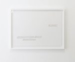
There are four works, starting with an unprepossessing framed pencil rubbing, by the gallery entrance, that was taken from the inaugural stone for Massey House (1957), Wellington’s first skyscraper. It shows the words ‘NZ Meat’ and ‘Plischke and Firth Architects’ peeking through the scribbled lines.
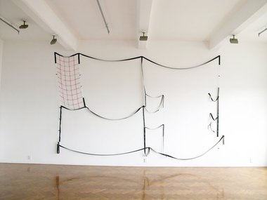
Satin and Air Composition looks at first glance to be a very large ‘seam’ drawing by Pip Culbert, until you realise it is a ‘soft’ floor plan of an apartment, meticulously constructed out of coloured ribbon and pinned up on the wall. With black satin ribbons for walls, parallel white lines for doors, black and white lines together for windows, and a grid of red linear squares for floor tiles, it is based on one of Plischke’s Dixon Street Flats that he designed with Gordon Wilson in 1947. Its sagging wobbly lines make it humorous and vulnerable and like some kind of bizarre and very flimsy national flag that oddly enough, looks incredibly beautiful.
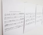
The main work is a sound installation which references five coloured lamp shades Plischke designed for St. Martin’s Church in Christchurch. The blue, red and green plastic shades hang in an intriguing entangled cluster from the ceiling, but instead of bulbs Bizumic has positioned inside them audio speakers that intermittently play native bird song: in sequence and also overlapping. These twittering and chiming bird calls have been transcribed to sheet music by composer Hermione Johnson, but like the frottage by the front door, they are not very exciting visually - being coded for aural not ocular sensation.
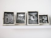
In Crockford’s back room are two small shelves holding silver framed, black and white collages of interiors from Massey House. The added overlaid fragments are either prismatic or circular, play with and subvert the initial austerity of the space, and are seductively intimate in the way they draw you in, though I find the metallic framing too chilling.
Bizumic’s Dixon St Flat floor plan is the killer work in this show, being loaded with more ambiguities and cross connections than the sound or photographic pieces. Its flag-like quality is especially compelling because it can be seen as an espousal of Bourdieu’s notion of ‘distinctive’ taste as a political act for defining class superiority; how we surround ourselves with objects (that includes spaces where we live) in order to construct an identity. I’m mentally riffing here for sure, improvising on aspects the artist probably hasn’t intended, but the ribbon drawing as a ‘flapping’ extrapolation of modernist house design turned into a skeletal pennant is an interpretative notion I find perversely appealing.


 Two Rooms presents a program of residencies and projects
 Advertising in this column
This Discussion has 0 comments.
Comment
Participate
Register to Participate.
Sign in
Sign in to an existing account.