John Hurrell – 27 March, 2010
They might overwhelm, but with their very considered placement and knowing pattern alignment, they are not out of control.
Auckland
Amber Wilson
The Bends
3 March - 1 April, 2010
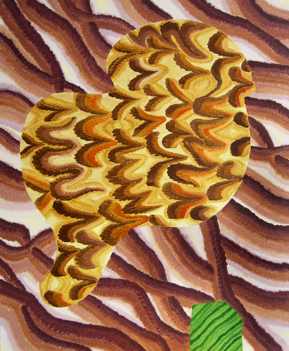
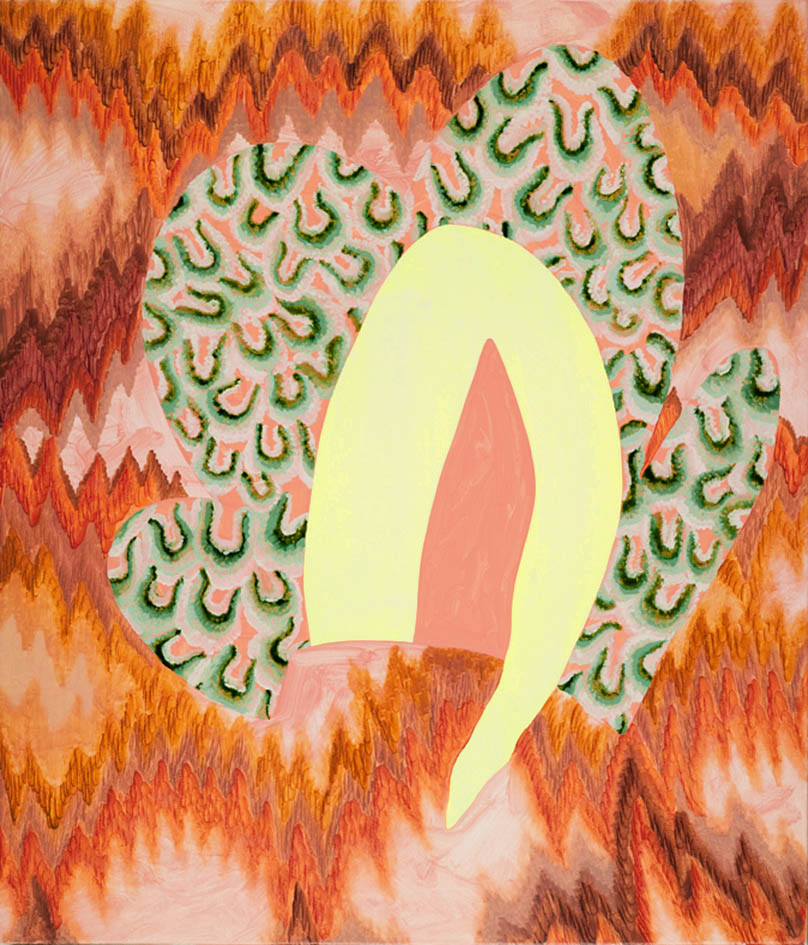
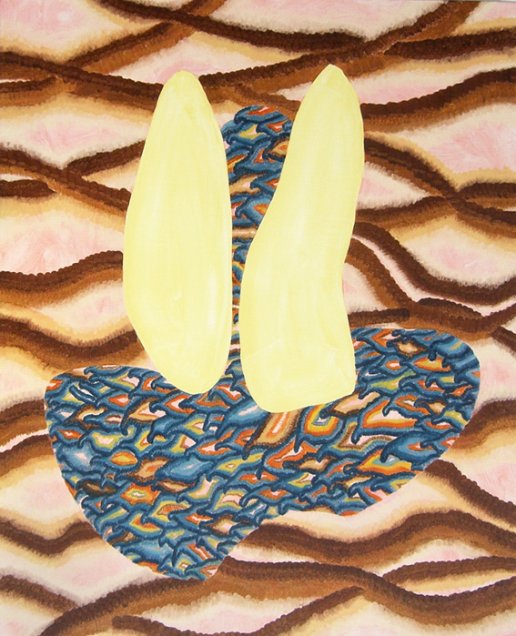
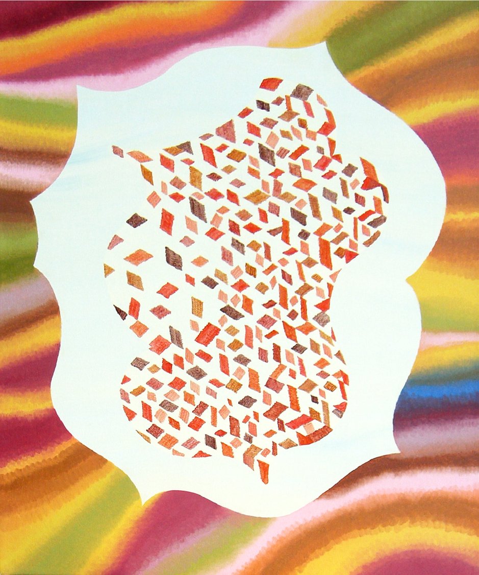
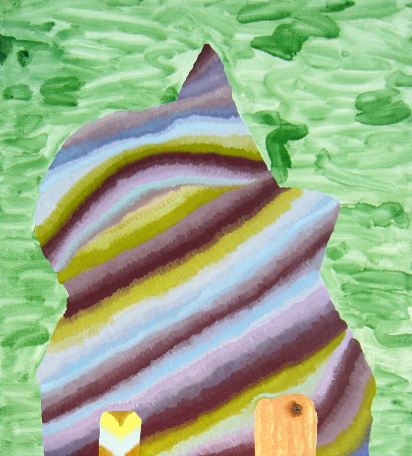
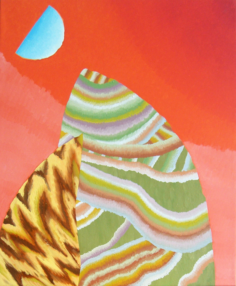
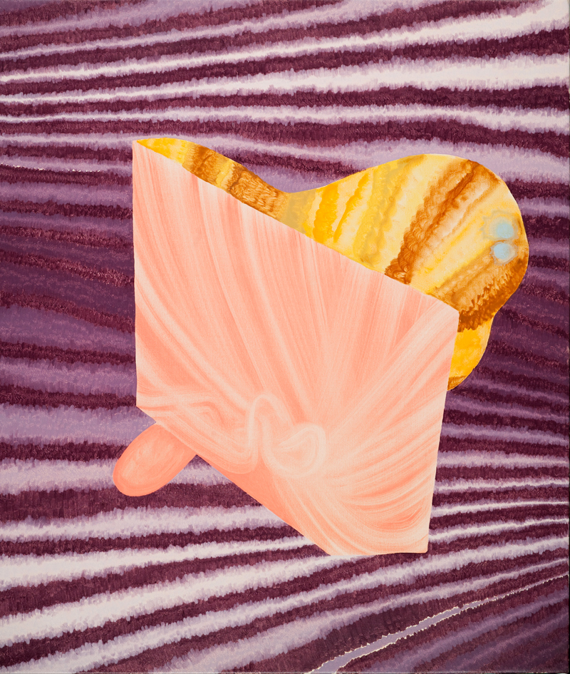
A couple of months ago I visited a group show out at Unitec’s Snowwhite gallery and commented on the watercolours of Amber Wilson. The year is passing quickly and her new oil paintings - now showing at Anna Miles - are understandably quite different, though still very much preoccupied with pattern and rhythm.
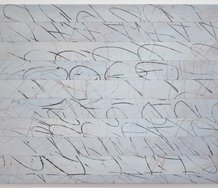
Whereas the watercolours were restrained, Wilson’s eight oil paintings are, in contrast, as you might expect, ‘full on’. They revel in loud garish organic patterns, yet when you study them, there is a lot of nuance. First impressions can be deceptive, and the colour is not as saturated as you might suppose - though it certainly is heated. In fact it is not shrill, but highly insistent and at times muted. More importantly, Wilson’s use of shape is extremely inventive.
These richly patterned canvases look like they are a hybrid of Ed Paschke and Elizabeth Murray, or made by Howard Hodgkin on acid. Their backgrounds seem to also allude to Victorian book marbling, fabric design, underwater sponges and lush beds of rampant tropical flowers. The inner shapes floating in front, containing plain or swirling colours in silhouette, hint of items as varied as animal parts, Moorish architecture or rubber stamps. There seems to be no embracing logic, but appear to have evolved through intuition.
If anything they are linked by humour that plays across the figure - ground relationship. There pervades a nutty ambiguity so that shape is always generating multiple interpretations. It is always loaded and rarely ‘pure’ abstraction. The vertiginous psychedelic wackiness is tempered by meticulous control of tone and a subtly serrated edge, especially when rendered by tiny multiple brushstrokes.
Wilson’s inventively decorative paintings are rich heady concoctions that celebrate ocular pleasure. They might overwhelm, but with their very considered placement and knowing pattern alignment, they are not out of control.
 Advertising in this column
 Two Rooms presents a program of residencies and projects
This Discussion has 0 comments.
Comment
Participate
Register to Participate.
Sign in
Sign in to an existing account.