Mark Amery – 26 May, 2010
In their thick web of abstracted influences there's a battle going on between different cultures, aesthetics, and hierarchies. One minute I'm thinking of the gridded battleground spaces of Uccello's San Romano, the next I'm feeding the watercolours of Frances Hodgkins through cubism enroute to the drips of the abstract expressionists and cubes of the geometric abstractionist.
Are these works on paper drawings or paintings? I couldn’t shake this question for a while, and felt foolish for wasting my head on it.
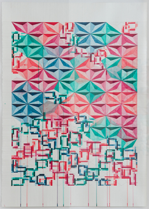
Yet the more I kept finding myself returning to these pencil-gridded kaleidoscopic abstract works, occasionally cut into, and overlaid with watercolour, gouache or acrylic, the more I realised they speak to the battleground of edges between things. The way in life we cannot adopt one system without having to concede it is failing as much as succeeding, sitting on top of and in constant agitation, on all sides, with others.
So the works in Porchlight, Kathy Barry’s first exhibition at Bowen Galleries, are both paintings and drawings, or neither. Let’s call them collages, with the works exploring the process of construction and deconstruction, and fight between systems and classifications.
Architectures or design ecologies of interposing ideas are in the process of being built on grids which are fifty or more columns wide, and eighty or more rows long. These grids are the field for complex interrelations between two and three dimensions, tones of colour, shapes and media. Fractal figures like cut glass and graph paper blocks of colour (reminiscent of a Mondrian Boogie Woogie) repeat but ultimately break down without establishing a clear pattern. The tensions keep you looking for the patchwork quilt design, only to find it has broken.
While embracing a package of structures from modernism, they constantly fight the idea of some forward momentum and harmony, to suggest a constant shifting forward and back; of things being built up, build down, built over and built around. On the surface they have the appearance of a fiendishly complicated modular board or computer game, but in their thick web of abstracted influences there’s a battle going on between different cultures, aesthetics, and hierarchies. One minute I’m thinking of the gridded battleground spaces of Uccello’s San Romano, the next I’m feeding the watercolours of Frances Hodgkins through cubism enroute to the drips of the abstract expressionists and cubes of the geometric abstractionist. Then I’m unfolding it all as boxes in Wellington with Richard Reddaway. The carefully trained drips of watercolour course along side the channels created by the vertical pencil marks, like blood spilt from battles between design and art, and one moment in cultural history and another.
They might seem to have strong affinities with Martin Thompson’s celebrated pen works on graph paper, but ultimately run counter to his eye-poppingly shimmery harmonics in favour of complex relationships between materials, shapes and colour. Like Thompson’s figures however most of these fragmented fractal blooms are delicately beautiful. In this digital age we’ve become familiar with such building blocks as the code behind artificial creation. We were also raised on painting that broke picture planes down into geometric systems. Yet in being hand drawn and painted, the reflectiveness of the human mark here is asserted. Barry’s work has an impressionistic or unsystematic intimacy of conversation that welcomes you into the play and process. Pencil strokes overreach their marks, markings for future colouring-in are left exposed, and watercolour splotches see colours stain other compartments. There’s a sense of performance and human-led, rather than machine-led animation.
Just as pencil, knife, watercolour and gouache fight to create order out of the planes, the colour palettes provide a whole other layer. In some of these works there are delicious and delicate interactions between three different shades each of orange, pink, green and blue, like a distilled rose garden. I like this sense of beauty pervading through the chaos.
Two works see the addition of acrylic to geometric figures which squat higher on their grids, like synthetic crystal blooms. Titled Colour of Water and Brilliant Blauviolett, Brilliant Blue Violet, Bleu Violet Brilliant, Azul Violeta Brillante (some competing systems in that last title) I found these less successful. The acrylic in its blotchiness is more leaden and less delicate than watercolour and pencil. They lack the optical fluidity and sense of folding in and out that some of the other systems contain. Built up, they are left hanging, ready to falter.
Mark Amery


 Two Rooms presents a program of residencies and projects
 Advertising in this column
This Discussion has 0 comments.
Comment
Participate
Register to Participate.
Sign in
Sign in to an existing account.