John Hurrell – 24 June, 2010
There is a double-binding hermeticism about the project that hints no other space might ever be appropriate to contain these almost holy objects, not only through its different proportions but also through its lesser purity and inevitably inadequate pristine cleanliness. Something perhaps impossible to attain.
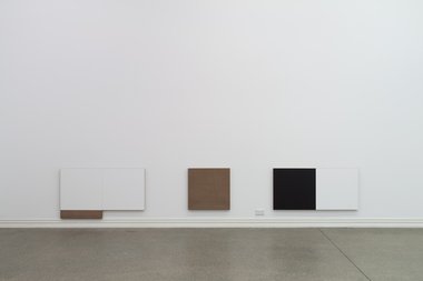
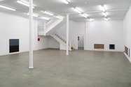
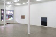
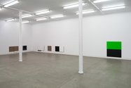
In his first show in Starkwhite’s big downstairs gallery Matt Henry continues his characteristic teasing out of similarities between minimalist abstraction and high-tech heating or home entertainment audio/visual equipment. This new precise installation tightly references various aspects of the Starkwhite room whilst also referring to fashionably elegant consumerist products that are coincidentally similar to the works of Judd, Baer or McCracken.
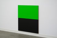
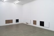
To do this - through meticulous positioning and the works’ measurements - he alludes to certain features of the room’s architecture and its trimmings, like skirting boards, power-points, a fire alarm and the thin grouting lines that traverse the floor. The paintings in some ways are like furniture, having specially designed features reminiscent of the hinged flaps of dining tables that can extend their horizontal planar surface. Some of the square works have differently coloured, lower rectangular strips.
Also the sides of the linen stretchers, their thicknesses, and the way the paint curves over the edges of the front plane, are crucial elements. So too are the negative spaces between the works, they often being repeated modules based on a reiterated square canvas unit. This sets up a pulse that hints that the entire room wall surface and ceiling is a gridded matrix.
All Henry’s painted (or unpainted) linen panels are obsessively crafted, from the fastidious construction of the stretcher and the way it is fastened to the gallery wall, to the very controlled covering of the surface with acrylic or size. In fact there is a double-binding hermeticism about the project that hints no other space might ever be appropriate to contain these almost holy objects, not only through its different proportions but also through its lesser purity and inevitably inadequate pristine cleanliness. Something perhaps impossible to attain.
The title Contraflow also alludes to purity, a Modernist going against the Postmodernist grain, a determined but futile counter-charge using realism and a consumer narrative as a ploy.
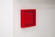
Upstairs in one of the small Starkwhite galleries overlooking K’ Rd, is a suite of eight much more chromatically buoyant Henry works based on cassette shapes. These are hung in a row and don’t refer to the room at all - apart from the whiteness of its wall - only their own proportions, sides and vertical thicknesses. They use cleverly isolated strips of vibrant colour to seduce, but they are combined with nuanced internal placement and a collectively driving finger-snapping rhythm.
These gorgeous pocket-sized paintings, and the urbane installation downstairs, are extremely accomplished projects. In my view, easily the best shows on in Auckland right now.
John Hurrell
 Two Rooms presents a program of residencies and projects
 Advertising in this column
This Discussion has 0 comments.
Comment
Participate
Register to Participate.
Sign in
Sign in to an existing account.