John Hurrell – 9 November, 2010
It would in fact be better if Hughes were openly formalist because that seems to be where her gifts lie. However in her spiel I think she is confused. She sets out her programme while also referencing Josef Albers, the guru of optically analysing contextual placement of colour. His ideas are not remotely connected to this project, for it is data based, not retinal; idea based, not experiential.
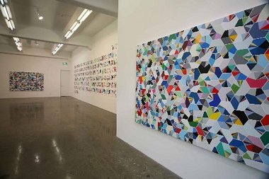
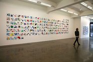
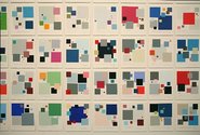
Here at Gow Langsford Sara Hughes presents seven acrylic paintings on linen stretchers, a Giclee print and a wall of 190 computer applied acrylic works on paper in an exhibition that is an extension of her previous show looking at banks and the financial crisis. This one though focusses on their use of websites and has larger better looking images. Instead of swirling dollar signs, it features grids of hexagonal pie graphs and horizontal bar graphs that go through countries of the world examining the netwide promotion of their dominant fiscal institutions and the colours of their home pages.
It is an odd project, one that I think is flawed because it implies a global sensibility dealing with political issues, whilst it really is a sophisticated form of formalism that incorporates a chance element. It is preoccupied with colour but never moves beyond that. The gallery blurb quotes Christina Vgh as saying ‘the fact that she manages to focus on the painterly means, despite the great complexity of her thematic starting points (ie. world wide systems with their constantly increasing influence on everyday life), highlights the quality of Hughes work.’
To me this is nonsensical. It is like saying intentions are more important than results, that referencing financial statistics makes her work global, despite the fact that the information being sourced is about colour choice only, aesthetic sensibilities used for marketing allocated to 5 geographic regions and 190 countries. It is a version of Komar and Melamid’s use of questionnaires researching national taste in painting imagery, but breaking down and analysing colour use in the pages of bank websites. No codes are involved because the information is statistical and about colour’s proportional use. Not interesting as content at all - despite the claims of gravitas. It is just as ostrichlike as that which any formalist might be accused of.
It would in fact be better if Hughes were openly formalist because that seems to be where her gifts lie. (The best work is the simplest, Oceania, with thick horizontal bars.) However in her spiel I think she is confused. She sets out her programme while also referencing Josef Albers, the guru of optically analysing contextual placement of colour. His ideas are not remotely connected to this project, for it is data based, not retinal; idea based, not experiential.
So if Hughes wants to be a conceptualist, it would be better to get the information communicated in the most direct manner possible, as in for example, Billy Apple’s 1980 Sold paintings, where language was incorporated into the canvas design to show the work served as a sort of receipt. That way the motivation behind her project can be grasped immediately with no convoluted gallery treatise needed.
Yet all is not lost. There is nevertheless a self reflexive consistency to Hughes’ installation, a system of cross-connections that makes it curious. Sharp-eyed visitors might notice patterns in colour percentages that link her 190 works on paper, each one referring to a country, to the five regional bargraph-as-strata canvases - Oceania, Asia, Africa, Americas and Europe - where the incorporated nations are stacked vertically as strata on each rectangle of geographical location, or the Colour Code painting, where the canvas displays all 190 countries as hexagons, each one with ten website hues in appropriate sector proportion.
That aspect saves this exhibition as a total visual statement. Even though colour is used to present information about colour use and not beyond, and its ‘thematic starting points’ pumped up by Hughes’ unsubstantiated ‘desire to articulate social meaning by utilizing aspects of perception and semiology’, the schematic threads between items intrigue. The works on paper serve as ‘keys’ for the different countries that help you ‘unlock’ the canvases, and so are worth spending time with. Whatever its inconsistencies and actual hermeticism, this is an interesting show to think about.
John Hurrell
 Advertising in this column
 Two Rooms presents a program of residencies and projects


This Discussion has 0 comments.
Comment
Participate
Register to Participate.
Sign in
Sign in to an existing account.