Mark Amery – 21 February, 2011
Echoing the real urupa passed over on the beach at the beginning of the sculpture walk, Schierning sets out a challenge to the organisers and artists to provide more work in future that actually feeds off the history and specific location of the sculpture walk. I'm not expecting a museum, but I learnt nothing about the site I was walking on elsewhere while visiting Sculpture in the Gulf.
Waiheke Island
Sculpture on the Gulf 2011
Curated by James McCarthy, Trish Clark and Heather Galbraith
28 January 2011 - 20 February 2011
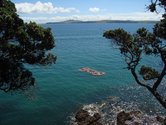
The undeniable star of Sculpture in the Gulf is its situation. As an isthmus Auckland has always made the most sense considered from the water. Travelling by ferry and foot from the city to a Waiheke Island headland is a joy. To ramble and swim at the foot of vineyards, at every turn looking back from the Pohutukawa-fringed and sculpture dotted trail at the city in the blue distance makes for a great experience. It’s an event that deserves to put Auckland on the map.
Don’t be mistaken, the art matters. I’d be resentful rather than soft on Sculpture in the Gulf 2011 if I’d had to trudge in the heat around too many oversized one-note jokes and metallic and wooden plant and bird forms.
By and large selectors Heather Galbraith, James McCarthy and Trish Clark have selected well and, refreshingly broadly, with strong attention to the experience and audience. Of itself for example 13-year-old Timothy Sang’s large walking lego man was not remarkable (despite the curators claims to the contrary), nor are Verena Jonker and Bryony Matthew flags made from plastic bags, to my mind, particularly strong works. But these things did a good job in introducing and framing the visit.
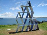
Yes, there was art here that visually impressed on first look, but then doesn’t leave you much to be getting on with after - Fletcher Vaughan’s visualisation of the house of cards we’ve built ourselves on the planet, and Brett Oakes’ giant takeaway coffee cup (both pop art throwbacks). But then this isn’t an art gallery. This is a place for crowd-pleasing novel icons too.
As Sculpture in the Gulf continues to gain a hold on the city one would hope the quieter, subtler and more grounded works might gain increasing space. And this year the curators did strike a nice balance - there was something for everyone.
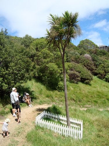
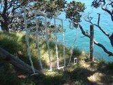
At the other end of the spectrum from the aforementioned was A.D. Schierning’s ti kouka/cabbage tree. Perhaps my favourite work, a grubby white picket fence around a cabbage tree referred to the urupa, colonial graveyard and trees as symbols and markers. As you asked yourself who or what has died, the work dug strong conceptual roots, asking you to consider the land’s past and its complications. Echoing the real urupa passed over on the beach at the beginning of the sculpture walk, it sets out a challenge to the organisers and artists to provide more work in future that actually feeds off the history and specific location of the sculpture walk. I’m not expecting a museum, but I learnt nothing about the site I was walking on elsewhere while visiting Sculpture in the Gulf.
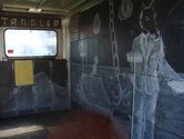
This weakness is a reflection of the fact that its reliant on most works being for sale and hence relocatable (anyone for a transplanted urupa at the bottom of their garden?). The sculpture here in the main is only temporary in so much that, as prize ponies, they will be trailered off somewhere else, like Denis O’Connor’s horsefloat.
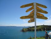
Matt Akehurst’s signpost You Are Here also spoke cleverly to this. (If you buy the work he’ll re-estimate the distances from your property to those pointed to on the signpost.) It underlines the residual feeling in New Zealand that we’re still too often looking out to sites of significance elsewhere, rather than busy making art that is grounded in our place: you are here, what are you going to do about it?
Another fine example of the charge when work is very site-specific was Judy Darragh and Rachel Shearer’s Data. As you entered a shadowy scrub patch a shimmering metallic, musical hum filled the air, and your eye was drawn to what looked like electrical cables glittering in the kikuyu grass, like chimes piping fairy magic into the glade. Made out of drinking straws (appropriately, we’d just passed the Tea Tree café) they tuned us into the cable transmissions running under the ground and through the air in the surround, and how data wraps around us with the aggressive pace of kikuyu, smothering other plants in its path.
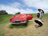
Hats also off to Kazu Nakagawa who decided to make his work the provision of umbrellas (featuring his own typographical design). While the suggestion that this was ‘part of the composition’ felt a little old hat and pretentious, or at least could have been developed further, he deserves the people’s choice award given the amount of sun and rain over the exhibition period.
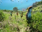
Two works played particularly well with landscape forms. Christian Nicolson’s brightly paint-streaked nudist figures straggled nicely in clumps across an ugly bare hillside with all the ungainliness of gorse. While the work was overegged in terms of their number (and placement at the ferry wharf), I did love how they populated an area as a community. They played with the awkwardness of two-dimensionality. They revelled in the preposterousness of our awkwardness with being naked, equating it with how uncomfortably we have stripped the landscape. It was like stumbling on a scene being filmed for a Carry On film.
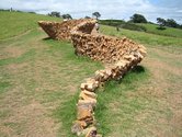
Marcus Tatton‘s wall snaked like a Richard Serra, but in a material that could almost be a Kiwi vernacular, stacked firewood. Not only did it look stunning, echoing the lines of the landscape but it spoke strongly of the problematic provisional way we tend to live on this land.
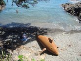
Overall the artists and curators worked very smartly on the exhibition’s pacing and how the works were positioned: Ruth Watson’s SOS of lifebuoys framed by trees; David McCracken’s beached rusty submarine whale in a cove where it could be looked down upon and sat with, Diane Atkinson’s birdhouses populating a wetland, and the ever reliable Jeff Thomson weaving matting out of iron in a glade. In all these cases care was taken over how the works were approached by the viewers.
A final brief note must again go to Denis O’Connor’s The Tangler, a deserved winner of the premier award. O’Connor got around the site by towing in suitable housing, a horse float, which he lined with slate to draw on. Like a fortune-teller’s hut at a fairground, the work openly invited you to swim in its poetic tangling of time and space and play dominoes with meaning.
The Tangler is very rich (the closest the show did get to providing a museum), and one hopes it will get towed to many other public sites where it can get the longer attention it deserves.
Mark Amery

 Two Rooms presents a program of residencies and projects
 Advertising in this column
This Discussion has 0 comments.
Comment
Participate
Register to Participate.
Sign in
Sign in to an existing account.