John Hurrell – 21 September, 2011
If you expect viewers to linger in front of a painting you need to provide a bait of sorts to keep them there - especially if the art is calculatedly ‘not quite right.' If you want them to attend to the ‘awkwardness' that is also present - that you want them to think is deliberate.
Auckland
Sam Rountree Williams
Nature Culture
14 - 15 September 2011
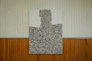
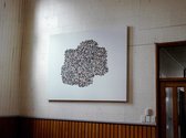
In this two day exhibition in this rather beautiful old Kyber Pass Road church hall Sam Rountree Williams presents seven paintings, all with his characteristic Rountree Williams trademark, layers of small clam shells stuck onto thick coats of gesso - and some at times with portions later pried off. The picking off (subtractive) aspect seems significant for it leaves a distinctive patterned texture as a record of the absent shell.
Overall the paintings come across as a sort of hybrid of Marcel Broodthaers mussel shell paintings and Julian Schnabel’s broken plate works. Rountree Williams seems to be aiming at Schnabel’s calculatedly crude manual touch, but with works much much smaller.
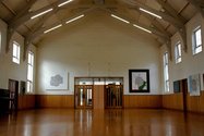
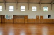
The show’s viewing suffers badly being in the hall because of the horizontal division on the wooden panelled walls - between upper cream painted panelling and lower brown stained tongue-and-groove, separated by a line of grey trim. The hall space would look better without Rountree Williams additions, but then his work would probably never get seen. I see his dilemma. He wants an audience, but he pays an aesthetic price.
Some of his images refer specifically to the North and South Islands, blobby, lumpy green versions that seem to be weather maps and which might be satirical references to New Zealand culture especially - dare I say it? - during the period of the Rugby World Cup. Not all of Rountree Wiliams’ paintings in the past have been hamfisted. He is capable of delicate and precise mark making. So his clunkiness and rawness here is knowingly done.
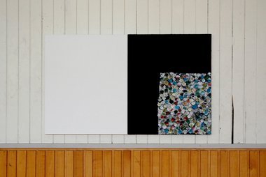
The other characteristic is his incorporation of blank gessoed canvases that often bring a lopsided cack-handed composition to the work. There is an essay that goes with the show written by George Watson. She says the work pursues ‘off-ness’, ‘an iconography of the not quite right,…a painterly codification of awkwardness.’
I can grasp what she is getting at but overall I have a problem with a lot of Rountree Wiliams’ work. My contention goes like this: I can see that he can move away from crude mark making if he wishes but I am not convinced he is capable of making well-executed resolved paintings when he tries to. He does so occasionally but that might be hit and miss, a matter of luck. If you expect viewers to linger in front of a painting you need to provide a bait of sorts to keep them there - especially if the art is calculatedly ‘not quite right.’ If you want them to attend to the ‘awkwardness’ that is also present, that you want them to think is deliberate.
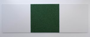
And indeed in this show there are two paintings where Watson is absolutely accurate. One where there are three sections: a blank square on the far left, a black square where acrylic has been applied with a palette knife, and within that black square, tucked into the bottom right-hand corner, a beautiful multi-coloured square of sprayed painted clam shells that look soft as decorations in a velvet quilt. It is sensuous on the right, and boring - and (metaphorically) about to topple off the wall - on the left.
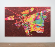
The other work of interest features a swollen bizarrely-ugly image of the South Island in a square framed by long canvas panels of maroon purple. Curving shell lines of anti-cyclones and cyclones near the lefthand outer edges lead into a central France-shaped, mottled conglomeration that presses into the curve of the Island’s back, creating a lovely prodding tension. The ubiquitous arabesques of landform contours and cyclones just hold the whole thing together - for it is somewhat gross in its flimsy casualness. The heavyhanded frame seems a strategy to distract from the painting within it - and the slyness of this furtive method works.
Rountree William’s other paintings in my view aren’t worth bothering with. They don’t cut it. Their compositions and surfaces are too anaemic, without any effective dynamic to draw you in close and mentally engage with, or persuade you that this self-declared ‘bad’ art might in fact be good.
John Hurrell
Recent Comments
John Hurrell
Nice connection Andrew. I forgot about Richard's sculpture from the late eighties / early nineties.
Andrew Paul Wood
Perhaps one might also make mention of Richard Reddaway, especially in the 1980s. I'm inclined to agree with John that ...
Owen Pratt
Very esoteric. Skill beyond measure to ascertain 'calculatedly not quite right' in the lexicon of clam painting. Both from the ...


 Two Rooms presents a program of residencies and projects
 Advertising in this column
This Discussion has 10 comments.
Comment
peter madden, 10:26 a.m. 22 September, 2011 #
Well I would have to put that review in the "poison pen, my mind is made of mud" mold. Where is the balance, where is the smarts? Damn it John, where is the idea? You seem at times only capable of flinging pejoratives to satisfy some sort of malignancy. I should know having amongst the many who have been prey to your diary of inadequacy.
In my view your reviews carry the past in their ink: that is to say, mostly not worth bothering with. I think when you are confronted with work that practises in an idiom far away from the 70s and doesn't contain some sort of nostalgia for post object art - basicly art in its messianic death throws - we get a bit of the above. Also you should have sent someone else to do the review [esp if you want this site to have any credibility], because you told me privately you don't like his work so why why why do it if you carry so much spleen into a show. The above review was preordained. That makes the above a pathetic review.
John Hurrell, 11:03 a.m. 22 September, 2011 #
I think, Peter, my review is scrupulously fair. Sam, like many artists, asked me to review his (somewhat brief) show, and I usually turn such requests down, accepting only if I think there is something interesting and new I can say. That is what happened. I thought about the essay provided with his display and responded.
Note I put in links to earlier both positive and 'critical' reviews to present a context for my writing and his art.
Note also I never claim to have the last word. It is - for this show - the first. You never saw the exhibition, Peter. Hopefully somebody who did might like to bring another take to this site - and open things up.
peter madden, 12:06 p.m. 22 September, 2011 #
I might take you to task on your first point "my review is scrupulously fair." Is it really conscientious and exact, does it have scruples? Not towards the idea of a robust criticality of a conscientious and exacting artist - it does not. If the artist asked you or not is irrelevant. I might find it more interesting if the dog around the courner had asked you. It still would have had no bearing on the outcome because as I intimated you walked in with a bias. Which in your reply you have not negotiated or refuted so I reiterate - that makes the above a wholely worthless review. Yes you are right, I didnt see the show as I was out of town and to this moment dissapointed by that, but this is a review of your style [or lack there of]. I know enough of the artist's work to comment [I think I'm feeling vunerable]. Anyhow as you say others may want to wade in, and that is the joy of this multi platformed site......
John Hurrell, 12:28 p.m. 22 September, 2011 #
Peter, I mentioned the links because they show I have supported (and enthused over) some of Sam's projects. Of course even if I hadn't, that wouldn't make me a ratbag. This is a forum and I present my viewpoint and welcome those who choose to respond. That's democracy and I'm trying to open up discussion where previously very little has occurred. Unpopular (even negative) opinions are better than total silence. As Oscar Wilde said, better to be talked about than not talked about.
Ralph Paine, 3:06 p.m. 22 September, 2011 #
"The show’s viewing suffers badly being in the hall because of the horizontal division on the wooden panelled walls - between upper cream painted panelling and lower brown stained tongue-and-groove, separated by a line of grey trim. The hall space would look better without Rountree Williams additions, but then his work would probably never get seen. I see his dilemma. He wants an audience, but he pays an aesthetic price."
To the contrary, how refreshing to see the work hung in such a beautiful space: White Cube Not!
But not only that, it is as if the works were made precisely "BECAUSE of the horizontal division on the wooden panelled walls - between upper cream painted panelling and lower brown stained tongue-and-groove, separated by a line of grey trim."
John Hurrell, 3:28 p.m. 22 September, 2011 #
I don't believe for a nanosecond you are serious, Ralph. You're clowning.
Ralph Paine, 5:21 p.m. 22 September, 2011 #
No, not for a nanosecond clowning.
In the long shots I see no artistic dilemma, nothing unresolved; nor any desperate scurrying after an audience. Rather, I see a rather beautiful addition to the space... The works seem silently at home, in repose, almost noticed but not quite: an aesthetic gain, architectural surplus.
And in the close ups I see no "codification of awkwardness" - as Watson puts it - or for that matter any deliberate "badness" or celebrations of the de-skilled. But what I do see is a fascinating and elegant a la Ryman set of charts, mosaics, odes to the river flats and estuaries, scrubbed atmospheres, strata.... Pilgrimages, no doubt; and which journey out across the walls.
But then I wasn't there.
Owen Pratt, 7:11 p.m. 22 September, 2011 #
Very esoteric. Skill beyond measure to ascertain 'calculatedly not quite right' in the lexicon of clam painting. Both from the artist and the reviewer.
I suspect Socratic irony.
Andrew Paul Wood, 6:11 p.m. 23 September, 2011 #
Perhaps one might also make mention of Richard Reddaway, especially in the 1980s. I'm inclined to agree with John that they are a mixed bag - some (and I freely admit I'm judging from the photos only) would appear much more successful and aesthetically resolved. Also, the structure of the hall does make the whole thing a little too busy and distracting to really grasp what's going on - again, judging from the pics. IMHO anyway.
John Hurrell, 12:58 a.m. 26 September, 2011 #
Nice connection Andrew. I forgot about Richard's sculpture from the late eighties / early nineties.
Participate
Register to Participate.
Sign in
Sign in to an existing account.