John Hurrell – 24 April, 2012
There is an extraordinarily varied range here in this rich smorgasbord of inventive approaches. Most of the works are impeccably finished as designed objects but some dwell on process, particularly ways of accumulating words so they as part of an ongoing procedure build up a poem, or marks from a score so they make a drawing.
Auckland
Group show
Paper-jams: artists between the covers
Curated by Andrew Clifford
9 March - 28 April 2012
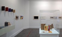
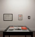
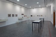
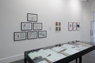
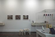
Most readers of this site have collect books to build up their own libraries, and/or a keen interest in borrowing and reading connected publications owned by their friends or institutions, especially if they happen to be artists who teach in universities. In the large gallery of Gus Fisher, resident curator Andrew Clifford looks at these portable paper repositories of creativity and information - where they (as physical objects) and their social/political context (such as collaborations and collectors) are its subject-matter.
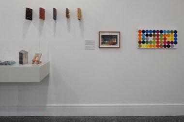
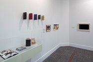
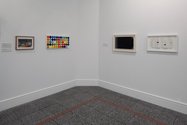
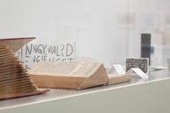
Over thirty artists are involved, yet the space with its several vitrines is uncluttered. Many of the books, drawings, musical scores, paintings, sculptures, ceramics and folded texts, are small, if not tiny, and a high percentage extremely elegant and innovative in their design: books of imagery or poetry gorgeous in their production, often made by skilled craftspeople such as Alan Loney, and designers like El Lissitzky.
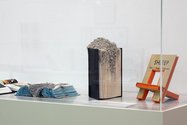
This includes mutilated books - pages and volumes glued together (Elliot Collins), pierced with pencils (Paul Cullen), perforated by hole punches (Teri Moon) - painted canvas versions (Patrick Pound), ceramic varieties (Tessa Laird), boxes of loose typed cards (Robert Grenier), matchbook cards (Ian Hamilton Finlay), poetry with thumbtab indexes (Mayakovsky / El Lissitsky), beautiful typefaces and printing press technology (Alan Loney), photocopy magazines (Tony Green) and spectacular drawings on musical scores (Marco Fusinato).
There is an extraordinarily varied range here in this smorgasbord of inventive approaches, a selection of publications presented at a time when most people believe books will be eventually replaced by electronic media. Most of the works are impeccably finished as designed objects but some dwell on process, particularly ways of accumulating words so they as part of an ongoing procedure build up a poem, or marks from a score so they make a drawing. Plus the various support networks of close friends is acknowledged, contributors to magazines, collaborations between artists and writers.
Here are six works which I found especially rivetting:
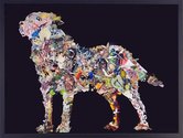
Patrick Reynolds has an amazing painting of an album in flat profile, (Album, 2004), with leather corners and thickly bound. It looks like a cross between a Fomison and a Mrkusich, painted in thin greys and scrubbed browns, and waxed over with dark triangular corners on the right. A horizontal rectangle it is like a moody landscape and oddly haunting.
A yellow facsimile of an anthology of Vladimir Mayakovsky poems designed by El Lissitzky perfectly blends Suprematist imagery into the Russian texts - though Mayakovsky was in fact a Futurist. A gem of a book with its exposed ‘quick find’ index-tabs, For the Voice (1923/2000) comes in a box with other publications of translation and essays.
Two hardcover books treated by Teri Moon have had their pages so perforated by a hole punch that the glued on shredded scraps look like wool or furry mould, a strange lumpy creature emerging from the closed pages. Like the Cullen pencil books this treatment is amusing and violently creepy - it could be leaking viscera - but its organic amorphous qualities have real mystery. It’s genuinely disturbing and very memorable.
Fiona Connor has a collaged newspaper made in Bacelona from a variety of free papers blended into the regular daily. Articles from different sources replaced the original news items by being superimposed on top, a fascinating hybrid subtly integrated. It is a wonderfully inventive collage that you are encouraged to open up and examine closely for yourself.
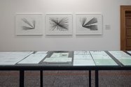
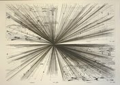
Marco Fusinato’s has three scores - transposing the music of Greek composer Anestis Logothetis - that double as instructions for musicians and as superb modernist drawings investigating perspective. These large intricate ink drawings could almost be linear etchings and are a graphic centrepiece of the exhibition.
Alan Loney’s Prima Materia, 2006, celebrates shape and colour. It is a gorgeous sampler of his many earlier typographical masterpieces, a modestly sized hardcover tome crammed with vibrant examples of type, wood blocks and ornaments. Like most of the work here, you linger over it in admiration and are reluctant to leave.
This show presents Andrew Clifford’s curatorial abilities at their best. Encompassing his deep knowledge of sound art and music as well as art and literature, it is full of surprises. Sensual, intimate and cerebral, this extremely informative exhibition is an indisputable highlight of the Gus Fisher calendar.
John Hurrell


 Advertising in this column
 Two Rooms presents a program of residencies and projects
This Discussion has 0 comments.
Comment
Participate
Register to Participate.
Sign in
Sign in to an existing account.