John Hurrell – 25 April, 2012
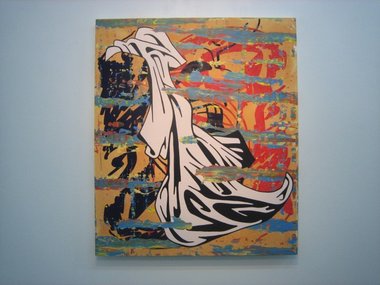
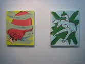
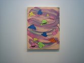
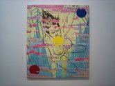
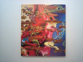
In a sense these works are abstracted landscapes with their stratalike horizontal streaks that could be stacked islands or peninsulas - floating in front of, or behind the comicbook imagery. The smudged and flattened globs of paint slice into it like an obliterating spud peeler or corrosive acid. They carve into the narrative, dismantling connections within the four edges, and raising other layers underneath from the appropriated billboards.
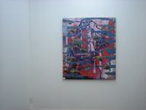
Tjalling de Vries’ neo-pop paintings take the illustrative screened imagery of early Warhol or Lichtenstein and mix the graphic line with painterly dragged smears of for example, Richter (and occasionally Frize). This merging of different methodologies normally considered ideological opposites follows in the footsteps of someone like the Venezuelan artist Arturo Herrera.
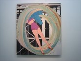
De Vries’ commercial black-lined imagery is calculatedly retro and provocative, especially with its depictions of women. It’s a knowing tease (an irritant to feminists) of boobs and ‘doll faces’, but it has a twist - many of the women are waving knives. The artist seems to be laughing at male fears of castration, but also enjoying images of female anger.
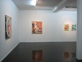
Also the images are - in today’s academically top heavy art climate - definitely ‘low brow’. The show has a conspicuously 60s European feel to it, and because many of the surfaces painted on are sections of billboard, the fragmented imagery is vaguely reminiscent of the French ‘torn poster’ artists of the fifties such as Raymond Hains, and Jacques de la Villeglé. This weaving of different styles into the picture plane, over and under, is almost an Ilam trademark - if you also consider the complicated masked-off paintings of people like Andre Hemer.
In a sense these works are abstracted landscapes with their stratalike horizontal streaks that could be stacked islands or peninsulas - floating in front of, or behind (or both together) the comicbook imagery. The smudged and flattened globs of paint slice into it like an obliterating spud peeler or corrosive acid. They carve into the narrative, dismantling connections within the four edges, and raising other layers underneath from the appropriated billboards.
Sometimes the black lined images themselves are fragments, hovering in pictorial abeyance so the viewer can (if they wish) mentally move them around and join them up in a coherent structure of their own invention. They are not blended snippets (as sometimes with Valerio Adami) but discretely separate portions, enabling easier imaginative couplings.
This of course is tricky if the partial forms are unrecognisable - and I suspect the best ones are - though even that quality allows a certain amount of mental creativity in making hybrid abstractions. Whatever the case, if you, like me, drool over old style line illustrations in your newspaper or letterbox advertisements (they still seem to be around) and you have a weakness for strips of dragged smudgy paint, this is the show for you.
John Hurrell
 Advertising in this column
 Two Rooms presents a program of residencies and projects
This Discussion has 0 comments.
Comment
Participate
Register to Participate.
Sign in
Sign in to an existing account.