John Hurrell – 13 July, 2012
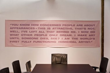
For a while I thought the long texts (all taken from cinema) had a problem because of their length, but what upsets me is more complex than that. It is not a question of just preferring concision and focus - for many here meander or waffle - it is a question of tone, the psychological inflection projected by each speaking actor. Many of these sentences are forceful and irritating, enunciated through scripted roles representing people who are overbearing.
I’m a big fan of Mary-Louise Browne‘s sequential text works (like Body to Soul, or Rape to Ruin), those beautifully carved granite slabs (of the nineties) or seats where in a series of words (all of the same letter count) nouns or adjectives change in stages - one letter at a time - as a form of sculpture.
What I adore is their compression and restraint; the wit of switching meaning within such minimal stages; the savouring of the sense of each individual word; the wonder of what a single letter switch can do emotionally to the reader. There is also the connection to the great late sixties Hotere - Manhire collaboration featuring Manhire’s Melody / Malady / My Lady poems. Wonderful works where the paintings’ formal attributes matched the brooding language. Browne’s sculpture was structurally similar.
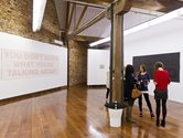
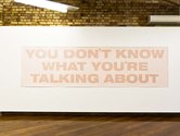
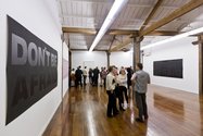
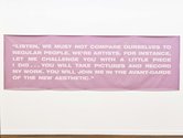
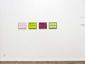
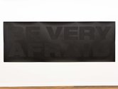
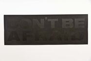
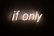
So what of these wall works that span the previous twelve years leading up to now? Some are of two words, others go up to eighty-five. One in neon, one framed under glass, some on paper, others on painted canvas or coloured leather. There are least three different fonts.
For a while I thought the long texts (all taken from cinema) had a problem because of their length, but what upsets me is more complex than that. It is not a question of just preferring concision and focus - for many here meander or waffle - it is a question of tone, the psychological inflection projected by each speaking actor. Many of these sentences are forceful and irritating, enunciated through scripted roles representing people who are overbearing. Perhaps Browne intends that. Maybe she sees that as desirable.
When you analyse the content of their words, most of these filmed (now unseen) speakers are acted-out artists, spouting forth about their projects or pompously giving some poor trapped soul advice. My feeling is that Browne here does not intend to be satirical, but instead, likes the artworld commentary and is curious about what happens when you transfer film dialogue to texts on gallery walls so it becomes reflexive. Therefore one asks what do such scripts generate in these new incarnations? Which read phrases lock into readers’ minds? What becomes memorable enough to be verbally repeated?
To answer such questions you probably have to live with these texts so you can’t retreat from their insistent voices. That way they’ll either become shrill and make you ratty, or you’ll decide they are friends generously imparting wisdom through certain choice phrases. I tend to think the former - that you’d tire of them.
For me in this show it is the small two-word paintings on leather that work best because of a wit many have referring to their own surface. They are compact, subtly sensual, and float free of any narrative. I like their intimacy and allusiveness; the tension between the two separate words - as a foil to when they blend together, stacked up. In comparison the other bigger works seem heavyhanded.
John Hurrell



 Two Rooms presents a program of residencies and projects
 Advertising in this column
This Discussion has 0 comments.
Comment
Participate
Register to Participate.
Sign in
Sign in to an existing account.