John Hurrell – 5 December, 2012
It's nice to see Gimblett not overloading his surfaces (now delicate with thin mottled washes), or over complicating his stretcher edges with circular forms. This is better painting than some of his more recent busier efforts - and a superior experience without any promotional hoopla about Gimblett as creative personality.
Auckland
Max Gimblett
The Ballad of the South Pacific
28 November - January 2013
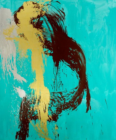
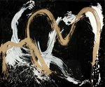
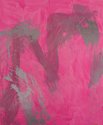
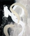
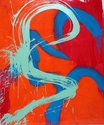
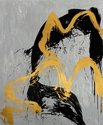
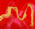
In this show Max Gimlett ignores his trademark quatrefoils - cross formations of four overlapping circles - exhibiting instead a group of about nine vertically rectangular paintings we could call ‘doorways’ or ‘works with a portrait format’. The largest ones, some over eight feet high, have considerable visceral impact with their use of tonally unstable metallic paint and glowing tinted backgrounds. They are pretty but not sickly.
Due to its comparative restraint numerically (not cluttered) and trickly, subtly modulated field (without an opaque flat background), this is an unusually satisfying group of Gimblett paintings. For most of them he has stopped brushing on his thick swirling calligraphic line at exactly the right time. The dominant, sweeping, splattered paint trails are surprising intricate in the way their sides disintegrate, forming gaps and speckled pitted edges - like coastlines.
It’s nice to see Gimblett not overloading his surfaces (now delicate with thin mottled washes), or over complicating his stretcher edges with circular forms. This is better painting than some of his more recent busier efforts - and a superior experience without any promotional hoopla about Gimblett as creative personality. Better without any (for example) videoed lunging with brushes accompanied by dramatic vocal effects, unnecessary props clawing at the visitor for attention.
One particularly striking work is the turquoise Leda and the Swan, a composition of looping vertical sweeps compacted against its lefthand edge. It has an admirably lopsided daring, a pressing unrelenting tension; oddly refreshing because it is not presenting evenly distributed ribbons of paint like most of the others. Its curving linear configuration is jammed, crumpled and bizarrely shredded. Irregular but strangely compelling.
John Hurrell
Recent Comments
harry rickit
kia ora John. that makes sense.
Simon Estades
I do like this work, and how Max Gimblett mixes the colours giving the final result a Pop Art touch. ...
John Hurrell
They might be versions of zen koan, designed to resist logic, to muck up any continuity of narrative or interpretive ...
 Advertising in this column
 Two Rooms presents a program of residencies and projects
This Discussion has 4 comments.
Comment
harry rickit, 7:05 p.m. 7 December, 2012 #
This looks like an interesting show. Great review too. I'm not sold on the titles of the paintings, they seem to obscure the graphic quality of each work, if, that is, they are meant to be images of 'works' or in other words performances.
John Hurrell, 8:31 p.m. 7 December, 2012 #
They might be versions of zen koan, designed to resist logic, to muck up any continuity of narrative or interpretive representation.
harry rickit, 11:09 a.m. 17 December, 2012 #
kia ora John. that makes sense.
Simon Estades, 12:53 p.m. 9 December, 2012 #
I do like this work, and how Max Gimblett mixes the colours giving the final result a Pop Art touch. This seems to be a bit of fresh air in New Zealand, where quality abstraction is so difficult to find.
Participate
Register to Participate.
Sign in
Sign in to an existing account.