Peter Dornauf – 3 June, 2013
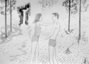
It's almost like Jack and Jill go camping where things go predictably awry. With the predominance of trees there's something of an Edenic feel about the setting and its narrative with all the symbolic resonance that's carried with the Western myth. The protagonists, male and female are always young, often nude, inevitably sad, distraught, even when they're doing it.
“Small is beautiful”. That Seventies mantra might happily apply to the diminutive, air-light works of Michael Harrison currently on show at Ramp Gallery, Waikato Wintec, curated by Kim Paton. Harrison’s recognizable trademark style is repeated here; understated, petite, pale work of watered down acrylics on small sheets of paper which are pinned to walls like captured moths, held, as it were, forever in stasis under some polished glass display case. To add to their ethereal nature, this twenty two page-size lot are simply preparatory works, sketches waiting to be worked up into the finished product.
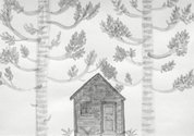
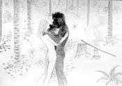
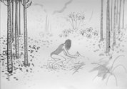
These modest creations are not shy though when it comes to exploring the tension and dynamics inherent in sexual relationships. It’s a theme the artist has traversed many times before, sometimes obliquely, using animals (cats and dogs) but here the mask is pulled back a little. It’s like Jeffery Harris meets Saskia Leek. The perennial subject of fraught relations, sex and its discontents, is placed this time in humble surroundings. It’s almost like Jack and Jill go camping where things go predictably awry. With the predominance of trees - girl gathering sticks between trees, girl climbing tree, girl beneath pine tree near hut, girls meets boy in tree, hut beneath kauri trees - there’s something of an Edenic feel about the setting and its narrative with all the symbolic resonance that’s carried with the Western myth. The protagonists, male and female are always young, often nude, inevitably sad, distraught, even when they’re doing it.
The artist has done the Garden of Eden trope more blatantly before in Original Mistake, 1992 and When the Apple Dream Comes True, but here in Tinder and Timber, there’s more of a profane bush craft backdrop without the apple and snake to screw things up. However, true love never runs smooth, as they say, and Harrison runs true to form here. This Boy Scout Girl Guide couple have, as always, forgotten their motto, “be prepared”. The two finger salute is not the one Baden Powell would have recognized.
In terms of style, the artist’s line is always assured, as fine as Matisse but without the distortion. Harrison keeps it simple, almost cartoonish with the occasional superimposition of images, (Messed Up) managing to achieve maximum frisson between the subject which is highly charged and the treatment which is quietly minimal. But how many times can one canvas the same subject and employ the same tricks while keeping the material fresh or avoiding one’s own clichés? Is this a vein one can mine forever?
It’s certainly one that few other New Zealand artists attempt. Most steer clear of sex as in sex with the exception perhaps of Seraphine Pick. We do the politics of sex, as in gender, but not the naked stuff, the emotional stuff. It’s off limits, it seems.
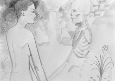
Something else that appears to be off limits too, as a subject, is sex’s twin, death. We do landscapes, birds, jeeps, cultural identity till it’s coming out our ears, but not death. Maybe we had enough of it after the legacy of McCahon. James Ross flirted with it briefly borrowing from Holbein some years back and Fomison too but mostly it’s disappeared (despite Heidegger’s presence) off the scene in any direct manifestation. But in this new series, Harrison has reintroduced the momento mori theme in a very demonstrative way.
In a work entitled, Bare Bones, he makes no bones about it. A lithe nude figure confronts his/her nemesis, death in skeletal form. (Shades of Death and the Maiden by Hans Baldund Grien and Edvard Munch and others.) Both figure and skeleton reach out to one another while staring into each other’s eyes. This embrace takes place in nature, within the environs of a New Zealand waterfall cascading in the background. A work called Skeleton repeats the image with slight modification which itself is a mirror image of another work, Suggestions, where the skeleton is replaced by a nude young man. This is new for Harrison and a bold move.
In a further ‘biblical’ reference, a work called Tracking (making tracks, bush walks) depicts a sort of post baptismal anointing (Jesus at Jordan with dove descending) portraying a naked young man, head bowed in front of a young woman, just in shot, replicating a sort of spiritualized experience of the libido with bird hovering. Sex becomes in the modern disbelieving age, sacralised, or as the British poet, John Ash, puts it in his poem, Twentieth Century:
“the body became a religion, sex a kind of makeshift sacrament.”
The thing is, in the postmodern cynical age, even that is insufficient to provide salvation - as Harrison is at pains to point out.
Harrison seems to have taken out the New Zealand franchise on two of arts traditional big themes, sex and death and woven them together in an adroit and timely fashion.
Peter Dornauf
Recent Comments
Peter Dornauf
The cliche is not so much in the forms because what we have here are just preparatory sketches and it ...
victor berezovsky
"In terms of style, the artist’s line is always assured, as fine as Matisse but without the distortion" Maybe Harrison ...




 Advertising in this column
 Two Rooms presents a program of residencies and projects

This Discussion has 2 comments.
Comment
victor berezovsky, 8:47 a.m. 4 June, 2013 #
"In terms of style, the artist’s line is always assured, as fine as Matisse but without the distortion"
Maybe Harrison should spend some more time investing in ‘distortion’. Maybe then he will get past these cliché illustrations.
Peter Dornauf, 11:01 a.m. 4 June, 2013 #
The cliche is not so much in the forms because what we have here are just preparatory sketches and it will be interesting to see what he does with them. His usual ploy is to do a sort of Gary Hume treatment which plays with colour, figure and abstract. The cliche is the boy meets girl meets angst saga. But then, that's life, I suppose. What is fresh for me is the exploration of a new territory of subject.
Participate
Register to Participate.
Sign in
Sign in to an existing account.