John Hurrell – 25 August, 2013
There is also the perculiarity of celebrating a technical process for replicating colour, but presenting key images - the quoted illustrations - in grainy black and white, while the glowing colour - the vividly sensual component - is paradoxically in the vertical stands, with geometrical shapes screened onto the translucent glass.
Auckland
Mladen Bizumic
Kodachrome Presents
Curated by Natasha Conland
10 August 2013 - 6 April 2014
With the onset of digital technology in photography, and the disappearance of analogue film, it is inevitable that many artists feel rueful about what has been lost - whether it involves moving image, transparency or print. This installation by Mladen Bizumic on the Level 2 sculpture terrace is a tribute to the chromatic qualities of the now unavailable Kodachrome film, as well as being a sly comment on the way the New Zealand tourism industry markets this country.
On the Level 2 foyer, outside the catwalk to the terrace, Bizumic presents a poster for the December 1991 issue of Geo magazine which promoted New Zealand to a German audience. The sheet also mentions the then bankruptcy of Eastman Kodak. I’m assuming he hasn’t Photoshopped the image, that it is authentic in its display as found object.
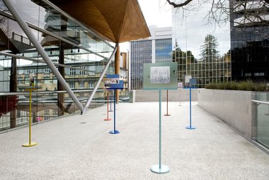
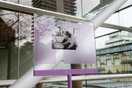
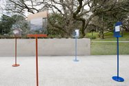
In Nastasha Conland’s introductory label (she commissioned the project), the artist is especially enthusiastic about the twelve colour system of Kodachrome. I’m guessing that this is some sort of complex separation process that provides extra veracity. Twelve museum stanchions are used to hold up obviously dated b/w images of New Zealand lifted from the magazine, each painted a different hue. The photographic examples of ‘New Zealand life’ are transparent and mounted on clear glass so they can be seen from both sides. That way, while looking through them - one side fainter than the other, you can consider whether what you are seeing matches what you know of, or observe, when you peer through.
The content of the twelve images is varied, each partially obscured, split or framed by the same geometric modernist design motifs as those accompanying them on the poster. Thus on the terrace in a new ‘live’ context, the geometry takes on symbolic dimension pertaining to the visitor’s interpretation of the photograph. Some images are about tourism and natural wonders (whale watch; mud pools; bush walks; sea spray over pancake rocks). Others are about civil unrest (protest marches by the unemployed), pollution in city skies, tertiary education, urban alienation (tagging alongside bored school-kids), and economic extremes (harbour marinas; a caravan truck). The rawness of the b/w shots offsets the lolly flavoured ambience of the stanchions. They look a wee bit like oversized music stands in a primary school.
Thematically the show is uneasily split in two: regretting the loss of Kodachrome, and an examination of New Zealand as a place to live now. ‘Uneasily’ because the setting, though essential for the sculpture to function, is the exhibition’s weakness. Being spindly, the elements are too overwhelmed by the outdoor location and surrounding architecture, and carry little emotional weight - a characteristic of many of the shows that have been presented here. After all, if you weren’t a person who regularly uses cameras, would you really care about the loss of a brand of film?
However you might care about images representing Aotearoa / New Zealand, whether in 1991 or now - and what they tell us about our community - if it occurred to you that you were being prompted into some evaluations. It’s pretty subtle.
There is also the peculiarity of celebrating a technical process for replicating colour, but presenting key images - the quoted illustrations - in grainy black and white, while the glowing colour - the vividly sensual component - is paradoxically in the vertical stands, with geometrical frosty shapes screened onto the glass. Never mind, the glass and stanchion colour here is beautiful and there is a perverse wit in having the pastel stanchions supporting b/w images, because optically it is normally the reverse with tone providing spatial volumetric structure.
It is an odd show that verges on being a little too cool, knowing that Bizumic can make works that are really emotionally affecting, especially when he uses music and images that feature dilapidated modernist buildings. The lively (almost pearlescent) colour is what saves this exhibition from being too dry. Such appeals to pleasure (bodily as well as cerebral) are important, providing a carrot that will bring you back for a second visit.
John Hurrell
 Two Rooms presents a program of residencies and projects
 Advertising in this column
This Discussion has 0 comments.
Comment
Participate
Register to Participate.
Sign in
Sign in to an existing account.