John Hurrell – 28 April, 2015
The pleasure in these 'building maps' comes from examining the unmodulated shapes very closely, the way some are deliberately not perfectly in parallel alignment, or have surprisingly complex contours. They are exact (ratio directed) correlations of the physical properties of the gallery architecture, so any unexpected ‘wonkiness' you spot is calculatedly so - as a documentation.
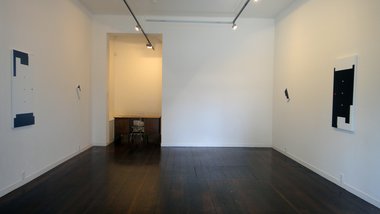
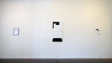
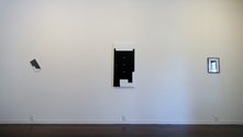
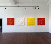
This small satellite show, an extension of the ‘long corridor / western wall’ Billy Apple works in Auckland Art Gallery’s The artist Has to Live like Everybody Else, is a gorgeous but understated installation that impresses through its simplicity, symmetry and restraint. The six intricate and subtle paintings and digital prints - all based on fastidiously re-measured and corrected gallery floorplans that scrutinise the position and alignment of manhole covers, waste water drain covers, columns and wall angles - come in matching pairs, one version (in each of the three) being the inverted and negative duplicate of the other.
Two of these works, the paintings referencing Two Rooms and Suite, were shown in a group show in Two Rooms three years ago. Now reshown at Roger away from other artists, and with an added laser print that looks at the second space of the Tim Melville Gallery, they look superb, the pairs split so that they march in parallel down the longer walls, one side (the eastern wall) emphasising white shapes with north on each ‘floorplan’ at top, the other (western wall) black with south above. Each work is perfectly positioned above the six carefully spaced power points by the floor. The Roger Gallery has never looked so good.
Of course it is understood that these ‘abstracts’ aren’t really non-objective abstractions, because they are clearly schematic diagrams: meticulously scaled and carefully put together floorplans. And it can be argued that the distinction between ‘abstraction’ and ‘realism’ is spurious anyway (putting aside later issues about quotation or simulacra). All abstraction carries a baggage of visual associations that make it part of the ‘real’ world; and all realism when reduced to a two dimensional painted or photographed image, loses the stereo vision of depth we experience via our engagement with our spatial environment, and becomes abstract.
The pleasure in these ‘building maps’ comes from examining the unmodulated shapes very closely, the way some are deliberately not perfectly in parallel alignment, or have surprisingly complex contours. They are exact (ratio directed) correlations of the physical properties of the gallery architecture, so any unexpected ‘wonkiness’ you spot is calculatedly so - as a documentation.
The other aspect is the effect of the painting stretchers on the canvas as a constructed object, the strange way the shapes curl around the edges - embracing not only the front, outward facing plane, but also the intermediary bevelled edges and side-facing, or up-and-down facing, lateral planes.
Here Apple is embracing a convention that is much like the black frames that go around the prints on paper. It could be argued that this interferes with the normal information bearing capacity of the medium, not so much the diagrammatic correlations linked to physical spaces but the codes of abstraction - through its under emphasis of the physical limit of the support’s edges (in the case of the paintings), and over emphasis (in the case of the print on paper).
This very beautiful show makes you wonder what a pair of Billy Apple paintings of Melanie Roger’s own gallery would look like; how he would go about it, and if the use of a symbolic red or blue (for example) would be absolutely necessary. If Apple has the sensibility of a formalist (this is obvious - but it is only part of his modus operandi) and he has the necessary graphic inclination (he has), he could make a set of dynamic ‘abstractions’ using black and white alone - like some of the ‘Good Works’ in the AAG survey. Such a work wouldn’t need a rationale (critiquing or otherwise) to provide a declarable reason, but would be driven solely by visual curiosity, even if the gallery was architecturally perfect. Maybe that will happen?
John Hurrell




 Two Rooms presents a program of residencies and projects
 Advertising in this column
This Discussion has 0 comments.
Comment
Participate
Register to Participate.
Sign in
Sign in to an existing account.