John Hurrell – 8 May, 2015
When in Guy's hands Chen Wen Hsi's referenced paintings are flipped around and transmuted into metal screens that project out from the wall, you are aware of the empty space behind the pushed out, vertical rectangle. With Macalister's bronze ducks the form is dematerialised to become a sequence of transmuting frosted glass bubbles - so again, new space and air is incorporated.
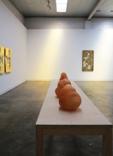
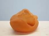
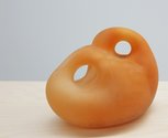
In this, Natalie Guy‘s first show of sculpture at Fox Jensen (now reopened in Putiki St), a series of brass wall plaques that reference Singaporean painter Chen Wen Hsi (1906 -1991), surround plinth based, handblown, biomorphic glass works inspired by pioneer New Zealand sculptor Molly Macalister (1920 -1979). Guy is obviously fascinated by mid-twentieth century modernism and its impact on that period’s decorative arts and craft, as well as fine art.
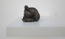
Although Macalister is famous for her imposing Maori warrior in Auckland’s Quay St, and her stocky little bull in Hamilton Gardens, Guy is mainly interested in the way both she and Chen Wen Hsi (in his use of ink and paint) have used bird motifs as springboards for organic improvisation.
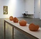
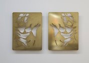
Guy’s brass screens with their angular and narrow cut out shapes, and her spherically swollen, frosted glass forms on a long narrow table, are very different. The former play with symmetry, inversion and mirroring, either within the same screen or in matching pairs - a standard template sheet, an eighth of an inch thick, being flipped over or swivelled. The latter seem more like a form of metamorphosis or linear sequence of embryonic development. The yellow screens with their jagged holes and wall brackets, reference ducks and roosters (separately); the pink sculpture, ducks, and very vaguely, voluminous flower forms.
With the computer-cut screens it makes more sense to ignore the individual modular units and focus on relationships of orientation, whereas with the fecund sculptures, single units seem more successful as domestic table sculpture. I’m not sure whether looking at the modernist artists who inspired Guy helps the viewer very much, for the morphological changes she makes are considerable, the newly chosen sculptural materials enormously different in their tactility, and the mood so highly ornamental.
When in Guy’s hands Chen Wen Hsi’s referenced paintings are flipped around and transmuted into metal screens that project out from the wall, you are aware of the empty space behind the pushed out, vertical rectangle. With Macalister’s bronze ducks the form is dematerialised to become a sequence of transmuting frosted glass bubbles - so again, new space and air is incorporated.
Here is some pertinent commentary from the gallery blurb:
In further removing the utility of the object, the notion that drove so much modernist design, Guy risks leaving her objects with neither role or meaning. However in the process of their cloning, these objects absorb a new visual ‘practicality’. Already familiar, we are more open to accepting them as they are - meaningless but rational, useless but vital.
It is interesting that meaning here relies on utility and practicality. I would have thought rationality and logic create in themselves a variety of meanings, that function and coherent narrative are not the only providers of sense, for what of ornamentation or formal manipulation? This is an unusual exhibition that prods at new modes of interpretation - and questioning - for domestic objects based on transmuted modernist origins.
John Hurrell


 Two Rooms presents a program of residencies and projects
 Advertising in this column
This Discussion has 0 comments.
Comment
Participate
Register to Participate.
Sign in
Sign in to an existing account.